300+ Free KPI PowerPoint Templates
300+ free KPI presentation templates for PowerPoint, Google Slides and Canva. Choose sales KPI dashboards, marketing scorecards, HR performance slides, financial reports and project trackers. Every layout is 100% editable and easy to download. Swap in your numbers, match your brand, and present with confidence in minutes.
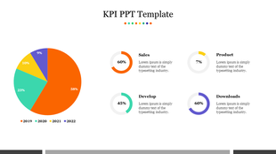
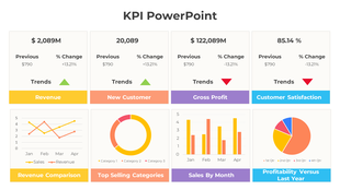
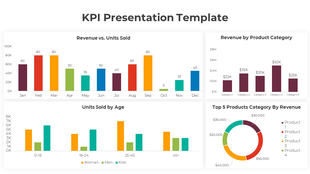
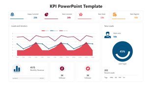
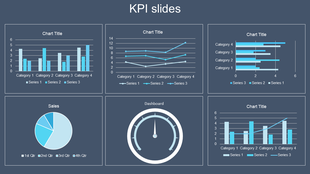
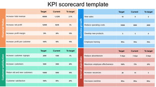
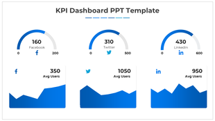
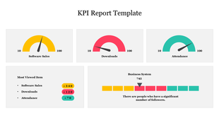
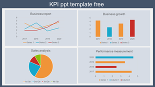
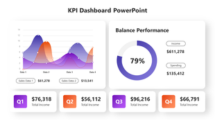
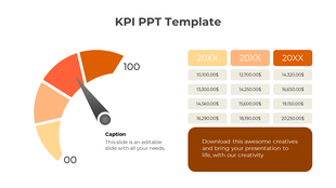
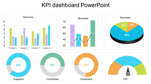
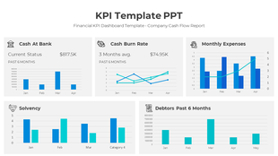
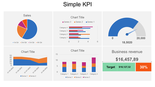
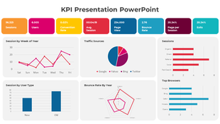
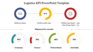
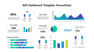
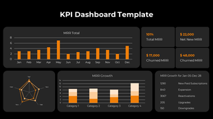
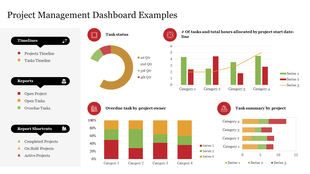
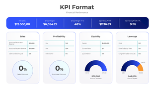
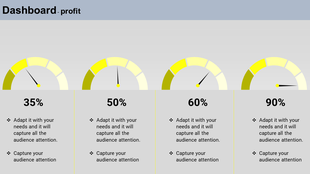

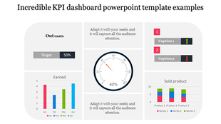
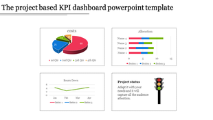
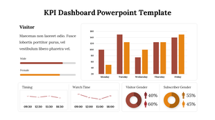
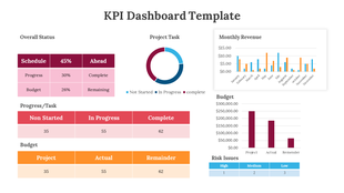
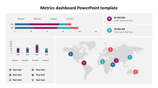
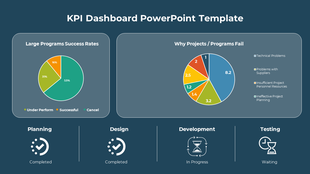
Showing48 of309


How to build a KPI slide that leadership actually reads
A strong KPI slide turns a spreadsheet full of numbers into a picture an audience can act on in seconds. Whether you're reporting sales pipeline, marketing ROAS, HR retention, or project status, the right layout shows what's on track, what's at risk, and what needs a decision.
This guide covers the reporting habits that separate a dashboard people trust from one they skim past — paired with ready-made, fully editable KPI PowerPoint templates for sales, marketing, finance, HR, and operations, each built around the metrics that function actually reports.
How to build a KPI slide in 6 steps
A repeatable process the design team uses to keep even dense performance data readable at a glance.
Pick 5–7 metrics, not 20
Choose only the numbers tied to a decision. If a metric doesn't drive an action, it doesn't belong on the slide.
Match chart type to data type
Line charts for trends, bar charts for comparisons, gauges for status, progress bars for completion. Don't force one chart to do every job.
Add targets, not just actuals
A number without a benchmark is just a number. Show the target next to the actual so the audience can judge performance instantly.
Color-code status consistently
Green for on-track, yellow for at-risk, red for off-track — the same three colors on every slide, every reporting cycle.
Match density to your audience
Board-level: 3–5 metrics, minimal text. Team-level reviews can go deeper with trendlines and period comparisons.
Pressure-test the 10-second read
Hand the slide to someone unfamiliar with the report. If they can't name what's at risk in 10 seconds, cut a metric.
Best practices from KPI reporting experts
Six rules that keep a performance report credible, not just pretty.
Tie every metric to a decision
If leadership can't act on a number, it's clutter. Cut it before the meeting, not during it.
One metric, one visual
Don't cram a KPI, its trend, and its breakdown into one crowded chart. Give each idea its own space.
Show period-over-period, not just a snapshot
A single data point invites questions. Last month vs. this month, or this quarter vs. last year, answers them upfront.
Explain declines honestly, not defensively
Show what changed, the context, and the plan forward. Leadership trusts transparency more than a hidden red number.
Update on a fixed cadence
Weekly for sales, monthly for finance, real-time for operations. A stale dashboard undermines trust in the data itself.
Separate the dashboard from the deep-dive
A dashboard is a status check; a report explains why. Don't force one slide to carry both jobs.
Which KPI template should you use?
Pick the template built around the metrics your team actually reports. Not every function tracks the same numbers, so this collection covers every major business function.
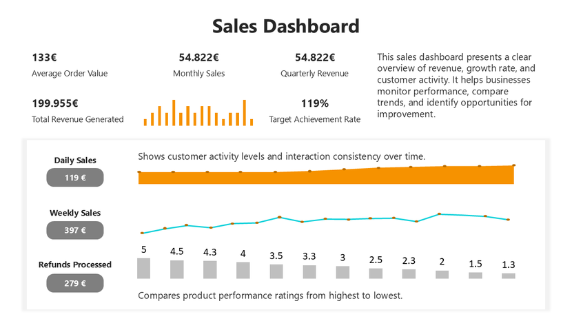
Design a KPI deck with AI
Describe your metrics, targets, and audience in plain language and the AI Presentation Maker drafts a structured, editable deck.
Try the AI Presentation MakerWho these KPI templates are for
Royalty-free for internal documents and client-facing or commercial presentations alike.
Sales leaders
Pipeline reviews and quarterly business reports.
Marketing managers
Campaign performance and channel attribution.
CFOs & finance analysts
Cash flow, EBITDA, and budget-vs-actual reviews.
HR leaders
Headcount, retention, and engagement tracking.
Project managers
Milestone, budget, and risk status reporting.
Operations leads
Efficiency, delivery, and cost-per-unit reviews.
Real-world use cases
A sales director presenting quota attainment by rep at a quarterly business review.
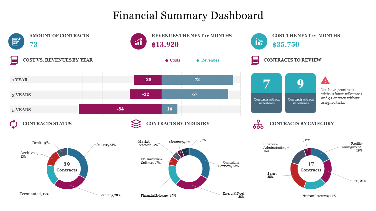
A CFO walking the board through cash flow and budget variance at a quarterly close.
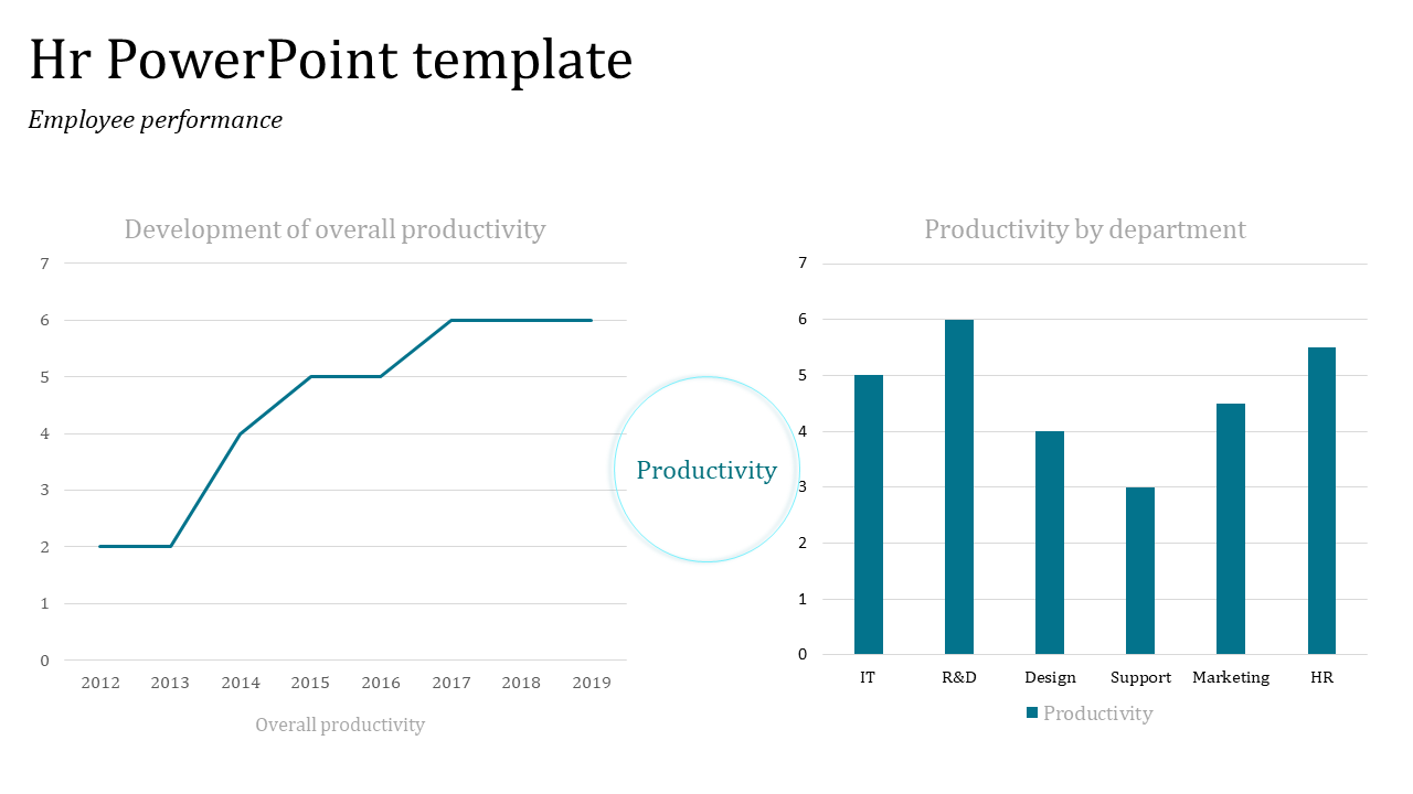
An HR lead reporting headcount and retention trends at a company town hall.
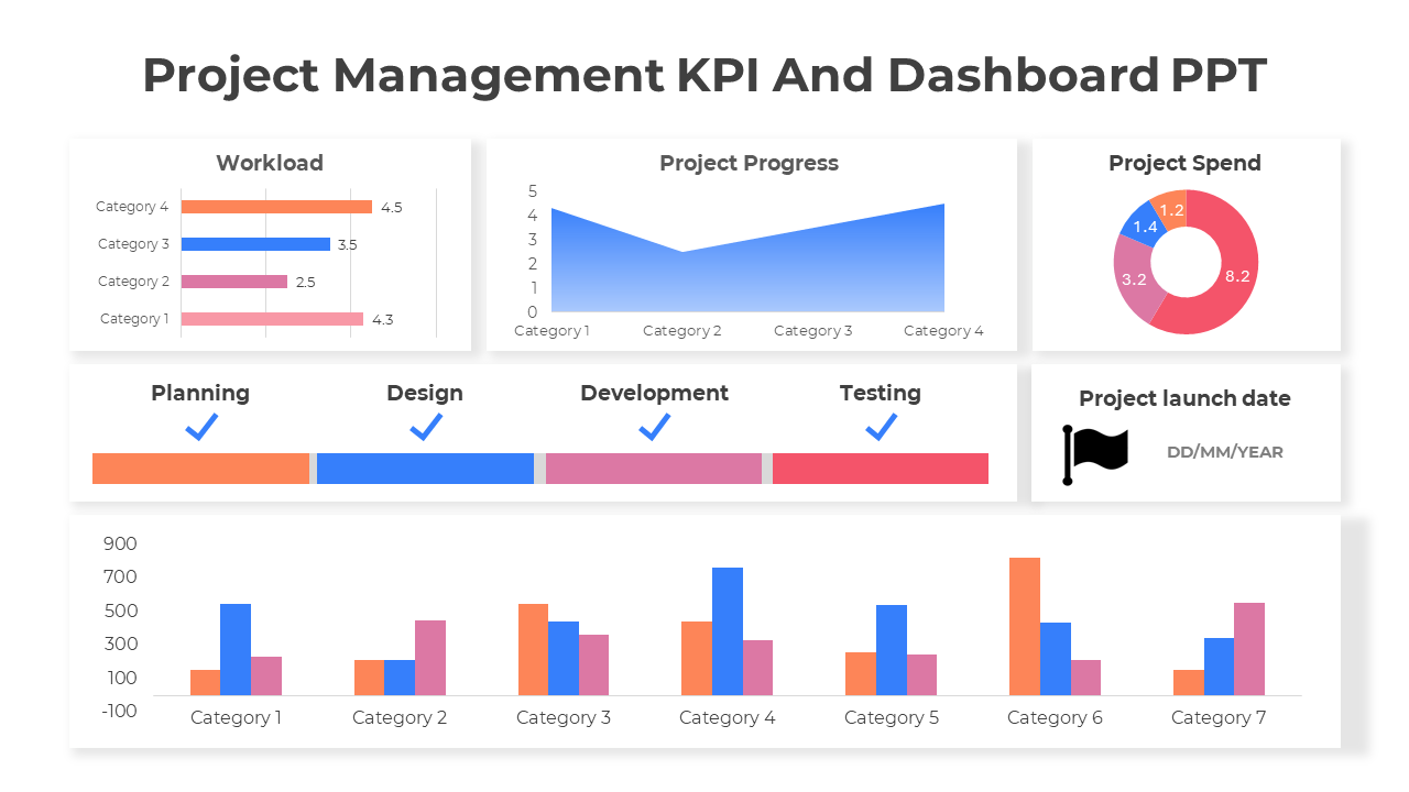
A project manager sending a one-slide traffic-light status update after a weekly standup.
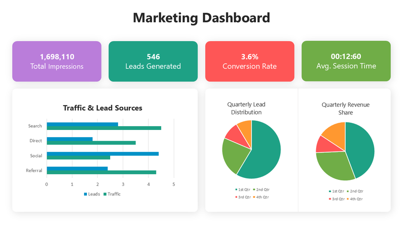
A marketing manager translating campaign traffic and ROAS into a monthly leadership update.
An operations manager reviewing on-time delivery and defect rates at a monthly plant review.
Formatting checklist for a clean, readable KPI slide
A technically accurate dashboard that's visually cluttered loses the room in ten seconds. These six habits keep it clear.
Key KPI terms, defined
A key performance indicator — a measurable value tracked against a goal.
A target or reference value used to judge whether a metric is on track.
A single-view visual summary of multiple KPIs, built for at-a-glance status checks.
The gap between actual performance and the planned or budgeted figure.
A structured report that pairs each KPI with its target and current status.
A comparison of the same metric across two time periods, such as month-over-month.
Why you can trust these templates
Ready to build your KPI report?
Browse 300+ editable KPI templates and have your slide ready today.
Explore Similar Collections
Frequently Asked Questions
What are KPI presentation templates?
Pre-designed slide layouts for reporting Key Performance Indicators, with ready-made charts, gauges, and data tables built in — just add your numbers. Available for PowerPoint, Google Slides, and Canva.
Are these KPI templates really free?
Yes — templates marked "Free" download instantly with no registration. Premium designs with more variations and chart styles are available through SlideEgg Pro. Free templates are royalty-free for personal and commercial use.
Can I use these KPI templates in PowerPoint, Google Slides, and Canva?
Yes. Every template works natively in PowerPoint and Google Slides, and opens directly in Canva for drag-and-drop editing. No design experience needed.
Can I edit these KPI templates without design skills?
Yes. Click any chart or text box and swap in your data — charts resize automatically. Colors, fonts, and layout are a few clicks away. Most edits take under 20 minutes.
What's the difference between a KPI dashboard, a KPI report, an OKR, and a Balanced Scorecard template?
A KPI dashboard is a single-slide overview for quick status checks; a KPI report adds trends across multiple slides. An OKR template ties metrics to objectives; a Balanced Scorecard covers four strategic perspectives at once. This collection covers dashboard and report styles.
How many KPIs should I include, and which ones matter most?
Track 5–10 metrics tied to your goals — not everything you can measure. If a number doesn't drive a decision, leave it off. One dashboard should tell one story your audience gets in 10 seconds.
How often should KPI dashboards be updated?
It depends on your cycle — weekly or daily for sales and operations, monthly for finance, weekly for projects. Regular updates keep your data trustworthy.
Should KPI dashboards include targets and benchmarks?
Yes. Color-code status — green on track, yellow at risk, red off track — against a clear target. Without a benchmark, numbers don't tell a story.
Can I generate a custom KPI presentation with AI instead of browsing templates?
Yes — use "Craft with AI" feature. Describe your focus and it drafts a custom deck, including supporting slides. Free accounts get limited monthly credits.
Does SlideEgg have KPI templates for a specific department, like sales or HR?
Yes — dedicated sections for Sales, Marketing, Finance, HR, Project Management, and Operations/Supply Chain, each built around that department's core metrics.