
Twenty-two KPIs in the dashboard. One slide before the meeting starts. That’s the actual problem — not “what is a KPI,” but which four or five of those twenty-two this specific room needs to see.
The short version: a KPI belongs on this slide if this audience needs it, it points at a real decision, it has something to compare against, and the data behind it is still current. Everything else is a different slide’s problem, not a missing one.
Most advice on this topic stops at “keep it simple.” This one gives you the actual filter, run against a real KPI list, for three different audiences looking at the same data.
Before You Touch PowerPoint: Name the Question
Every slide answers one question for one audience. Before picking a single KPI, write that question down in one sentence — “Are we on track to hit the Q3 revenue target?” not “How’s the business doing?”
A vague question produces a slide crowded with everything that might be relevant, because nothing has been ruled out yet. A specific question makes the shortlist obvious: whatever number directly answers it goes on the slide. Everything else is background.
If you’re starting from scratch and need a fuller list of candidate KPIs to run through the filter below, KPI Examples: The Most Common KPIs by Department is a useful starting inventory before you narrow anything down. And if “KPI” versus “metric” still needs sorting out first, KPI vs Metric vs OKR: What’s the Difference? covers that distinction.
The One-Slide Filter
Once you have a shortlist, run each candidate through four questions. A KPI only needs to fail one to get cut — from this slide specifically, not from your tracking overall.
| Filter | Ask this | Cut it if… |
|---|---|---|
| Audience fit | Does this room act on this number? | It’s someone else’s slide, not this one |
| Decision relevance | Would anyone do something differently if it moved? | It’s interesting but changes no decision here |
| Comparability | Is there a target or prior period next to it? | It’s a fact with nothing to judge it against |
| Timeliness | Is the data still true right now? | It answers last month’s question, not today’s |
A KPI that clears all four has earned its place. One that clears two or three is usually more useful as supporting detail in an appendix than as a headline number on the main slide.
How Many Survive the Filter
Run a typical KPI list through that table and you’ll usually land on three to five survivors — which is also, not coincidentally, about how many slides can hold before people stop reading the numbers and start scanning for color instead.
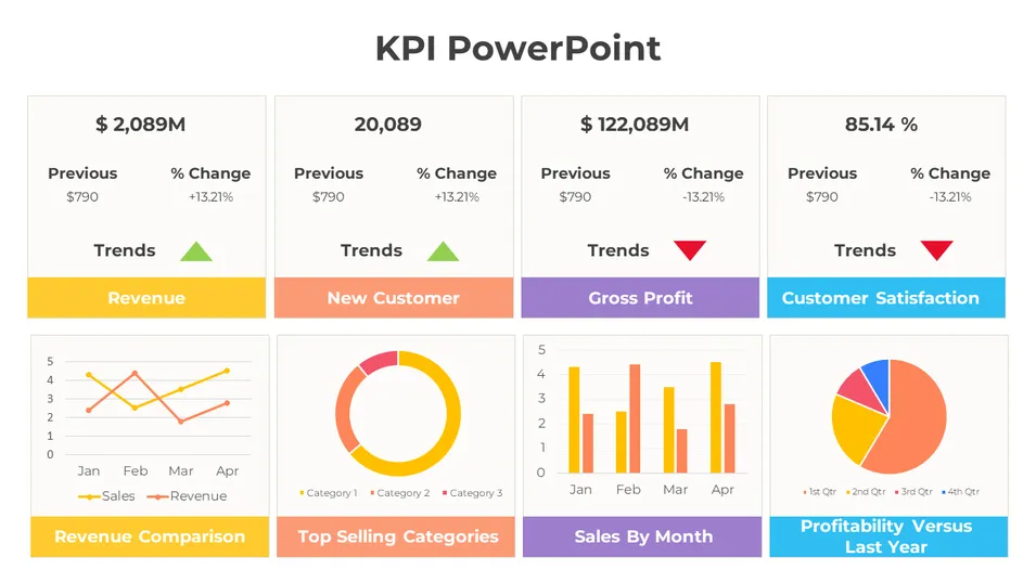
The template above shows what that looks like in practice. The top row holds four KPI cards — Revenue, New Customers, Gross Profit, Customer Satisfaction — and each one answers a question at a glance: current value, direction, comparison to the prior period. The charts underneath aren’t four more KPIs competing for attention; they’re supporting detail for the numbers that already made the cut. Headline KPIs on top, everything else pushed underneath — that split matters more than the exact count.
Same Data, Three Rooms
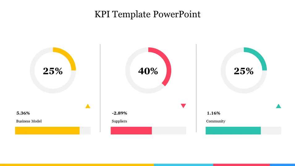
Here’s the filter applied to one real data pool — a support team’s numbers — for three different audiences. Same six candidate metrics each time: ticket volume, first-response time, resolution time, backlog size, CSAT, and cost per ticket.
| Audience | What they’re actually deciding | KPIs that make the cut | What gets cut, and why |
|---|---|---|---|
| Executive review | Are we on track for the retention goal, and is anything about to become a risk? | CSAT, resolution time vs. quarterly target, backlog vs. SLA threshold | Ticket volume and cost per ticket inform the story but don’t change a leadership decision on their own |
| Ops / team review | What should the team prioritize this week? | First-response time, backlog by agent | CSAT stays off — it’s too lagging to inform a weekly call |
| Cross-functional stakeholder update | Is this initiative broadly on track? | One combined status read (backlog trend vs. SLA) | Everything else is more detail than the question requires; held in reserve for follow-up questions |
Same underlying numbers, three different slides — because the question and the audience changed, not the data.
Cut Doesn’t Mean Deleted
A metric that fails the filter for this slide isn’t wrong to track — it just isn’t ready to be a headline number here. Every KPI is a metric, but not every metric is a KPI, and a metric with no target or decision tied to it hasn’t earned that promotion yet.
The practical move: metrics that fail the audience or decision filter go to an appendix slide, a shared dashboard, or a written report — somewhere they stay available without crowding out what this specific audience needs. Metrics that fail the comparability filter need a baseline before they’re promoted anywhere, not a spot on the slide anyway.
Self-Check: Is Your Slide Still Too Crowded?
Before you call the slide finished, run it against these five questions. Answering yes to two or more is a sign something still needs to be cut.
- Could you reorder the KPIs on this slide without changing what it means?
If yes, nothing on it is clearly the headline. - Is there a number with no target or baseline sitting next to it?
A number with nothing to compare against tells the room it matters without telling them if it’s good. - Did this audience get the same KPIs as a different audience’s slide, just relabeled?
The exec set and the ops set should rarely match. - Are two numbers on different timeframes sitting side by side with no label?
A monthly figure next to a real-time counter reads as inconsistent unless the cadence is marked. - If someone in the room challenged one number, could you explain in one sentence why it’s on this slide?
If the honest answer is “it was already in the dashboard,” it’s not ready yet.
A slide with nine KPIs doesn’t look more rigorous than one with four — it looks like nobody made the cut. The filtering is the work; showing everything is the absence of it.
From Filtered List to Finished Slide
Once you’ve filtered a list down to what belongs on this specific slide, resist the pull to add “just one more” during layout. The template below is a real example of what that pull looks like once it wins — a project-status dashboard trying to answer several different questions (timeline progress, budget status, team workload) inside one slide.
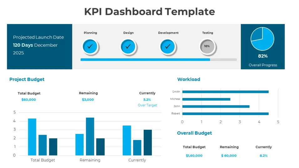
None of the individual numbers here are wrong, and an ongoing monitoring dashboard is a different use case than a single-audience presentation slide — but as a slide built for one room with one question, it’s a useful before-picture. Compare it back to the four-card layout earlier in this article: same idea of grouping related numbers, but a narrower headline set with everything else pushed to supporting detail.
If your filtered list naturally groups into headline numbers plus supporting charts, the KPI-card layout shown earlier saves you from building that structure from scratch.
Choosing the KPIs is the harder half of this job. How to Present KPIs So They Tell a Story picks up right where this article stops — once the numbers are chosen, turning them into something the room actually follows.
FAQs
How many KPIs should I put on one slide?
Three to five is the practical range for most audiences. Fewer than that and a slide can feel thin; more than that and viewers stop reading individual numbers and start scanning for color instead.
What’s the difference between a KPI and a metric when I’m deciding what goes on a slide?
Every KPI is a metric, but not every metric is a KPI — a KPI is a metric your organization has decided matters enough to judge performance against a goal. When you’re filtering candidates for a slide, that distinction is the first cut: a metric with no target or decision tied to it isn’t ready to be a headline number yet.
Should the same KPIs appear on every slide in a deck?
No. The right KPIs depend on the audience and the question that specific slide needs to answer. A number that belongs on an executive summary slide often isn’t the number an operational team needs for a weekly review, even when both come from the same underlying data.
What do I do with KPIs that don’t make the cut for this slide?
Move them, don’t delete them. A metric that fails the audience or decision filter for one slide can still belong in an appendix, a shared dashboard, or a written report where it stays available without crowding out the numbers this audience actually needs.
How do I choose KPIs specifically for an executive audience?
Filter for strategic risk and progress against stated commitments. A small set works best: the headline number tied to the current goal, a leading indicator that signals whether that number will hold, and one risk metric that would change a resourcing or timeline decision if it moved.
Is there a difference between how many KPIs a business tracks overall and how many belong on one slide?
Yes — a business can reasonably track dozens of KPIs across different teams and systems. The three-to-five range is specifically about what one slide, for one audience, at one moment, can hold without losing the room.
The Bottom Line
Choosing the right KPIs for a slide isn’t a chart-design problem — it’s a filtering problem, solved before you open your presentation tool. Name the question the slide needs to answer, run your candidates through the four-part filter, and expect the same underlying data to produce a different slide for a different audience. What doesn’t make the cut isn’t wasted — it just belongs somewhere else.
Once you know which numbers earned their place, laying them out cleanly is the easier half of the job.