300+ Free KPI Presentation Templates for PPT, Google Slides & Canva
Browse 300+ free KPI presentation templates for PowerPoint, Google Slides, and Canva. Choose from sales KPI dashboards, marketing scorecards, HR performance slides, project tracking decks, and financial reporting layouts. Every template is 100% editable, royalty-free, and ready to download instantly. Free slides. No paywall. Just great slides.
Editor's Choice (1 of5)


KPI Presentation Templates That Help Your Audience Understand Your Numbers
What Types of KPI Templates Are in This Collection?
KPI Presentation Templates for Every Team and Use Case
KPI reporting looks different depending on who is presenting, who is in the room, and what decisions need to be made. Browse the use-case categories below to find the template type that matches your team and reporting context.
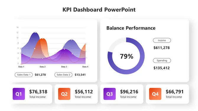
Sales KPI Dashboard Templates
Sales KPI dashboard templates are designed for revenue leaders who need to clearly demonstrate performance during pipeline reviews and quarterly business reviews (QBRs). Each template is pre-structured around the metrics that matter most to sales teams: monthly recurring revenue, conversion rate, pipeline value, win/loss rate, and quota attainment by rep. Choose from single-slide summary views for quick standups or multi-slide deck structures that walk stakeholders through funnel performance, regional breakdowns, and year-over-year growth in sequence. Fully editable in PowerPoint, Google Slides, and Canva.
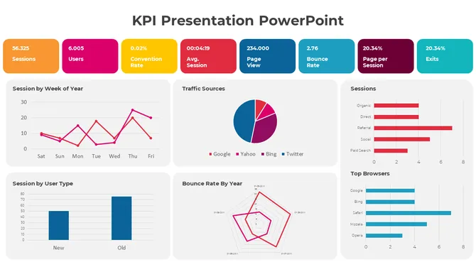
Marketing KPI Report Slides
Marketing KPI report templates are designed for marketing managers who need to translate campaign data into a story that leadership can act on. Each template is structured around the metrics that appear in weekly performance updates and monthly campaign reviews: website traffic, qualified leads, customer acquisition cost (CAC), return on ad spend (ROAS), email open and click rates, and channel attribution. Choose from single-channel layouts for focused campaign reports or multi-channel scorecards that present the full marketing picture in one slide. Available in PowerPoint, Google Slides, and Canva.
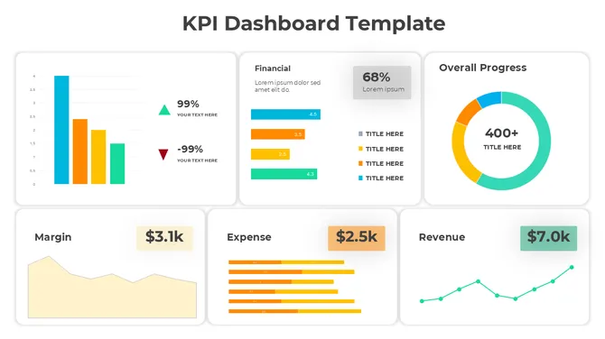
Financial KPI Presentation Templates
Financial KPI templates are built for CFOs, finance analysts, and controllers who need to present complex financial data without overwhelming their audience. Slide layouts cover cash flow summaries, EBITDA performance, budget variance analysis, profit and loss (P&L) overviews, and revenue forecasting — each formatted for board presentations, investor updates, and internal finance reviews. Charts follow clean data visualization principles: one metric per visual, clear period-over-period comparisons, and minimal clutter so the numbers speak for themselves. Editable in PowerPoint and Google Slides.
HR Performance KPI Templates
HR performance templates give people teams a structured way to present workforce metrics at leadership reviews, all-hands meetings, and company town halls. Slide layouts are built around the metrics HR leaders report most: headcount by department, employee retention rate, time-to-hire, engagement survey scores, and training completion rates. Whether you are presenting to a management team, a board of directors, or the full company, these templates make workforce data accessible, easy to discuss, and simple to update each reporting cycle. Editable in PowerPoint, Google Slides, and Canva.
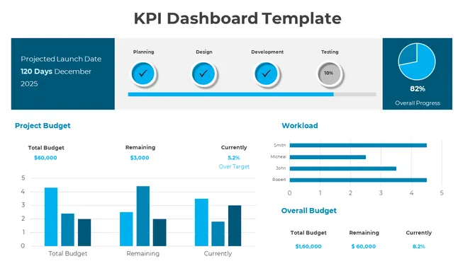
Project Management KPI Slides
Project management KPI templates are built for project managers who need to keep stakeholders aligned without long status meetings. Each template covers the core progress indicators: milestone completion rate, timeline adherence, resource utilization, budget tracking, and risk indicators. Layouts include traffic-light status slides for quick reads and detailed timeline views for in-depth project reviews. Use them for weekly standups, steering committee updates, or executive project summaries where status needs to be communicated clearly and quickly. Available in PowerPoint and Google Slides.
Operations and Supply Chain KPI Dashboards
Operations and supply chain KPI dashboard templates are used by operations leads, logistics managers, and supply chain teams who need to report performance at weekly and monthly operational reviews. Slide layouts cover efficiency ratios, on-time delivery performance, defect and quality rates, and cost-per-unit tracking. Each template is pre-formatted for the operational metrics that matter most to plant managers and COOs — scannable, structured, and ready for quick decision-making without requiring a design background to customize. Editable in PowerPoint and Google Slides.
What Makes These Templates Stand Out?
Who Uses KPI Presentation Templates?
How to Choose the Right KPI Template
Free Download — No Subscription Required
Related Collections
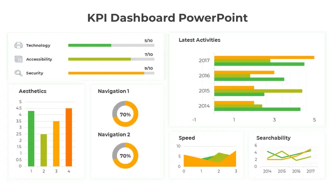
Dashboard PowerPoint Templates
500+ Templates
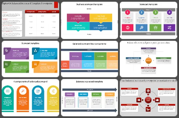
Balanced Scorecard PowerPoint Templates
40+ Templates
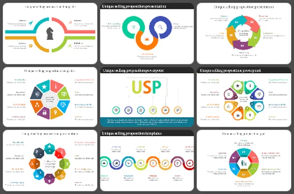
USP PowerPoint Templates
100+ Templates
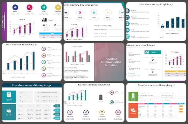
Executive Summary PowerPoint Templates
100+ Templates

Executive PowerPoint Templates
50+ Templates
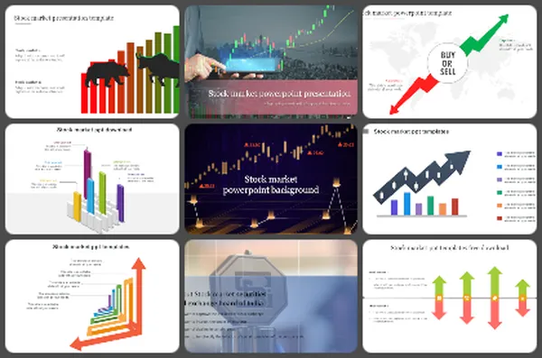
Stock Market PowerPoint Templates
50+ Templates
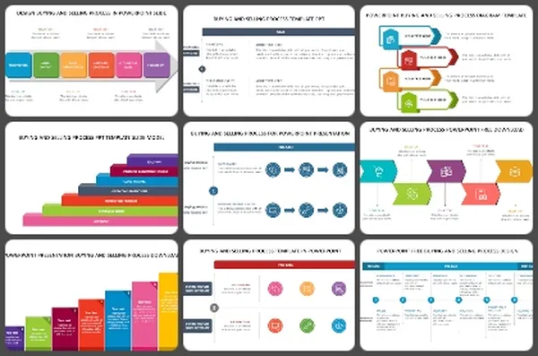
Buying and Selling Process PowerPoint Templates
20+ Templates
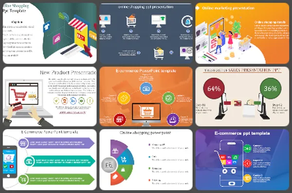
E-commerce PowerPoint Templates
200+ Templates
Frequently Asked Questions
What are KPI presentation templates?
KPI presentation templates are pre-designed slide layouts built to display Key Performance Indicators — business metrics that measure progress toward goals. They include pre-formatted charts, progress bars, gauges, and data tables so you can plug in your numbers and present professional performance reports without starting from scratch. SlideEgg's KPI templates are available for PowerPoint, Google Slides, and Canva.
Can I use these KPI templates in Canva?
Yes. SlideEgg's KPI templates are compatible with Canva, PowerPoint, and Google Slides. You can download any template and open it directly in Canva to customize colors, fonts, data, and layout. No design experience is needed — every element is drag-and-drop editable.
Are these KPI templates really free?
Many templates in this collection are available for free download with no registration required. Templates marked with a "Free" badge can be downloaded instantly. Additional premium designs are available through SlideEgg Pro, which offers more slide variations, alternate color themes, and advanced chart frameworks. Free templates are royalty-free for personal and commercial use.
What's the difference between a KPI dashboard and a KPI report template?
A KPI dashboard is a single-slide or multi-metric visual overview — designed for at-a-glance status checks in meetings or on digital screens. A KPI report template is a multi-slide document that provides context, trends, period-over-period comparisons, and narrative explanation. SlideEgg's collection includes both styles. Dashboard templates are best for live presentations; report templates work better for email attachments and PDF distribution.
Can I edit these KPI templates without design skills?
Absolutely. Every template in this collection is fully editable without any design experience. In PowerPoint and Google Slides, you click any chart or text element and replace it with your own data. In Canva, everything is drag-and-drop. Charts automatically resize when you update the numbers. Colors, fonts, and layout can all be changed in a few clicks. Most users complete their customization in under 20 minutes.
What metrics should managers track and present to leadership?
Track what matters to your business: revenue, profit margins, customer satisfaction, quality metrics, project timelines, and cost control. Choose 5-7 key metrics, not 20. Leadership cares about trends and status, not every number. Show what's improving and what needs attention.
How do I choose which KPI to visualize in a dashboard?
Pick metrics tied to your goals. Sales managers: revenue, conversion rates, pipeline. Operations: efficiency, timelines, cost. Finance: cash flow, budgets, variance. HR: hiring, retention, engagement. Only include metrics you act on. If a number doesn't drive decisions, it doesn't belong on the dashboard.
What's the best way to visualize different types of data?
Use bar charts for comparing amounts. Line graphs for trends over time. Pie charts for proportions. Gauges for status (on track/at risk). Progress bars for completion. Tables for detailed numbers. Match the visual to what you're trying to show, not what looks pretty.
How often should KPI dashboards be updated?
Update based on your business cycle. Sales: weekly or daily. Finance: monthly. Projects: weekly. Operations: daily or real-time. The frequency depends on how fast things change and how often decisions get made. Regular updates show your data is current and trustworthy.
How do I explain declining KPIs to leadership without looking bad?
Be honest about what changed. Show context — market conditions, staffing issues, timing. Present what you're doing to improve. Leadership respects transparency more than hiding bad numbers. Focus on the plan forward, not blame backward.
Should KPI dashboards include targets and benchmarks?
Yes. Show where you are now and where you need to be. Use color coding: green (on track), yellow (at risk), red (off track). Benchmarks give context. Without targets, numbers are just numbers. With targets, they tell a story of progress or concern.
How many KPIs should I put on one dashboard?
5-10 metrics maximum. More than that overwhelms people. One dashboard = one story. If you need to show 20 metrics, create multiple dashboards by department or goal. Your audience should understand the dashboard in 10 seconds, not spend 5 minutes reading it.