Creative Peaks And Troughs PPT Presentation Template

 Canva
Canva
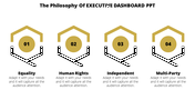
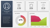
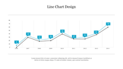
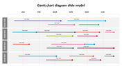
Show The Progress Of Our Desired Topic
Get your hands on this graph diagram PPT template for your business and formal presentation slides for providing sufficient information related to your topic. You can explain the progress of your project with the captions and contents presented with this template. You can also find that the nodes presented on the graph improve the template's standard. So, start using this graph diagram inserted template in your presentation as soon as possible.
Features Of This Template:
- 100% customizable slides and easy to download
- Slides are available in different nodes & colors.
- The slides contained 16:9 and 4:3 formats.
- Easy to change the slide colors quickly.
- Well-crafted template with instant download facility.
- Crisp and elegant font style.
- The best template with attractive nodes.


You May Also Like These PowerPoint Templates
Add to Wishlist
Download
Edit

Add to Wishlist
Download
Edit

Add to Wishlist
Download
Edit

Add to Wishlist
Download
Edit

Add to Wishlist
Download
Edit

Add to Wishlist
Download
Edit

Add to Wishlist
Download
Edit

Add to Wishlist
Download
Edit

Add to Wishlist
Download
Edit

Add to Wishlist
Download
Edit


Add to Wishlist
Download
Edit

Add to Wishlist
Download
Edit

Add to Wishlist
Download
Edit


Add to Wishlist
Download
Edit


Add to Wishlist
Download
Edit
