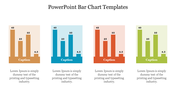
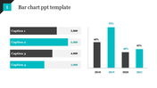
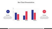
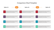
Free - Top Notch Comparison Bar Graph PowerPoint Presentation

Free
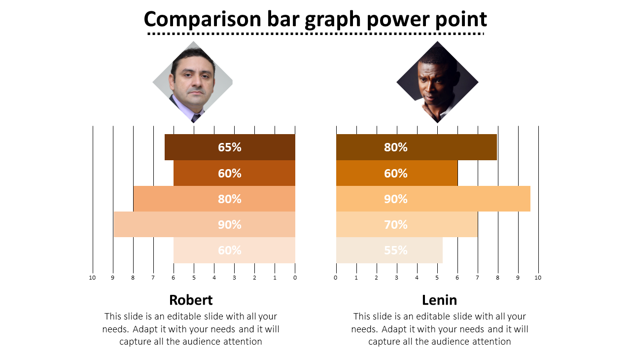
Top Notch Comparison Bar Graph PowerPoint Presentation
P.ID : 5144
    1.7K+ views
    378 Downloads
    Designer
    Kavitha
    Get Custom Slides by Experts
    Enhance Your Presentations with Add-ins
    Google Slides Add-in
    Access templates directly in Google Slides
    Microsoft PowerPoint Add-in
    Access templates directly in PowerPoint
    GPT Add-on
    AI-powered presentation assistance

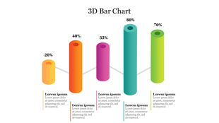
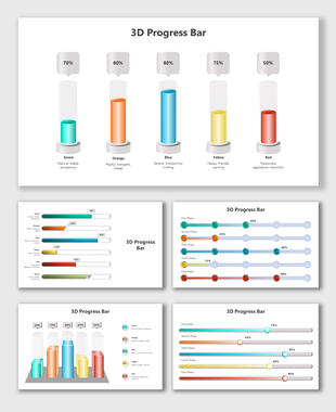
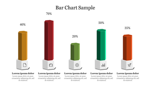
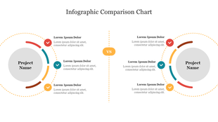
    Comparison Bar Graph Templates and Google Slides

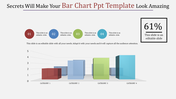
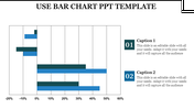
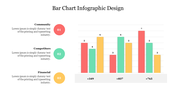
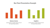
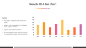
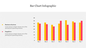
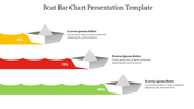
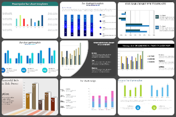
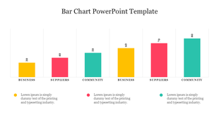
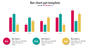
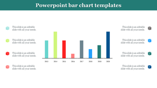
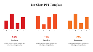
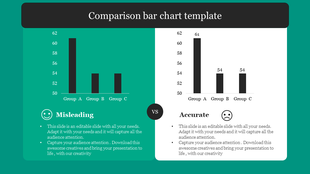
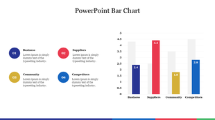
    Are you ready to visually compare data and present it in a clear and engaging way? Look no further than our Comparison Bar Graph Templates! But what exactly is a comparison bar graph? It's a powerful tool that allows you to compare and contrast different sets of data using horizontal bars. Our templates provide a user-friendly way to create visually appealing bar graphs that make data interpretation a breeze. Whether you're comparing sales figures, survey results, or any other data sets, our templates offer customizable designs and eye-catching visuals that captivate your audience. So, unleash your inner data analyst and create compelling presentations with our Comparison Bar Graph Templates. Start exploring today and showcase your data with style!

    Features of the template 

    • 100% customizable slides and easy to download. 
    • Slides are available in different nodes & colors. 
    • The slide contains 16:9 and 4:3 formats. 
    • Easy to change the colors of the slides quickly. 
    • Well-crafted template with an instant download facility. 
    • Highly compatible with PowerPoint, Google Slides, and Canva Presentation.
    Advertisement

    You May Also Like These PowerPoint Templates
    Add to Wishlist Download Edit
    Force field analysis slide with two columns, in red and green, with three numbered captions in blue, yellow, and purple.
    Free
    Add to Wishlist Download Edit
    Orange background slide featuring education themed tools and two circular percentage charts for comparison.
    Free
    Add to Wishlist Download Edit
    Cause and effect diagram with three orange circles, connected by a white loop, and labeled sections for text.
    Free
    Add to Wishlist Download Edit
    Comparison slide with male icon in Circle A and female icon in Circle B, flanked by steps 01 and 02 on both sides.
    Add to Wishlist Download Edit
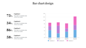
    Bar chart slide design with stacked bars showing three categories per item and percentage captions on the left.
    Add to Wishlist Download Edit
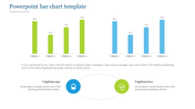
    PowerPoint template with two bar charts, one green, and one blue, representing four categories.
    Free
    Add to Wishlist Download Edit
    Chart with colorful bars representing yearly data from 2013 to 2020, paired with eight colorful cube icons on the sides.