Get PPT Chart Templates Slide Design In Blue Color
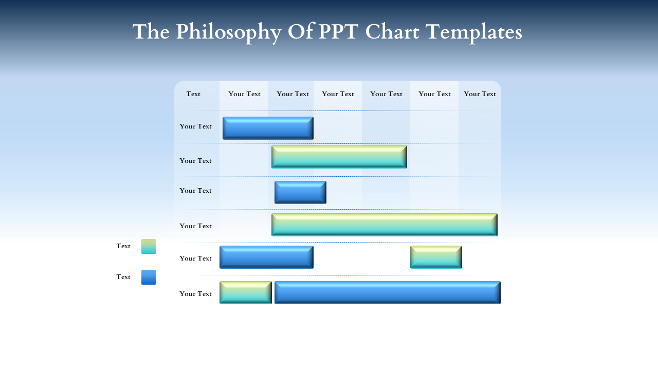
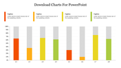
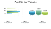
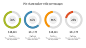
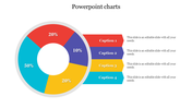
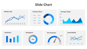
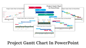
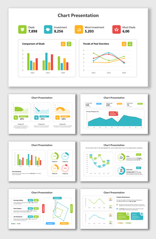
Chart Presentation Slide
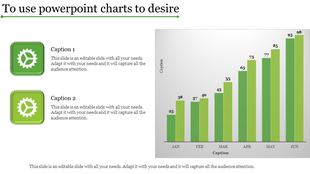
Presenting Our Modern Professional Performance Chart Slide: A Way to Sharpen Your Professional Edge. A lifesaver for data-driven decision-makers is a PowerPoint presentation. Imagine taking your audience on an engaging journey through your presentation and drawing them in with a smooth-flowing story. Let's now examine the landmark horizontal bar chart slide.
the Horizontal Bar Chart, carefully created to elevate expertise. The bars give life to your data by carefully differentiating each color, resulting in an arrangement of information that is complementary. The x- and y-axes prominently display custom labels and give your viewers a clear path forward. This slide serves as your professional board, where information is transformed into an engaging narrative of progress and discovery.
You may wonder, "Why this slide?" This horizontal bar chart is a useful strategic tool in addition to being visually appealing. It's transformative for companies, schools, and presenters looking to make data-driven decisions because it's perfect for displaying trends, comparisons, and advancement over time. With the clarity this chart offers, you can engage your audience, empower your team, and impress stakeholders
.
Are you prepared to shift the style in which you display? Utilize our Chart Presentation's influence by downloading it right now. Improve your performance, make a bigger difference, and make an impression that lasts!
Features of the Templates
- Completely adaptable.
- The slide show is in 4:3, 16:9, zip format.
- There is very strong connectivity with Google Slides and PowerPoint.
- It is simple and quick to alter the slide's color.
- An efficient template that can be easily accessed immediately.
- Easy to Download
You May Also Like These PowerPoint Templates
Showing20 of69,218 templates