Free - Best Editable Traction PowerPoint Download Templates

Free
PowerPoint slide showing a line chart with data for 2018, 2019, 2020, and 2021, displaying percentages for each year.
P.ID : 49866
    372 views
    127 Downloads
    Get Custom Slides by Experts
    Instantly Access Templates in PowerPoint

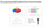
    Fantastic Traction Slide For Presentation

    Do you want to track your business activities well? Here Our SlideEgg has awesome traction templates. Using this template, we can do a very good PowerPoint presentation. Tracking or mapping all the business activities, sales, and marketing is possible with this traction slide. We can represent the data with a colorful line chart and have a vast text space to describe the tracking points of your activities more clearly. You can show the percentages with this slide which helps to do a fantastic presentation. Use this slide to track your process or daily business activities brilliantly. You can save more time and edit as you want. Grab Now!!

    Features of the template

    • 100% customizable slides and easy to download.
    • Slides are available in different nodes & colors.
    • The slide contains 16:9 and 4:3 formats.
    • Easy to change the colors of the slide quickly.
    • Well-crafted template with instant download facility.
    • Quick Tracking of business activities is possible and easy.
    Advertisement

    You May Also Like These PowerPoint Templates

    Free
    Add to Wishlist
    Download
    AI Customize
    Vertical bars in purple, blue, green, yellow, orange, and pink showing percentages, next to a businesswoman.
    Free
    Add to Wishlist
    Download
    AI Customize
    Project dashboard slide for electricity data with bar graphs showing units and amounts for different categories and months.
    Add to Wishlist
    Download
    AI Customize
    Horizontal layout featuring five purple icons connected by a bar, with detailed text columns below each step.
    Add to Wishlist
    Download
    AI Customize
    KPI dashboard template with progress bars, pie chart, bar graphs, and workload metrics in a clean blue theme.
    Add to Wishlist
    Download
    AI Customize
    Dashboard slide showing business performance, including technology, accessibility, and security scores with activity graphs.
    Free
    Add to Wishlist
    Download
    AI Customize
    A professional comparison slide featuring horizontal bar graphs displaying various percentages alongside captions with icons.
    Free
    Add to Wishlist
    Download
    AI Customize
    Dashboard with four sections showing charts, icons, and metrics in purple, red, green, and teal.
    Free
    Add to Wishlist
    Download
    AI Customize
    KPI dashboard with percentage stats, bar charts, and flow diagrams in red, blue, and orange representing data trends.
    Add to Wishlist
    Download
    AI Customize
    KPI dashboard slide displaying supplier metrics with colorful pie charts, bar graphs, and a process flow with percentages.
    Free
    Add to Wishlist
    Download
    AI Customize
     KPI dashboard featuring colorful graphs, sales metrics, real estate charts, and visitor statistics, in a grid layout.
    Free
    Add to Wishlist
    Download
    AI Customize
    Slide with multiple dashboard elements including bar charts, line charts, pie charts, and progress meters in various colors.
    Free
    Add to Wishlist
    Download
    AI Customize
    KPI PowerPoint slide with line, bar, pie, and horizontal bar charts, each showing different business data metrics.
    Free
    Add to Wishlist
    Download
    AI Customize
    Business growth chart with a bar graph for years 2018 to 2022, captions on the left, and a text block at the bottom.
    Free
    Add to Wishlist
    Download
    AI Customize
    Free Dashboard Templates For PowerPoint & Google Slides
    Add to Wishlist
    Download
    AI Customize
    Brand perception map illustrating consumer views on six brand tastes and natural qualities, with color coded labels.
    Add to Wishlist
    Download
    AI Customize
    Dashboard slide displaying data through colorful bar charts, a pie chart, and a project timeline with phase completions.
    Add to Wishlist
    Download
    AI Customize
    Comparison chart slide with two bar graphs comparing four categories with values ranging from 20 to 80 with percentages.
    Add to Wishlist
    Download
    AI Customize
    Three-section KWL chart with bold headings in orange, pink, and purple columns, each containing placeholder text.