Editable Chart PowerPoint Templates And Google Slides Themes

Bar chart presentation with sections for payment, transaction, and product across five categories.
P.ID : 32642
    207 views
    25 Downloads
    Get Custom Slides by Experts
    Instantly Access Templates in PowerPoint

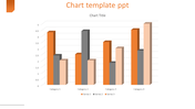
    Graph Presentation Template


    Present your data effectively with our chart PowerPoint presentation template.

    Benefits of using our Data Visualization PowerPoint Template


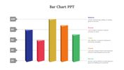
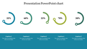
    i) Our template features a multi-colored theme with three sections
    1. Payment: Represented by an icon this section covers methods and processes for settling financial obligations.
    2. Transaction: Illustrated with an icon it focuses on the exchange of goods, services, or funds.
    3. Product: Depicted with an icon, this section deals with tangible or intangible items offered for sale.

    Below these sections, you'll find a vibrant bar chart with five categories (Category 1 to Category 5). Each category features three differently colored bars, representing data for Payment, Transaction, and Product.

    ii) The purpose of this slide is to visually compare data across three business aspects: Payment methods, Transactions made, and Products offered. It helps in analyzing performance in these areas over different categories.

    iii) This template will be great for business professionals, students, and educators.

    Download our chart PowerPoint presentation template now and begin to present your data in a highly effective manner.

    Features of the template:


    • Slides are available in 4:3 & 16:9
    • Well-crafted template with instant download.
    • Get slides that are 100% customizable and easy to download
    Advertisement

    You May Also Like These PowerPoint Templates

    Add to Wishlist
    Download
    AI Customize
    Chart presentation template with a bar graph showing the progress of four projects with percentages.
    Free
    Add to Wishlist
    Download
    AI Customize
    Line chart template with three data series in blue, teal, black, and text sections.
    Add to Wishlist
    Download
    AI Customize
    Layered area chart with red and green segments, numeric axes, and two icons below with captions on a white background.
    Add to Wishlist
    Download
    AI Customize
    Gradient-styled horizontal bar chart with blue and green bars, labeled text areas, and a light blue background.
    Free
    Add to Wishlist
    Download
    AI Customize
    Bubble chart on the right with varying circle sizes and a dark blue section on the left featuring three headings and text.
    Add to Wishlist
    Download
    AI Customize
    Chart presentation template displaying monthly data for Visitors, New Customers, and Leads with bar and line charts.
    Add to Wishlist
    Download
    AI Customize
    Chart presentation template showing statistics for total clients, projects, and earnings with bar graphs.
    Add to Wishlist
    Download
    AI Customize
    Versatile PowerPoint Chart Templates for Data Insights
    Add to Wishlist
    Download
    AI Customize
    Horizontal bar chart with three color-coded series, labeled values, and a left side legend with numbered captions.
    Add to Wishlist
    Download
    AI Customize
    Slide deck with multiple circular progress bars in various colors, showing percentages and captions below.
    Add to Wishlist
    Download
    AI Customize
    Slide with a horizontal bar chart on the left and 3D cylindrical percentage charts in blue, green, and teal, on the right.
    Add to Wishlist
    Download
    AI Customize
    Horizontal bar chart with four labeld sections A to D, in purple, pink, teal, and blue, and captions below.
    Add to Wishlist
    Download
    AI Customize
    Business chart slide with a red and black line graph on the left, a red bar chart on the right, and two description sections.
    Add to Wishlist
    Download
    AI Customize
    Best Waterfall In PowerPoint Presentation Slide Designs
    Free
    Add to Wishlist
    Download
    AI Customize
    Layered area chart with Series 1 in yellow, Series 2 in orange, and Series 3 in black, showing data trends over time.
    Add to Wishlist
    Download
    AI Customize
    Clustered bar chart comparing data across quarters with horizontal bars in various colors.