Bar Chart PPT Template Slide Design-Five Node
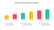
Subtle Bar Chart PPT Template
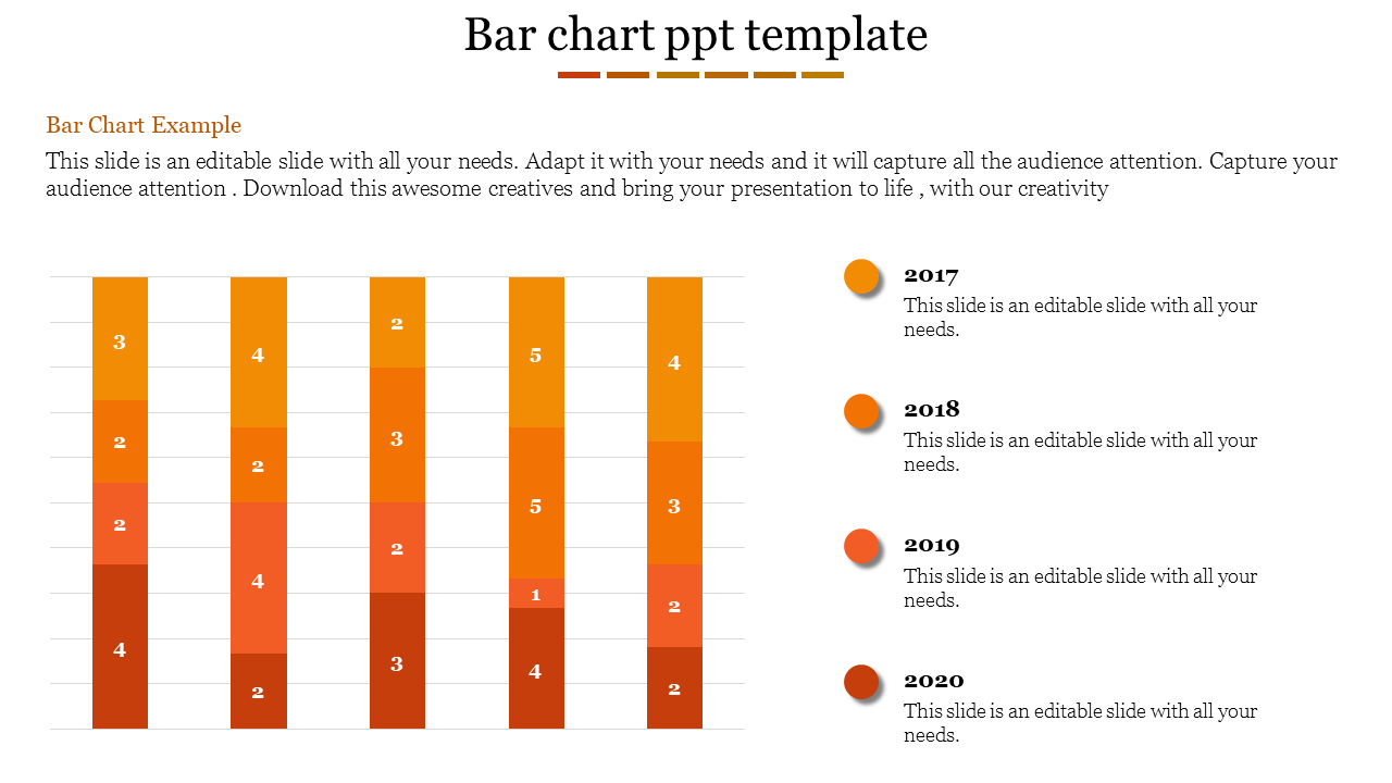
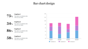
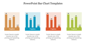
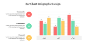
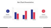
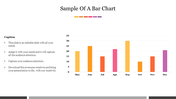
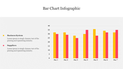
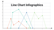
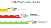
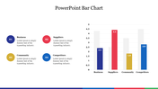
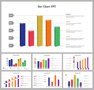
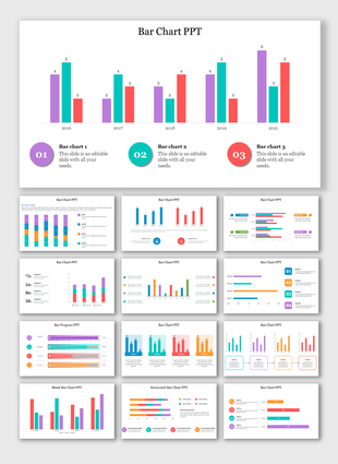
Bar charts are crucial for illustrating data trends and comparisons effectively. Our Bar Chart PPT Template and Google Slides Themes are designed to elevate your data presentations. This template features five orange-themed bars, each divided into four sections, with an orange dot and caption text area alongside customizable years. This template is ideal for business analysts, educators, and corporate presenters who need to communicate data insights.
Use it for quarterly reports, academic presentations, and market analysis to make your data visually engaging and easily understandable. Each bar can be tailored to represent different data sets, while the customizable years allow for precise temporal analysis. The professional design ensures that your audience grasps the key points effortlessly. Maximize your presentation impact with our Bar Chart PPT Template and Google Slides Themes, designed to make your data speak volumes.
Features of this template
- 100 % customizable slides are easy to download.
- Slides are available in different nodes and colors.
- The slide was contained in 16:9 and 4:3 formats.
- It is easy to change the slide colors quickly.
- Well-crafted template with an instant download facility.
You May Also Like These PowerPoint Templates

Showing20 of69,218 templates