Best Waffle chart powerpoint presentation

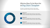
Excellent Waffle Chart Templates For Presentation
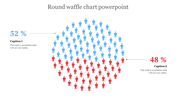
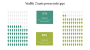
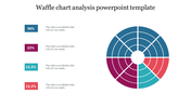
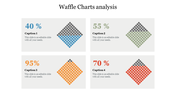
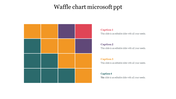
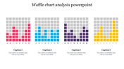
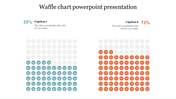
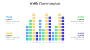
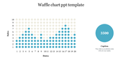
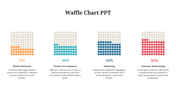
A waffle chart is a square display of 100 smaller squares arranged in a 10-by-10 grid, where each box denotes 1%. Similarly, the squares are colored to signify the data. The box's color shows the percentage of the target achieved. You can use our numerous waffle charts to display a comparison between different charts and data. It is a pre-designed slide to visualize the data in a creative way. Hence, these diagrams play a vital role in portraying the percentage of completion based on your work. Get this alluring slide to enhance your style of presenting your data and captivate the attention of the people. They are super cool to customize.
Features of the template
- 100% customizable slides and easy to download.
- Slides are available in different nodes & colors.
- The slide contained 16:9 and 4:3 formats.
- Easy to change the slide colors quickly.
- It is a well-crafted template with an instant download facility.
- Mind-blowing slide for the PowerPoint.
- Best presentation slide.


You May Also Like These PowerPoint Templates
Add to Wishlist
Download
Edit

Add to Wishlist
Download
Edit

Add to Wishlist
Download
Edit

Add to Wishlist
Download
Edit

Add to Wishlist
Download
Edit

Add to Wishlist
Download
Edit

Add to Wishlist
Download
Edit

Add to Wishlist
Download
Edit

Add to Wishlist
Download
Edit

Add to Wishlist
Download
Edit

Add to Wishlist
Download
Edit

Add to Wishlist
Download
Edit

Add to Wishlist
Download
Edit

Add to Wishlist
Download
Edit

Add to Wishlist
Download
Edit


Add to Wishlist
Download
Edit

Add to Wishlist
Download
Edit


Add to Wishlist
Download
Edit
