Best Infographics With Waffle Charts PPT And Google Slides

Colorful Infographics Waffle Charts Google Slides
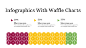
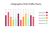
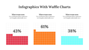
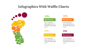
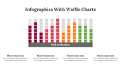
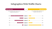
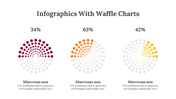
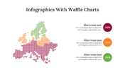
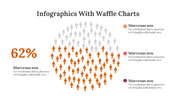
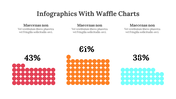
Everyone knows what a pie chart and the bar chart are. What is a waffle chart? A waffle chart is also similar to a pie chart. It is designed using a grid of rectangles or squares to represent data. The colorful square or rectangle shapes represent a proportion of the entire data in percentage.
Do you know what is unique about these waffles? They are very easy to understand and read. When compared to other charts, this diagram is visually engaging to use in your presentations. Our designs go beyond your imagination, and you have many one-of-a-kind charts in this set. Feel free to seize these slides and make modifications if needed.
Features of the template
- 100% customizable slides and easy to download.
- Slides are available in different nodes & colors.
- The slides contain 16:9 and 4:3 formats.
- Easy to change the colors quickly.
- It is a well-crafted template with an instant download facility.
- It is a 100% pre-designed slide.
- This slide is compatible with Google Slide Themes.
- It is a pack of colorful slides in a single deck.


You May Also Like These PowerPoint Templates


Add to Wishlist
Download
Edit

Add to Wishlist
Download
Edit

Add to Wishlist
Download
Edit

Add to Wishlist
Download
Edit

Add to Wishlist
Download
Edit

Add to Wishlist
Download
Edit

Add to Wishlist
Download
Edit

Add to Wishlist
Download
Edit

Add to Wishlist
Download
Edit

Add to Wishlist
Download
Edit

Add to Wishlist
Download
Edit

Add to Wishlist
Download
Edit

Add to Wishlist
Download
Edit

Add to Wishlist
Download
Edit

Add to Wishlist
Download
Edit

Add to Wishlist
Download
Edit

Add to Wishlist
Download
Edit

Add to Wishlist
Download
Edit

Add to Wishlist
Download
Edit

Add to Wishlist
Download
Edit

Add to Wishlist
Download
Edit

Add to Wishlist
Download
Edit

Add to Wishlist
Download
Edit

Add to Wishlist
Download
Edit

Add to Wishlist
Download
Edit

Add to Wishlist
Download
Edit

Add to Wishlist
Download
Edit

Add to Wishlist
Download
Edit


Add to Wishlist
Download
Edit

Add to Wishlist
Download
Edit


Add to Wishlist
Download
Edit
