Stacked Column Chart PPT Template & Google Slides

 Canva
Canva
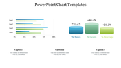
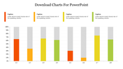
Stacked Column Chart PPT Template & Google Slides
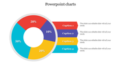
The "Stacked Column Chart PPT Template & Google Slides" features three stacked bar charts in the center, each adorned with vibrant colors to visually represent data. Positioned on either side of the charts are captions and percentages, providing contextual information and enhancing the understanding of the data presented. With its clean and organized layout, this template offers an effective way to showcase numerical data and trends.
This template is ideal for presentations that involve data analysis, performance metrics, or statistical reports. Whether you're presenting financial data, sales figures, market trends, or project milestones, the stacked column charts offer a visually appealing way to illustrate complex information.
Compatibility with PowerPoint and Google Slides. Available in 16:9 and 4:3 aspect ratios, catering to different screen sizes and presentation preferences. Provided in ZIP format for easy sharing and distribution. 100% customizable features. Download now.


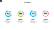
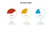
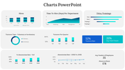
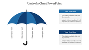
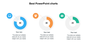
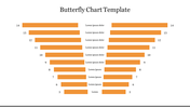
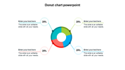
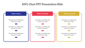
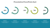
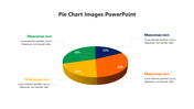
You May Also Like These PowerPoint Templates
Add to Wishlist
Download
Edit


Add to Wishlist
Download
Edit

Add to Wishlist
Download
Edit

Add to Wishlist
Download
Edit


Add to Wishlist
Download
Edit


Add to Wishlist
Download
Edit


Add to Wishlist
Download
Edit

Add to Wishlist
Download
Edit


