S Shaped Graph PowerPoint Presentation & Google Slides

An S shaped curve graph with three key points, illustrating growth or change over time with captions.
P.ID : 62629
    1.6K+ views
    261 Downloads
    Get Custom Slides by Experts
    Instantly Access Templates in PowerPoint

    Three Noded S Graph PPT Slide

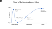
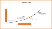
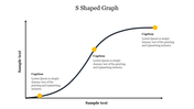
    In business and economics, the S-shaped graph is often used to describe the adoption curve of new products or technologies. It helps to identify the point at which the market reaches its saturation point and the growth rate starts to decline. It is a sigmoid function that shows the growth of a variable over time. The graph typically starts with slow growth, accelerates rapidly, and then levels off as it reaches a saturation point. You can use it for businesses and organizations to visualize their growth and development over time. Also customize it with your own data to create a clear and concise visual representation of their growth trajectory.

    Features of the template

      • 100% customizable slides and easy to download.
      • Slides are available in different nodes & colors.
      • The slide contains 16:9 and 4:3 formats.
      • Easy to change the slide colors quickly.
      • Well-crafted template with an instant download facility. 
      • Supports use on both PowerPoint and Google Slides for maximum flexibility.
      • Highly compatible with PowerPoint, Google Slides, and Canva Presentation.
      Advertisement

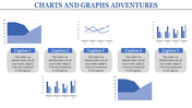
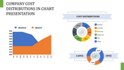
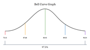
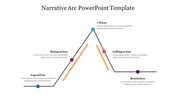
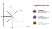
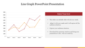
      You May Also Like These PowerPoint Templates

      Add to Wishlist
      Download
      AI Customize
      Bradley curve chart with four sections in shades of maroon, and orange, illustrating progression through stages.
      Add to Wishlist
      Download
      AI Customize
      A chart with a bell curve divided into five colored sections illustrating market segments with percentages.
      Add to Wishlist
      Download
      AI Customize
      Graph illustrating the law of diminishing marginal return with a curved line between input and output, with labeled sections.
      Add to Wishlist
      Download
      AI Customize
      Graphical representation of a story arc showing stages from exposition to resolution, with labeled points for each action.
      Add to Wishlist
      Download
      AI Customize
      Collection of plot diagram templates showing rising action, climax, and resolution in a line graph style.
      Add to Wishlist
      Download
      AI Customize
      Line graph template with two lines showing data across seven items, with percentage icons and captions below.
      Add to Wishlist
      Download
      AI Customize
      Conflict management slide with a slope line graph marking stages in four colored arrows, ending in a yellow star.
      Add to Wishlist
      Download
      AI Customize
      Spider graph displaying data from 2018 to 2023 with two data sets highlighted in orange and pink lines.
      Add to Wishlist
      Download
      AI Customize
      Slide deck showing the Kubler Ross change curve with colorful dots on a line graph illustrating emotional stages over time.
      Add to Wishlist
      Download
      AI Customize
      Perceptual map slide showcasing product placement across geographical regions Europe, Asia, and Africa in colored boxes.
      Add to Wishlist
      Download
      AI Customize
      Graph showing a positively skewed distribution, with a longer tail extending to the right, indicating more high values.
      Add to Wishlist
      Download
      AI Customize
      Kano model analysis graph illustrating delighters, satisfiers, and basic features with curved lines and caption areas.
      Add to Wishlist
      Download
      AI Customize
      A green circular pie chart showing percentage, and four colored sales data graphs for different years.
      Add to Wishlist
      Download
      AI Customize
      A donut chart with multiple segments in different colors next to a table displaying statistics and percentage changes.
      Add to Wishlist
      Download
      AI Customize
      Progress bar slide with colored bars representing market, business, timeline, and goal categories with percentages.
      Add to Wishlist
      Download
      AI Customize
      A curved graph showing stages of change over time and morale axis with five colored circular markers.
      Add to Wishlist
      Download
      AI Customize
      Endowment effect graph depicting reference points, gains, losses, and a description explaining ownership bias in psychology.