Effective Diagram Of Skewed Graph PowerPoint Presentation

Skewed graph with a curved line depicting negative skewness, marked with three highlighted points along the curve.
P.ID : 57309
    12 slides
    Collection of plot diagram templates showing rising action, climax, and resolution in a line graph style.
    11 slides
    Kano model slides with green, blue, and red curves showing delighters, satisfiers, and basic expectations in a product.
    11 slides
    Slide deck showing the Kubler Ross change curve with colorful dots on a line graph illustrating emotional stages over time.
    268 views
    28 Downloads
    Get Custom Slides by Experts
    Instantly Access Templates in PowerPoint

    Skewed Graph Presentation Slide

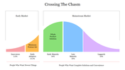
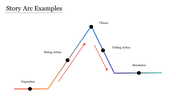
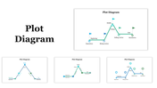
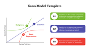
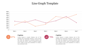
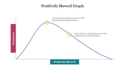
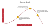
    A skewed graph is a type of graph where the data is not evenly distributed around the mean, resulting in an asymmetrical shape. There are two types of skewness: positive and negative. In a positively skewed graph, the tail of the graph is longer on the right side, while in a negatively skewed graph, the tail is longer on the left side. They may also cover important details or trends in the data. Presenters should take care to accurately represent the data and choose appropriate graph types that best display the information. The apt representational graph helps to clarify the data and minimize any potential confusion or misinterpretation.


    Features of the template:

    • Elegant slide background designs
    • 100% easy to edit and customize slides
    • The slide has 4:3 and 16:9 layouts
    • Well-crafted template with instant download facility.
    • The elegant look of this template will give life to your presentation.
    • It is a well-designed presentation template.
    • Highly compatible with PowerPoint and Google Slides.
    Advertisement

    You May Also Like These PowerPoint Templates

    Add to Wishlist
    Download
    AI Customize
    Graph displaying the absolute value function in blue with a V-shape, with a caption on the right.
    Add to Wishlist
    Download
    AI Customize
    Graph diagram illustrating the Dunning Kruger Syndrome, showcasing the relationship between confidence and competence.
    Add to Wishlist
    Download
    AI Customize
    Smooth red quartic curve on an axis, showing roots and peaks, with descriptive text section to the right.
    Add to Wishlist
    Download
    AI Customize
    Creative graph slide with colorful numbered captions and a bar chart displaying varying percentage values from 40% to 80%.
    Add to Wishlist
    Download
    AI Customize
    A slide featuring four bar graphs labeled A, B, C, and D with caption areas underneath, connected by dotted arrows.
    Free
    Add to Wishlist
    Download
    AI Customize
    Chevron graph template with four percentage columns and captions below each bar.
    Add to Wishlist
    Download
    AI Customize
    Kano Customer Model chart slide showing the categories Delighters, Basic, and Satisfiers with labeled arrows.
    Add to Wishlist
    Download
    AI Customize
    Kano model with a red arrow and orange, red, and green zones for user satisfaction placed in a white background.
    Add to Wishlist
    Download
    AI Customize
    Circular segmented graph showing percentages from 52% to 80% in green and blue tones, with text captions on the right.
    Add to Wishlist
    Download
    AI Customize
    Graph illustrating the Endowment Effect, showing value versus outcome with gains and losses marked.
    Add to Wishlist
    Download
    AI Customize
    Best Graph Business Growth PowerPoint Template Slide
    Add to Wishlist
    Download
    AI Customize
    Graphics PowerPoint slide featuring five vertical progress bars with different percentages and icons with captions.
    Add to Wishlist
    Download
    AI Customize
    Story plot diagram with beginning, middle, and end sections in pastel colors, connected by icons on a line graph.
    Add to Wishlist
    Download
    AI Customize
    Graph illustrating the yearly findings of how to find PowerPoint templates from 2016 to 2023 with two data series.
    Free
    Add to Wishlist
    Download
    AI Customize
    Slide with green radar chart, satellite dish on the right, and two labeled statistical hexagonal sections below.
    Add to Wishlist
    Download
    AI Customize
    Line graph representing the Kubler Ross Model with seven emotional stages marked by colored points on a curve.
    Add to Wishlist
    Download
    AI Customize
    PowerPoint slide showing a quick fact about music's impact, with a graph displaying intelligence levels and famous composers.
    Free
    Add to Wishlist
    Download
    AI Customize
    Slide with a sloping bar graph in green and gray segments, three numbered points, and a text box on the right.