EXCLUSIVE Grab Unbeatable Independence Day Deals – Up to 80% OFF

Kubler Ross Change Curve PowerPoint And Google Slides
Pack of 11 slides
P.ID : 59290
Advertisement
1.2K+ views
184 Downloads
Designer
Shanmugapriya
Get Custom Slides by Experts
Enhance Your Presentations with Add-ins
Google Slides Add-in
Access templates directly in Google Slides
Microsoft PowerPoint Add-in
Access templates directly in PowerPoint
GPT Add-on
AI-powered presentation assistance

Five Noded Kubler Ross Change Curve PPT Slide

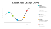
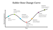
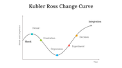
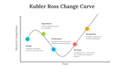
Download this Kubler Ross Change Curve Graph PowerPoint Template to present the five stages of grief. This slide is applicable to most types of change situations, including mergers and acquisitions, restructuring, and implementing new policies. You can customize this slide and use it in any kind of business presentation. 

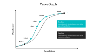
The Kubler Ross Change Curve PowerPoint Template includes a curved graph with five nodes. The x-axis depicts time, and the y-axis depicts morale and competence. The five nodes represent denial, frustration, experiment, decision, and integration. It is a good option for any change management presentation. It also helps to show the evolution of a company over time. 

Features of this template:

1. 100% customizable slides and easy to download.
2. Slides available in different nodes & colors.
3. The slide contained 16:9 and 4:3 format.
4. Easy to change the slide colors quickly.
5. Well-crafted template with instant download facility.
6. It is a creative slide with a curved graph.
You May Also Like These PowerPoint Templates
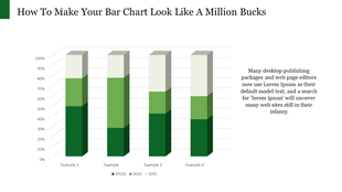
Stacked bar chart with four vertical bars showing percentages from 2013, 2014, and 2015 in varying green shades.
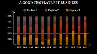
Business template bar graph with stacked segments for three captions, showing percentages per month from January to December.
Infographic with four bar graphs, each showing data points A to D, and captions areas in green boxes.
Blank bar chart template featuring three series of data across four categories, with orange, green, and blue bars.
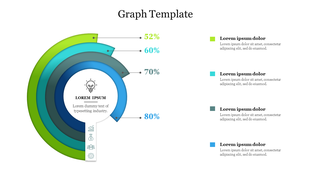
Circular infographic with four layers representing percentages from 52% to 80%, with a lightbulb icon in the center.
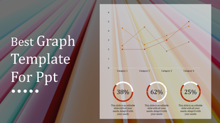
Line graph displaying trends across four categories with three distinct colored lines and percentage highlights below.
Free
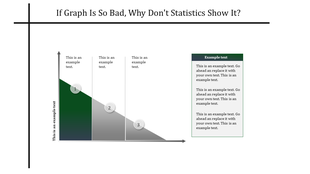
Slide with a sloping bar graph in green and gray segments, three numbered points, and a text box on the right.
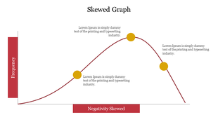
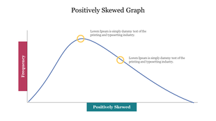
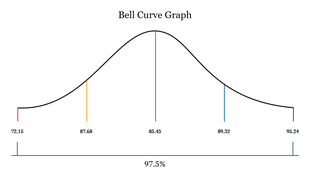
Graph showing a positively skewed distribution, with a longer tail extending to the right, indicating more high values.
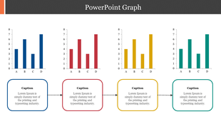
A slide featuring four bar graphs labeled A, B, C, and D with caption areas underneath, connected by dotted arrows.
Circular segmented graph showing percentages from 52% to 80% in green and blue tones, with text captions on the right.
Free
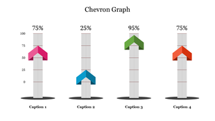
Chevron graph template with four percentage columns and captions below each bar.

Showing36 of69,218 templates