Best Line Graph PowerPoint Presentation Template Slide

Two Noded Line Graph Template
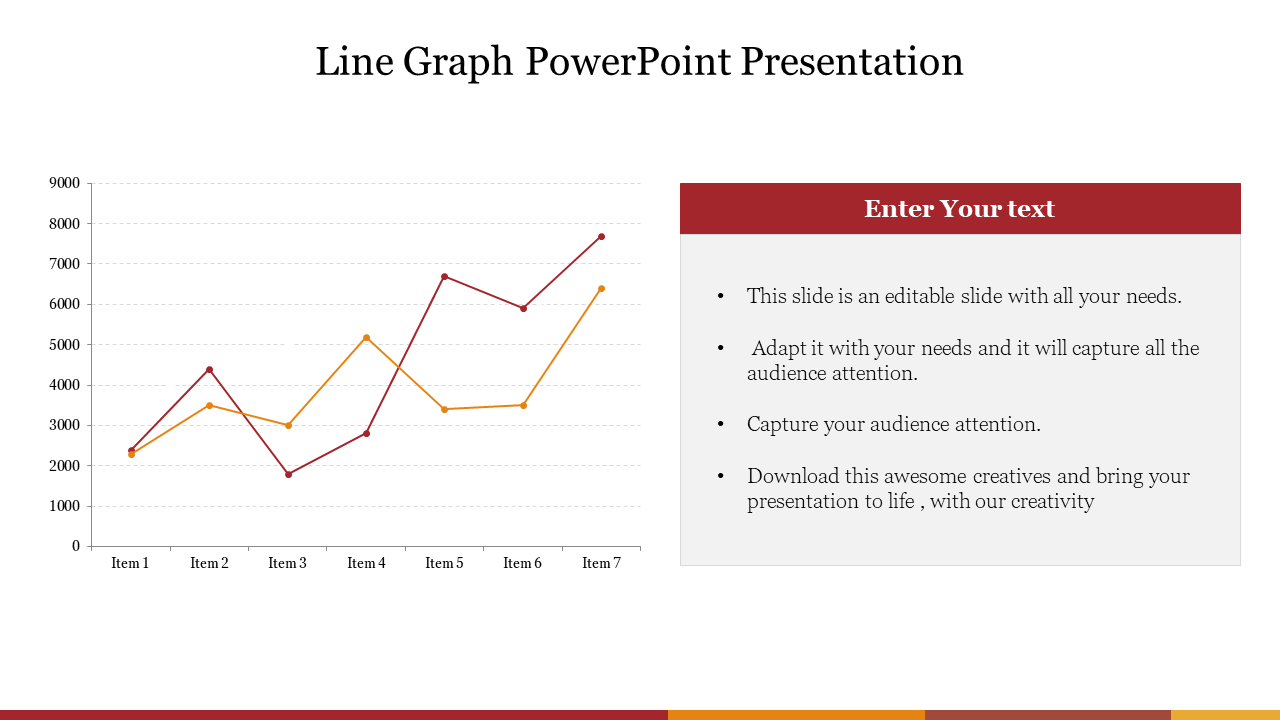
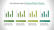
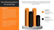
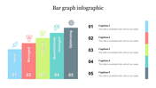
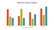
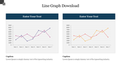
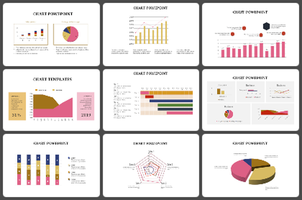
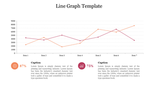
Download this Line Graph PowerPoint Presentation Template to make the best graphical representations of data. You can use this template to overview the current economic situation, business growth, historical data, etc. It is also used to graph the recent trend in financial data over a specified time interval or a specified period. You can edit the appearance of this slide to suit your needs.
The Line Graph PowerPoint Presentation Template is a kind of chart presentation template that displays data as points, series, and those points connected by a straight line. This template has a chart with two sets of values. It also has a text area to present your information and analysis report. It is the best way to make presentations in the financial and banking fields.
Features of this template:
1. 100% customizable slides and easy to download.
2. Slides available in different nodes & colors.
3. The slide contained 16:9 and 4:3 format.
4. Easy to change the slide colors quickly.
5. Well-crafted template with instant download facility.
6. It has a well-designed Line graph.
You May Also Like These PowerPoint Templates

Showing20 of69,218 templates