Awesome Statistics And Graphs PowerPoint Presentation

A donut chart with multiple segments in different colors next to a table displaying statistics and percentage changes.
P.ID : 54800
    421 views
    43 Downloads
    Get Custom Slides by Experts
    Instantly Access Templates in PowerPoint

    Colorful Contents Inserted Template


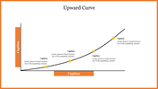
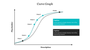
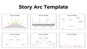
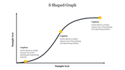
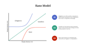
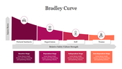
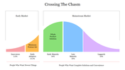
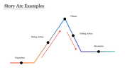
    Get your hands on this innovative content inserted template for your business presentation slides for providing sufficient information to your audience. You can give a detailed explanation of the project's progress with the captions and icons presented with this template. You can also find that the numerous nodes are filled with unique colors and highlighting tables that improve the template's standard. So, start using this wonderful template in your presentation as soon as possible.

    Features of this template

    • 100% customizable slides and easy to download
    • Slides are available in different nodes & colors.
    • The slides contained 16:9 and 4:3 formats.
    • Easy to change the slide colors quickly.
    • Well-crafted template with instant download facility.
    • Minute details inserted template.
    • Many Diagrams are inserted.
    Advertisement

    You May Also Like These PowerPoint Templates

    Add to Wishlist
    Download
    AI Customize
    Collection of plot diagram templates showing rising action, climax, and resolution in a line graph style.
    Add to Wishlist
    Download
    AI Customize
    Line graph template with two lines showing data across seven items, with percentage icons and captions below.
    Add to Wishlist
    Download
    AI Customize
    Conflict management slide with a slope line graph marking stages in four colored arrows, ending in a yellow star.
    Add to Wishlist
    Download
    AI Customize
    Spider graph displaying data from 2018 to 2023 with two data sets highlighted in orange and pink lines.
    Add to Wishlist
    Download
    AI Customize
    Slide deck showing the Kubler Ross change curve with colorful dots on a line graph illustrating emotional stages over time.
    Add to Wishlist
    Download
    AI Customize
    Graph showing a positively skewed distribution, with a longer tail extending to the right, indicating more high values.
    Add to Wishlist
    Download
    AI Customize
    Kano model analysis graph illustrating delighters, satisfiers, and basic features with curved lines and caption areas.
    Add to Wishlist
    Download
    AI Customize
    Progress bar slide with colored bars representing market, business, timeline, and goal categories with percentages.
    Add to Wishlist
    Download
    AI Customize
    A curved graph showing stages of change over time and morale axis with five colored circular markers.
    Add to Wishlist
    Download
    AI Customize
    Endowment effect graph depicting reference points, gains, losses, and a description explaining ownership bias in psychology.
    Add to Wishlist
    Download
    AI Customize
    Skewed graph with a curved line depicting negative skewness, marked with three highlighted points along the curve.
    Add to Wishlist
    Download
    AI Customize
    Graph displaying the absolute value function in blue with a V-shape, with a caption on the right.
    Add to Wishlist
    Download
    AI Customize
    Graph diagram illustrating the Dunning Kruger Syndrome, showcasing the relationship between confidence and competence.
    Add to Wishlist
    Download
    AI Customize
    Smooth red quartic curve on an axis, showing roots and peaks, with descriptive text section to the right.
    Free
    Add to Wishlist
    Download
    AI Customize
    Chevron graph template with four percentage columns and captions below each bar.
    Add to Wishlist
    Download
    AI Customize
    Kano Customer Model chart slide showing the categories Delighters, Basic, and Satisfiers with labeled arrows.
    Add to Wishlist
    Download
    AI Customize
    Kano model with a red arrow and orange, red, and green zones for user satisfaction placed in a white background.