Best Plot Diagram PowerPoint and Google Slides Themes

Attractive Plot Diagram Template
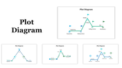
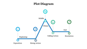
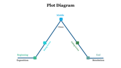
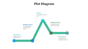
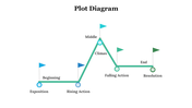
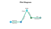
A plot diagram is a helpful tool for understanding the structure of a story and identifying its key elements. By breaking down the story into these five parts, you can analyze the plot and see how each part contributes to the overall narrative. Download this exclusive template for a better presentation.
Features of the template:
- 100% customizable slides and easy to download.
- The slide contains 16:9 and 4:3 formats.
- Slides are available in different nodes & colors.
- Easy to change the colors of the slide quickly.
- Well-crafted template with an instant download facility
- Plot design with text area.
- Point-to-point model.
- Easy to edit.


You May Also Like These PowerPoint Templates

Add to Wishlist
Download
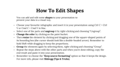
Edit

Add to Wishlist
Download
Edit

Add to Wishlist
Download
Edit

Add to Wishlist
Download
Edit

Add to Wishlist
Download
Edit

Add to Wishlist
Download
Edit

Add to Wishlist
Download
Edit

Add to Wishlist
Download
Edit

Add to Wishlist
Download
Edit

Add to Wishlist
Download
Edit

Add to Wishlist
Download
Edit

Add to Wishlist
Download
Edit

Add to Wishlist
Download
Edit

Add to Wishlist
Download
Edit

Add to Wishlist
Download
Edit

Add to Wishlist
Download
Edit

Add to Wishlist
Download
Edit

Add to Wishlist
Download
Edit

Add to Wishlist
Download
Edit

Add to Wishlist
Download
Edit

Add to Wishlist
Download
Edit

Add to Wishlist
Download
Edit

Add to Wishlist
Download
Edit

Add to Wishlist
Download
Edit

Add to Wishlist
Download
Edit

Add to Wishlist
Download
Edit

Add to Wishlist
Download
Edit

Add to Wishlist
Download
Edit

Add to Wishlist
Download
Edit

Add to Wishlist
Download
Edit

Add to Wishlist
Download
Edit

Add to Wishlist
Download
Edit

Add to Wishlist
Download
Edit

Add to Wishlist
Download
Edit

Add to Wishlist
Download
Edit
