Attractive Charts And Graphs PowerPoint And Google Slides

A green circular pie chart showing percentage, and four colored sales data graphs for different years.
P.ID : 5739
    809 views
    87 Downloads
    Get Custom Slides by Experts
    Instantly Access Templates in PowerPoint

    Incredible Charts And Graphs PowerPoint Template


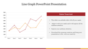
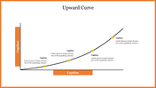
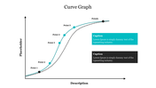
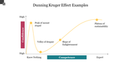
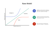
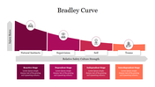
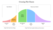
    Visualize your data with precision and clarity using our versatile Charts and Graphs PowerPoint template. Perfect for business analysts, educators, marketers, and professionals in various fields, this template offers a comprehensive suite of customizable slides designed to present complex data in an engaging and easy-to-understand manner. With a variety of chart types including bar graphs, pie charts, line graphs, and scatter plots, you can effectively highlight trends, compare metrics, and illustrate data relationships.

    The intuitive layout and professional design ensure your data is not only visually appealing but also easily interpretable by your audience. Whether you're delivering financial reports, presenting research findings, or tracking project progress, this template empowers you to convey your insights with impact and precision. Elevate your presentations and make your data stand out with our dynamic Charts and Graphs PowerPoint template. Download today and transform your data presentation approach!

    Features of this template


    • 100% customizable slides and easy to download.
    • The slide contains 16:9 and 4:3 formats.
    • Easy to change the colors of the slide quickly.
    • Highly compatible with PowerPoint and Google Slides.
    Advertisement

    You May Also Like These PowerPoint Templates

    Add to Wishlist
    Download
    AI Customize
    Graphical representation of a story arc showing stages from exposition to resolution, with labeled points for each action.
    Add to Wishlist
    Download
    AI Customize
    Collection of plot diagram templates showing rising action, climax, and resolution in a line graph style.
    Add to Wishlist
    Download
    AI Customize
    Line graph template with two lines showing data across seven items, with percentage icons and captions below.
    Add to Wishlist
    Download
    AI Customize
    Conflict management slide with a slope line graph marking stages in four colored arrows, ending in a yellow star.
    Add to Wishlist
    Download
    AI Customize
    Spider graph displaying data from 2018 to 2023 with two data sets highlighted in orange and pink lines.
    Add to Wishlist
    Download
    AI Customize
    Slide deck showing the Kubler Ross change curve with colorful dots on a line graph illustrating emotional stages over time.
    Add to Wishlist
    Download
    AI Customize
    Graph showing a positively skewed distribution, with a longer tail extending to the right, indicating more high values.
    Add to Wishlist
    Download
    AI Customize
    Kano model analysis graph illustrating delighters, satisfiers, and basic features with curved lines and caption areas.
    Add to Wishlist
    Download
    AI Customize
    Progress bar slide with colored bars representing market, business, timeline, and goal categories with percentages.
    Add to Wishlist
    Download
    AI Customize
    A curved graph showing stages of change over time and morale axis with five colored circular markers.
    Add to Wishlist
    Download
    AI Customize
    Endowment effect graph depicting reference points, gains, losses, and a description explaining ownership bias in psychology.
    Add to Wishlist
    Download
    AI Customize
    Skewed graph with a curved line depicting negative skewness, marked with three highlighted points along the curve.
    Add to Wishlist
    Download
    AI Customize
    Graph displaying the absolute value function in blue with a V-shape, with a caption on the right.
    Add to Wishlist
    Download
    AI Customize
    Graph diagram illustrating the Dunning Kruger Syndrome, showcasing the relationship between confidence and competence.
    Add to Wishlist
    Download
    AI Customize
    Smooth red quartic curve on an axis, showing roots and peaks, with descriptive text section to the right.
    Add to Wishlist
    Download
    AI Customize
    Creative graph slide with colorful numbered captions and a bar chart displaying varying percentage values from 40% to 80%.
    Add to Wishlist
    Download
    AI Customize
    A slide featuring four bar graphs labeled A, B, C, and D with caption areas underneath, connected by dotted arrows.
    Add to Wishlist
    Download
    AI Customize
    Kano Customer Model chart slide showing the categories Delighters, Basic, and Satisfiers with labeled arrows.