Get Bell Curve PowerPoint Template And Google Slides

Bell Curve PowerPoint Template
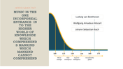
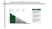
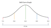
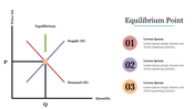
Embark on an enlightening journey into the concept of a bell curve, a statistical graph that represents the distribution of a dataset, where the highest point forms a bell-shaped curve. This curve illustrates the frequency of occurrence of values in a dataset, with the highest frequency usually occurring at or near the mean value, and decreasing gradually towards the peak. Commonly used in various fields such as statistics, economics, and psychology, the bell curve helps analyze and interpret data distributions, understand patterns, and make informed decisions based on probability and distributional properties. Designed for statisticians, analysts, and researchers, the Bell Curve PowerPoint template provides a versatile tool for effectively presenting and visualizing data distributions. With fully editable slides, users can customize the template to illustrate statistical concepts, analyze datasets and illustrate distribution patterns with clarity and precision, improving engagement and understanding. Encourage your audience to use this template to improve data analytics presentations and make data-driven decisions with confidence.
Features of the template
- 100% customizable slides and easy to download.
- The slide contains 16:9 and 4:3 formats.
- Easy to change the colors of the slide quickly.
- Highly compatible with PowerPoint and Google Slides.
- Well-crafted template with an instant download facility.


You May Also Like These PowerPoint Templates
Add to Wishlist
Download
AI Customize

Add to Wishlist
Download
AI Customize

Add to Wishlist
Download
AI Customize

Add to Wishlist
Download
AI Customize

Add to Wishlist
Download
AI Customize

Add to Wishlist
Download
AI Customize

Add to Wishlist
Download
AI Customize

Add to Wishlist
Download
AI Customize

Add to Wishlist
Download
AI Customize

Add to Wishlist
Download
AI Customize

Add to Wishlist
Download
AI Customize

Add to Wishlist
Download
AI Customize

Add to Wishlist
Download
AI Customize

Add to Wishlist
Download
AI Customize

Add to Wishlist
Download
AI Customize

Add to Wishlist
Download
AI Customize

Add to Wishlist
Download
AI Customize

Add to Wishlist
Download
AI Customize

Add to Wishlist
Download
AI Customize

Add to Wishlist
Download
AI Customize
