EXCLUSIVE Grab Unbeatable Independence Day Deals – Up to 80% OFF

Best Positively Skewed Histogram Presentation Slide
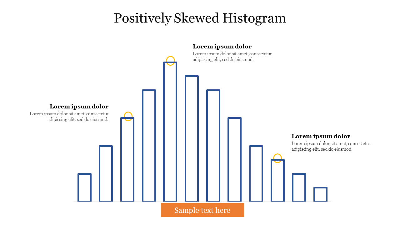
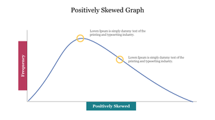
Positively skewed histogram with blue bars, three highlighted data points, and a centered orange button at the bottom.
P.ID : 59101
    230 views
    16 Downloads
    Designer
    Kavitha
    Get Custom Slides by Experts
    Enhance Your Presentations with Add-ins
    Google Slides Add-in
    Access templates directly in Google Slides
    Microsoft PowerPoint Add-in
    Access templates directly in PowerPoint
    GPT Add-on
    AI-powered presentation assistance

    Creative Histogram PowerPoint Template Data with the graph model

    Get our Positively Skewed Histogram PowerPoint Slide to display statistical data that uses rectangles to show the business data. It is not so difficult to make a better Histogram graph if you use our graph. You will also learn some essential tips while using our template. In addition, This template is used to showcase your different processes in a business meeting. Our Positively Skewed Histogram PowerPoint Slide provides blue shade rectangles with three captions. Every part of the chart is highlighted in colors and letters. We have a lot of premium templates for the graph PowerPoint Templates. Users can change the fonts, the format of this template, and the borders.

    Features of this template

    • 100% Customizable (shape color, size & text)
    • This template has a blue theme
    • Drag and drop image placeholder
    • Huge Collections of slides to impress your audience
    • It supports an aspect ratio of 4:3 and 16:9 format
    • Easy to change the slide colors quickly.
    Advertisement

    You May Also Like These PowerPoint Templates
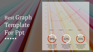
    Line graph displaying trends across four categories with three distinct colored lines and percentage highlights below.
    Free
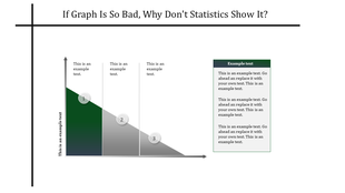
    Slide with a sloping bar graph in green and gray segments, three numbered points, and a text box on the right.
    Graph showing a positively skewed distribution, with a longer tail extending to the right, indicating more high values.
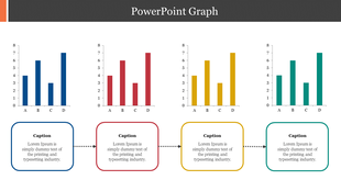
    A slide featuring four bar graphs labeled A, B, C, and D with caption areas underneath, connected by dotted arrows.
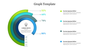
    Circular segmented graph showing percentages from 52% to 80% in green and blue tones, with text captions on the right.
    Free
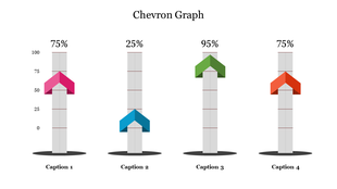
    Chevron graph template with four percentage columns and captions below each bar.

    Showing20 of69,218 templates