Curve Graph PPT Template & Google Slides for Presentation

A curve graph with two lines in teal and black and six labeled points, with corresponding captions on the right.
P.ID : 64165
    13 slides
    A collection of story arc slides featuring graphs illustrating rising action, climax, and resolution points for storytelling.
    12 slides
    Editable Kano Model PowerPoint and Google Slides Themes
    12 slides
    Collection of plot diagram templates showing rising action, climax, and resolution in a line graph style.
    11 slides
    Kano model slides with green, blue, and red curves showing delighters, satisfiers, and basic expectations in a product.
    809 views
    115 Downloads
    Get Custom Slides by Experts
    Instantly Access Templates in PowerPoint

    Two Noded PowerPoint Slide With Curve Line Graph

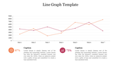
    A Curve Line Graph is the best tool to visualize the linear relationship between the variables. It will help your present the data in a visually engaging manner. SlideEgg offers you an amazing slide with a well-designed curve line graph. It is an easily editable slide with your own data. Hurry to grab!

    About the template

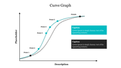
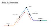
    This slide is crafted with a curved line graph in which the x-axis denotes the description, and the y-axis denotes the placeholder. It has six nodes representing six points. It has a solid and a dotted curved line. It also has two textboxes to present the legend. With this two-noded slide, it will be easy for you to compare two variables. You can also find 3D Bar Graphs on our site. Try Now!

    Features of the template

    • 100% customizable slides and easy to download.
    • Slides are available in different nodes & colors.
    • The slide contained 16:9 and 4:3 formats.
    • Easy to change the slide colors quickly.
    • Well-crafted template with instant download facility.
    • It includes a well-crafted graph with curved lines.
    Advertisement

    You May Also Like These PowerPoint Templates

    Add to Wishlist
    Download
    AI Customize
    Spider graph displaying data from 2018 to 2023 with two data sets highlighted in orange and pink lines.
    Add to Wishlist
    Download
    AI Customize
    Slide deck showing the Kubler Ross change curve with colorful dots on a line graph illustrating emotional stages over time.
    Add to Wishlist
    Download
    AI Customize
    Perceptual map slide showcasing product placement across geographical regions Europe, Asia, and Africa in colored boxes.
    Add to Wishlist
    Download
    AI Customize
    Graph showing a positively skewed distribution, with a longer tail extending to the right, indicating more high values.
    Add to Wishlist
    Download
    AI Customize
    Kano model analysis graph illustrating delighters, satisfiers, and basic features with curved lines and caption areas.
    Add to Wishlist
    Download
    AI Customize
    A green circular pie chart showing percentage, and four colored sales data graphs for different years.
    Add to Wishlist
    Download
    AI Customize
    A donut chart with multiple segments in different colors next to a table displaying statistics and percentage changes.
    Add to Wishlist
    Download
    AI Customize
    Progress bar slide with colored bars representing market, business, timeline, and goal categories with percentages.
    Add to Wishlist
    Download
    AI Customize
    A curved graph showing stages of change over time and morale axis with five colored circular markers.
    Add to Wishlist
    Download
    AI Customize
    Endowment effect graph depicting reference points, gains, losses, and a description explaining ownership bias in psychology.
    Add to Wishlist
    Download
    AI Customize
    Skewed graph with a curved line depicting negative skewness, marked with three highlighted points along the curve.
    Add to Wishlist
    Download
    AI Customize
    Graph displaying the absolute value function in blue with a V-shape, with a caption on the right.
    Add to Wishlist
    Download
    AI Customize
    Graph diagram illustrating the Dunning Kruger Syndrome, showcasing the relationship between confidence and competence.
    Add to Wishlist
    Download
    AI Customize
    Smooth red quartic curve on an axis, showing roots and peaks, with descriptive text section to the right.
    Add to Wishlist
    Download
    AI Customize
    Creative graph slide with colorful numbered captions and a bar chart displaying varying percentage values from 40% to 80%.
    Add to Wishlist
    Download
    AI Customize
    A slide featuring four bar graphs labeled A, B, C, and D with caption areas underneath, connected by dotted arrows.
    Free
    Add to Wishlist
    Download
    AI Customize
    Chevron graph template with four percentage columns and captions below each bar.
    Add to Wishlist
    Download
    AI Customize
    Kano Customer Model chart slide showing the categories Delighters, Basic, and Satisfiers with labeled arrows.