Get Bell Curve Graph PowerPoint Template and Google Slides

Bell curve graph with key data points marked in various colors, highlighting 72.15, 87.68, 85.45, 89.32, and 95.24.
P.ID : 58986
    3.8K+ views
    557 Downloads
    Get Custom Slides by Experts
    Instantly Access Templates in PowerPoint

    Bell Curve Graph Presentation Slide

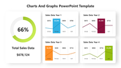
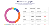
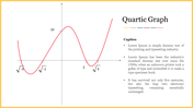
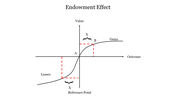
    Bell Curve Graph has become a topic of controversy in the context of education and intelligence testing. The Bell curve graph, also known as the Gaussian distribution, is a statistical tool that represents a normal distribution of data. It is a symmetrical curve that illustrates the frequency of data points that fall within a certain range of values, with the highest frequency occurring in the centre of the curve. They are widely used in fields like economics, psychology, and sociology to analyze data and draw conclusions. Slide Egg provides you with an elegant template with a bell curve graph, which assists you in crafting presentations that involve data analysis or forecasting. Also, making decisions and predictions, such as in forecasting sales or predicting exam scores.


    Features of the template

    • 100% customizable slides and easy to download.
    • Slides are available in different nodes & colors.
    • The slide contains 16:9 and 4:3 formats.
    • Easy to change the slide colors quickly.
    • Well-crafted template with an instant download facility. 
    • Access on both MS PowerPoint and Google Slides.
    • Ideal for analytical data.
    • Bell curve graphics added.
    Advertisement

    You May Also Like These PowerPoint Templates

    Add to Wishlist
    Download
    AI Customize
    Best Graph Business Growth PowerPoint Template Slide
    Add to Wishlist
    Download
    AI Customize
    Graphics PowerPoint slide featuring five vertical progress bars with different percentages and icons with captions.
    Add to Wishlist
    Download
    AI Customize
    Story plot diagram with beginning, middle, and end sections in pastel colors, connected by icons on a line graph.
    Add to Wishlist
    Download
    AI Customize
    Layered area chart with red and green segments, numeric axes, and two icons below with captions on a white background.
    Add to Wishlist
    Download
    AI Customize
    Infographic PowerPoint slide with four blue bars of increasing height, each associated with a caption and placeholder text.
    Add to Wishlist
    Download
    AI Customize
    Slide showing a gray-shaded area graph with red circular markers and captions for three highlighted years.
    Add to Wishlist
    Download
    AI Customize
    Graph illustrating the yearly findings of how to find PowerPoint templates from 2016 to 2023 with two data series.
    Free
    Add to Wishlist
    Download
    AI Customize
    Slide with green radar chart, satellite dish on the right, and two labeled statistical hexagonal sections below.
    Add to Wishlist
    Download
    AI Customize
    Line graph representing the Kubler Ross Model with seven emotional stages marked by colored points on a curve.
    Add to Wishlist
    Download
    AI Customize
    Line graph displaying trends across four categories with three distinct colored lines and percentage highlights below.
    Free
    Add to Wishlist
    Download
    AI Customize
    Weekly bar chart with green bars showing Style 1 to Style 4 timelines, accompanied by a tilted yellow note box.
    Add to Wishlist
    Download
    AI Customize
    PowerPoint slide showing a quick fact about music's impact, with a graph displaying intelligence levels and famous composers.
    Add to Wishlist
    Download
    AI Customize
    PowerPoint template showing a line graph with three products A, B, and C plotted over time from 2015 to 2019.
    Free
    Add to Wishlist
    Download
    AI Customize
    Slide with a sloping bar graph in green and gray segments, three numbered points, and a text box on the right.
    Add to Wishlist
    Download
    AI Customize
    Two vertical bar charts with three columns each, alongside captions with percentages in varying shades of orange.
    Free
    Add to Wishlist
    Download
    AI Customize
    Revenue analysis slide with bar chart, financial icon, and two descriptive sections for customer metrics.
    Free
    Add to Wishlist
    Download
    AI Customize
    3D bar graph with six green bars of varying heights, labeled placeholders, and a gray sidebar with text blocks.
    Free
    Add to Wishlist
    Download
    AI Customize
    Visual layout of various charts, including area and bar graphs, arranged in a grid format with caption areas.
    Free
    Add to Wishlist
    Download
    AI Customize
    Comparison of revenue and cost distributions with pie charts displaying CAPEX and OPEX percentages.