Flatten The Curve PowerPoint And Google Slides Templates





 Canva
Canva
Flatten The Curve PowerPoint, Google Slides, and Canva Template
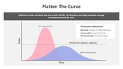
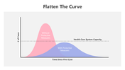
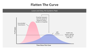
Flatten the curve became a crucial term in public health during the global pandemic. It refers to the idea of slowing down the spread of a disease to avoid overwhelming healthcare systems. By reducing the number of active cases at any given time, we can ensure that medical resources and services are available to those who need them most.
Purpose Of The Slides
This presentation with a pink and purple curve is designed to visually represent the concept of flattening the curve. It breaks down the statistical concepts related to healthcare capacity and disease transmission. The slide also offers easy-to-understand visual elements that make it simple for your audience to grasp the importance of social distancing, wearing masks, and vaccination in managing public health.
Who Can Use It?
This flattening of the curves is ideal for health professionals, educators, students, government officials, and organizations involved in public health communication. It helps explain complex public health data in a clear, concise, and engaging format, making it perfect for presentations, reports, or educational sessions.
Special Key Features
Enhance your next health-related presentation with this customizable flatten the curve presentation. The simple, eye-catching design and clear messaging will help you convey critical public health information effectively. Download now and make your presentations impactful and informative!
Features of this template
- 100% customizable slides and easy to download.
- The slides contain 16:9 and 4:3 formats.
- Easy to change the colors quickly.
- Highly compatible with PowerPoint, Google Slides, and Canva templates.


You May Also Like These PowerPoint Templates




Showing36 of69,218 templates