Four Noded Comparison Chart PowerPoint Presentation

Four donut charts in red, blue, green, and yellow, displaying percentages with corresponding content boxes below.
P.ID : 62354
    374 views
    48 Downloads
    Get Custom Slides by Experts
    Instantly Access Templates in PowerPoint

    Four Noded Comparison Chart Template For PowerPoint Presentations

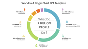
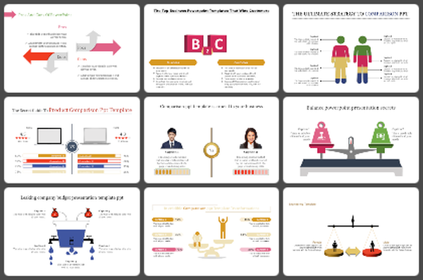
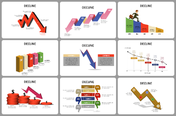
    Do you want to compare different products? Then download our well-designed Comparison Chart PowerPoint template. You can quickly get the best and worst product results in a minute. The comparison template is easy to use and is a great way to get your point across.

    About this template

    A Comparison Chart PowerPoint template is a visual tool. It can display the result of two sets of products. It is a four-noded template designed using circles. This template is highly customizable. Moreover, you can change the circle design, color, background colors as you need. In addition, there are more Free PPT templates available at SlideEgg to present your ideas creatively to your audiences.

    Feature of this template  

    • The Slides are available in different nodes & colors.
    • This slide contains 16:9 and 4:3 format.
    • It is easy to change the slide colors quickly.
    • It is a well-crafted template with an instant download facility.
    • The best PowerPoint theme template.
    • It is a well-designed presentation template.
    Advertisement

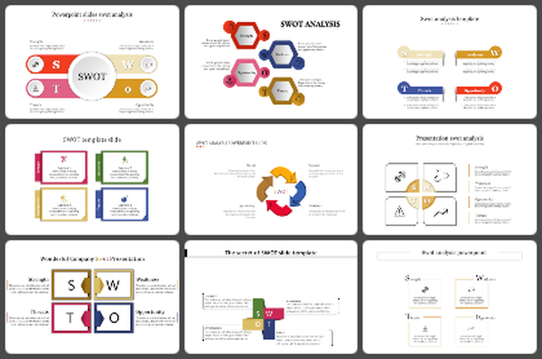
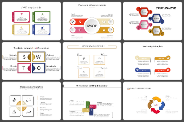
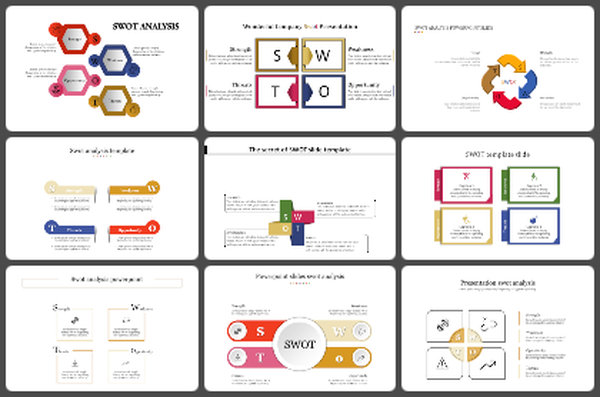
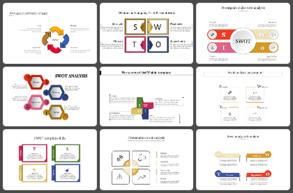
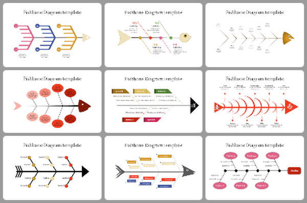
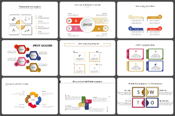
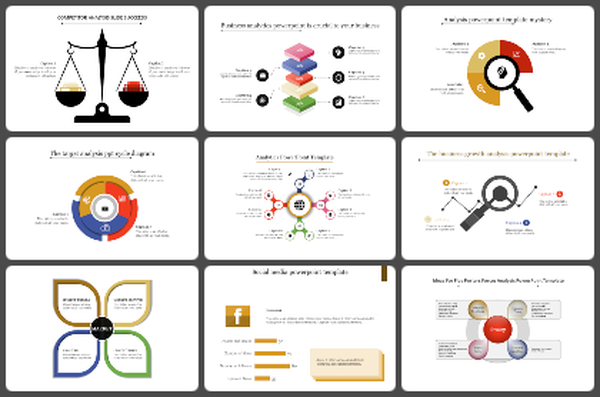
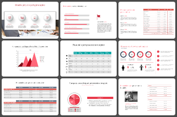
    You May Also Like These PowerPoint Templates

    Add to Wishlist
    Download
    AI Customize
    Pie chart slide showing budget distribution for facebook, google, and linkedIn ads with respective percentages.
    Add to Wishlist
    Download
    AI Customize
    Project management dashboard slide with visually colored charts and graphs displaying task status with icons.
    Add to Wishlist
    Download
    AI Customize
    Stacked bar chart template with green gradients, showing data from 2017 to 2020, with labeled sections.
    Add to Wishlist
    Download
    AI Customize
    Visual KPI layout with performance bar chart, doughnut chart, and percentage indicators for project analysis.
    Add to Wishlist
    Download
    AI Customize
    Dashboard PowerPoint Template and Google Slides
    Add to Wishlist
    Download
    AI Customize
    Row of four colored speedometer-style gauges, each showing varying percentages with needle, and captions at the bottom.
    Add to Wishlist
    Download
    AI Customize
    Three pie charts in brown, blue, and green sections, each with labeled percentages and caption lines.
    Free
    Add to Wishlist
    Download
    AI Customize
    Multicolored circular pie chart in yellow, red, and green, with labeled categories listed on the right.
    Free
    Add to Wishlist
    Download
    AI Customize
    KPI dashboard with a data table on the left and a circular chart on the right, featuring shades of teal and white.
    Free
    Add to Wishlist
    Download
    AI Customize
    Bar chart with five vertical bars representing data analysis with various high, low, and volume indicators displayed.
    Add to Wishlist
    Download
    AI Customize
    KPI themed slide with data visualization including pie charts, bar graphs, line graphs, and key metrics.
    Free
    Add to Wishlist
    Download
    AI Customize
    Colorful bar chart with three data categories and corresponding bars each with caption areas.
    Add to Wishlist
    Download
    AI Customize
    Six semicircular gauges with colored indicators in red, purple, blue, yellow, pink, and green on a white backdrop.
    Free
    Add to Wishlist
    Download
    AI Customize
    Slide showcasing three different types of colored charts an area chart, a bar chart, and a line chart, with captions below.
    Add to Wishlist
    Download
    AI Customize
    Three pie charts with segmented sections and percentage labels, each chart featuring placeholder text below.