Free - Innovative PowerPoint Chart Template And Google Slides
Free
Incredible PowerPoint Chart Template Presentations
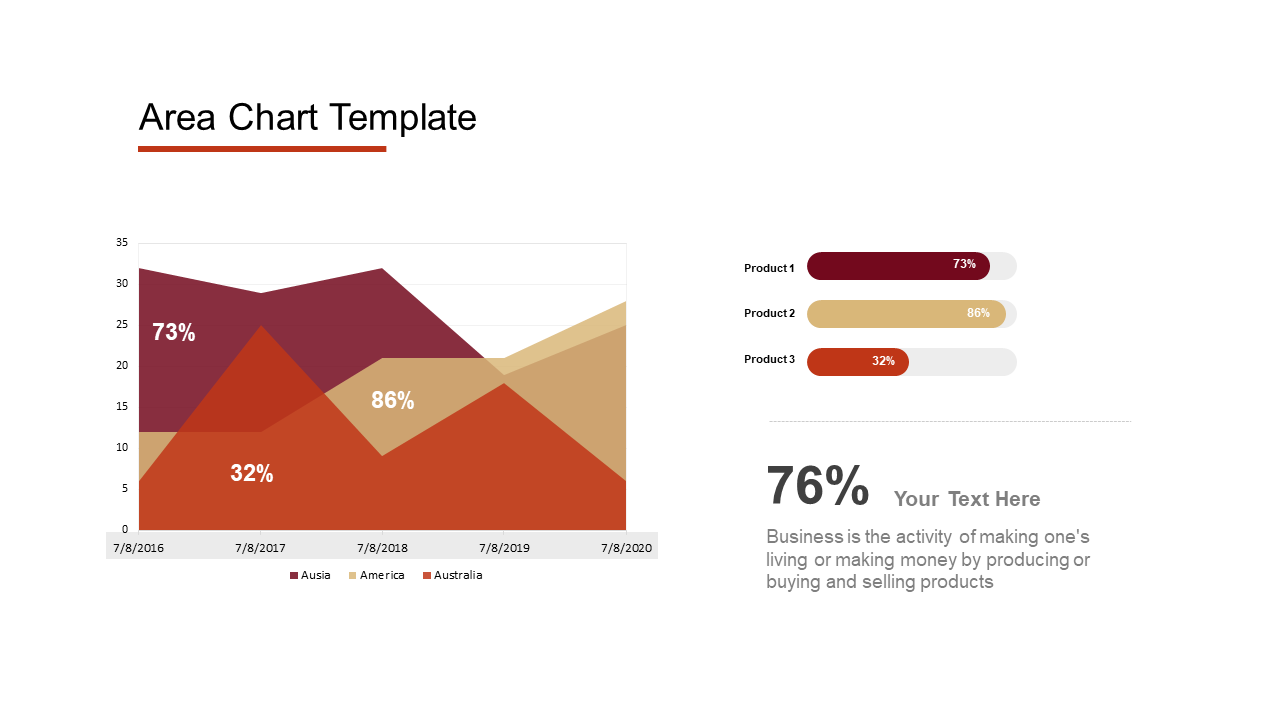
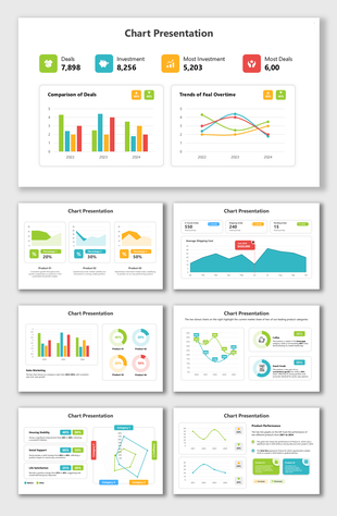
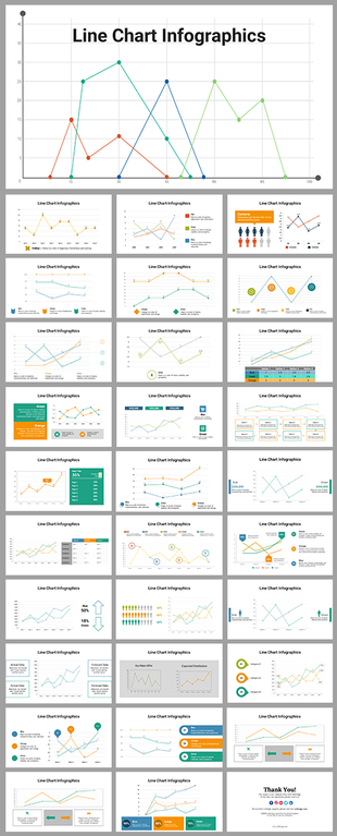
Numbers can be powerful, but sometimes they just sit there on a slide, looking dull. This PowerPoint chart PPT template is here to change that! It's like having a personal data translator, turning complex information into clear, engaging visuals that grab your audience's attention.
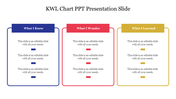
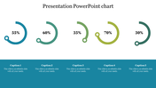
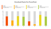
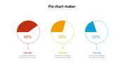
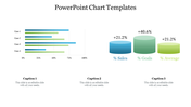
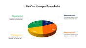
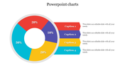
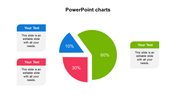
A chart that practically tells a story! This user-friendly design features three color-coded sections, making it easy to compare and contrast information. There's even a dedicated text area where you can add details, product descriptions, or percentages to provide rich context.
Marketing professionals can use them to showcase sales figures, educators can leverage them to represent student performance data, and business analysts can employ them to convey financial results. Download this template today and watch your data come alive! It's time to turn numbers into powerful storytelling tools.
Features of the template
- 100% customizable slides and easy to download.
- The slides contain 16:9 and 4:3 formats.
- Easy to change the colors quickly.
- It is a well-crafted template with an instant download facility.
- It is a 100% pre-designed slide.
- The slide holds vibrant colors.
You May Also Like These PowerPoint Templates
Showing20 of69,218 templates