Drone Model Chart PowerPoint Templates And Google Slides Themes

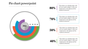
Chart Presentation Template
Transform your presentations with our Chart PPT Presentation Templates. Our template features a dark background with white text. Two large circles labeled 2015 and 2020 are connected by an arrow, suggesting a timeline or progression. Each circle is divided into segments representing different sectors where drones are used: Agriculture, Energy, Entertainment, and Other applications. The segments are color-coded: Agriculture (dark grey), Energy (yellow), Entertainment (orange), and Other applications (light grey).
Purpose of the Slide: It visually illustrates how drone usage has changed or is projected to change across various sectors over the next five years.
Beneficiaries: Professionals and students who need to present information on drone usage trends: Researchers studying drone applications, Industry experts in agriculture, energy, entertainment, or other relevant fields, Policymakers and regulators involved in drone legislation.
Download our "Chart Presentation Templates" today and make your next presentation a standout success.
Features of the template:
- Slides are available in 4:3 & 16:9
- Well-crafted template with instant download.
- Get slides that are 100% customizable and easy to download


You May Also Like These PowerPoint Templates
Add to Wishlist
Download
AI Customize


Add to Wishlist
Download
AI Customize

Add to Wishlist
Download
AI Customize

Add to Wishlist
Download
AI Customize

Add to Wishlist
Download
AI Customize

Add to Wishlist
Download
AI Customize

Add to Wishlist
Download
AI Customize

Add to Wishlist
Download
AI Customize

Add to Wishlist
Download
AI Customize

Add to Wishlist
Download
AI Customize

Add to Wishlist
Download
AI Customize

Free
Add to Wishlist
Download
AI Customize

Add to Wishlist
Download
AI Customize

Add to Wishlist
Download
AI Customize

Free
Add to Wishlist
Download
AI Customize


Add to Wishlist
Download
AI Customize

Add to Wishlist
Download
AI Customize
