Free - Editable PowerPoint Charts Template And Google Slides

Free
Histogram on the left and Pareto chart in pink and orange with cumulative line on the right.
P.ID : 11835
    664 views
    92 Downloads
    Get Custom Slides by Experts
    Instantly Access Templates in PowerPoint

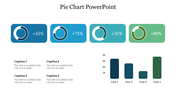
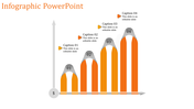
    Two Node PowerPoint Charts Template Presentation


    In short, PowerPoint charts are one of the key drivers that help drive raw data and turn it into apparently meaningful panes of valuable information. 

    Slide Description: 

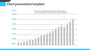
    The PowerPoint Charts template and Google Slides provide a colorful solution with histograms and Pareto charts. These types of charts will let you draw how distributions look, and also give a view of those factors that most strongly influence your data sets. 

    Overview:

    Histograms plot numerical data distribution, while Pareto charts plot categorical data based on frequency and cumulative effect. Both are extremely useful in analysis and in arriving at decisions in quite a host of businesses. 

    Purpose of Slide:

    This slide will help to provide clear and effective visualization of data using histograms and Pareto charts. It can also be used to show frequency distributions and prioritize factors in order of importance.

    Who is interested?

    The template serves well in the areas of data analysis, business management, and education. Whether you want to analyze sales, performance data, or educational statistics, this template will make your work stand out by representing data in clear and professional graphs.

    Download this PowerPoint charts template

    Features of the template


    • 100% customizable slides and easy to download.
    • The slides contain 16:9 and 4:3 formats.
    • Easy to change the colors quickly.
    • It is a well-crafted template with an instant download facility.
    • It is a 100% pre-designed slide.
    • The slide holds vibrant colors.
    Advertisement

    You May Also Like These PowerPoint Templates

    Add to Wishlist
    Download
    AI Customize
    Gantt chart PowerPoint template displaying project tasks over a four week timeline with placeholder text.
    Add to Wishlist
    Download
    AI Customize
    Versatile PowerPoint Chart Templates for Data Insights
    Add to Wishlist
    Download
    AI Customize
    Horizontal bar chart with three color-coded series, labeled values, and a left side legend with numbered captions.
    Add to Wishlist
    Download
    AI Customize
    Slide deck with multiple circular progress bars in various colors, showing percentages and captions below.
    Add to Wishlist
    Download
    AI Customize
    Slide with a horizontal bar chart on the left and 3D cylindrical percentage charts in blue, green, and teal, on the right.
    Add to Wishlist
    Download
    AI Customize
    Horizontal bar chart with four labeld sections A to D, in purple, pink, teal, and blue, and captions below.
    Add to Wishlist
    Download
    AI Customize
    Business chart slide with a red and black line graph on the left, a red bar chart on the right, and two description sections.
    Free
    Add to Wishlist
    Download
    AI Customize
    Purple bar chart PPT slide with years 2018 to 2021 and percentages and a businesswoman presenting the information.
    Free
    Add to Wishlist
    Download
    AI Customize
    Layered area chart with Series 1 in yellow, Series 2 in orange, and Series 3 in black, showing data trends over time.
    Add to Wishlist
    Download
    AI Customize
    Clustered bar chart comparing data across quarters with horizontal bars in various colors.
    Add to Wishlist
    Download
    AI Customize
    Slide with three vertical boxes in blue, red, and green banners, and rounded icons labeled K, W, and L for learning stages.
    Add to Wishlist
    Download
    AI Customize
    PowerPoint chart template showing stacked bar graphs with different categories and values for each year from 2016 to 2019.
    Add to Wishlist
    Download
    AI Customize
    Line graph infographic showing data from 2015 to 2020, with three colored lines in purple, yellow, and green, and text.
    Add to Wishlist
    Download
    AI Customize
    Donut chart in blue and orange displaying percentage, with matching colored caption boxes on either side.
    Add to Wishlist
    Download
    AI Customize
    Our Predesigned Chart Templates PPT Slides Designs
    Add to Wishlist
    Download
    AI Customize
    KWL chart slide with three columns in blue, red, and gold, representing learning insights.
    Add to Wishlist
    Download
    AI Customize
    Infographic with four bar graphs, each showing data points A to D, and captions areas in green boxes.
    Add to Wishlist
    Download
    AI Customize
    Slide with four pie charts in green and blue, paired with text boxes, and a silhouette of a woman holding a bag on the right.