Multicolored Pie Chart PPT Template for Data Breakdown


Visualize Data Effectively with our Pie Chart Template
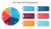
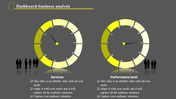
Using pie charts is essential for presenting data clearly and concisely. Empower your presentations with our Pie Chart PPT template and Google Slides Themes. This versatile template features a dynamic pie chart divided into three vibrant colors, each representing a percentage level. It has captions and text areas to seamlessly explain data points, trends, and insights to your audience. Ideal for analysts, researchers, educators, and business professionals, this template simplifies complex data visualization, enabling you to convey information with precision and clarity. Whether you're delivering sales reports, financial forecasts, or project progress updates, our chart template equips you with the tools to captivate your audience and make informed decisions. Elevate your presentations and transform data into compelling narratives with ease.
Features of the template
- 100% customizable slides are easy to download.
- Slides are available in different colors.
- The slide has 4:3 and 16:9 formats.
- It is easy to change the slide colors quickly.
- It has a cute design to impress an audience.
- Create feature-rich, animated presentations.


You May Also Like These PowerPoint Templates


Add to Wishlist
Download
Edit

Add to Wishlist
Download
Edit

Add to Wishlist
Download
Edit

Add to Wishlist
Download
Edit

Add to Wishlist
Download
Edit

Add to Wishlist
Download
Edit

Add to Wishlist
Download
Edit

Add to Wishlist
Download
Edit

Add to Wishlist
Download
Edit

Add to Wishlist
Download
Edit

Add to Wishlist
Download
Edit

Add to Wishlist
Download
Edit

Add to Wishlist
Download
Edit

Add to Wishlist
Download
Edit

Add to Wishlist
Download
Edit

Add to Wishlist
Download
Edit

Add to Wishlist
Download
Edit

Add to Wishlist
Download
Edit
