Free - Editable Pie Chart PowerPoint Presentation Template
Free

 Canva
Canva
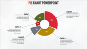
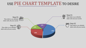
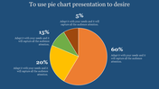
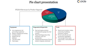
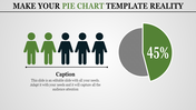
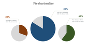
Data Representation And Comparison Using Pie Chart
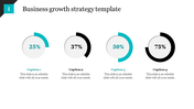
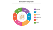
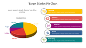
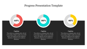
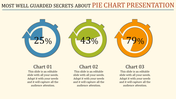
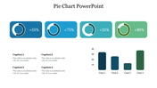
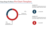
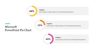
Pie Charts are primarily used in business marketing, projects, education, reports, sales, etc. It is an easy way to show up data; you can also make a comparison with that quickly. You can show the data in percentages and make it more unique using colors.
About the template:
Using this slide, you can make an excellent presentation. You can show the difference among the data with the colors. You can edit this on your own; adding values is more accessible than usual. Download this for free and make an exciting data representation. For more chart slides, visit the category page; you can get free slides there.
Features of this template:
- Innovative slide background designs
- 100% easy to edit and customize slides
- The slide contained 16:9 and 4:3 format.
- Easy to change the slide colors quickly.
- The elegant look of this template will give life to your process presentation.
- Easy to add values.
- Graphics are elegant and change depends on value.
- Highly compatible with PowerPoint, Google Slides and Canva templates


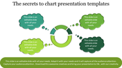
You May Also Like These PowerPoint Templates
Add to Wishlist
Download
Edit

Add to Wishlist
Download
Edit

Add to Wishlist
Download
Edit

Add to Wishlist
Download
Edit

Add to Wishlist
Download
Edit

Add to Wishlist
Download
Edit


Add to Wishlist
Download
Edit


Add to Wishlist
Download
Edit


Add to Wishlist
Download
Edit


Add to Wishlist
Download
Edit

Add to Wishlist
Download
Edit


