Infographic Charts for PowerPoint Presentations Template
Free
Nodes
Colors
Infographic PowerPoint Template and Google Slides
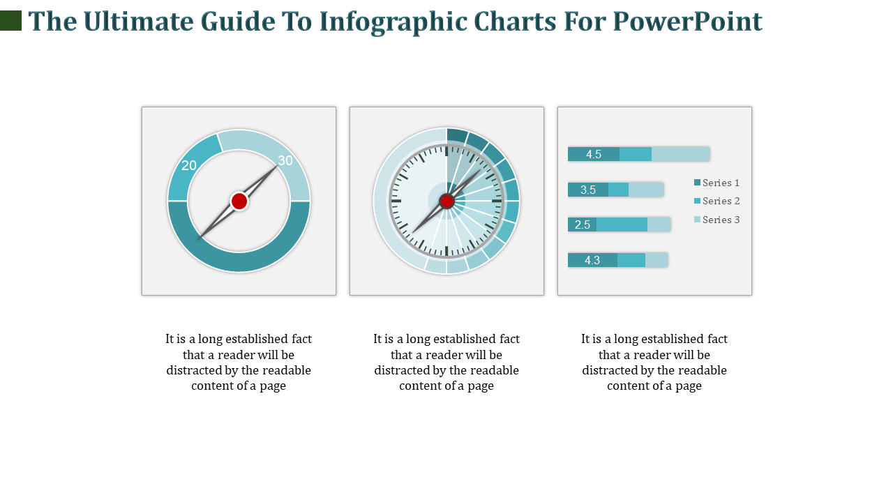
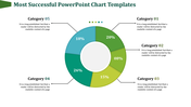
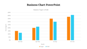
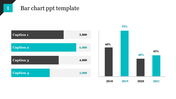
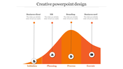
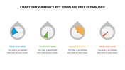
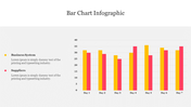
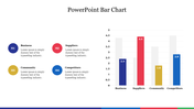
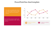
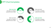
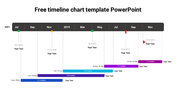
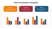
The "Infographic PowerPoint Template and Google Slides" provides a versatile collection of infographic charts designed to enhance presentations. The image showcases a guide to infographic charts, featuring a compass, speedometer, and a bar graph. These visual elements are intended to effectively convey complex information in a visually appealing and easy-to-understand format.
This template is ideal for professionals, educators, and students who need to create engaging and informative presentations that utilize infographic charts. It can be used in various contexts, including business meetings, academic lectures, workshops, and conferences, to communicate data, statistics, processes, and concepts more effectively.
Compatibility with PowerPoint and Google Slides. Available in 16:9 and 4:3 aspect ratios, catering to different screen sizes and presentation preferences. Provided in ZIP format for easy sharing and distribution. 100% customizable features. Download now.
Explore Related Collections
Recommended based on this template.
You May Also Like These PowerPoint Templates
Showing20 of69,218 templates