Chart PowerPoint Templates and Google Slides

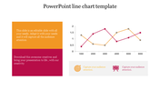
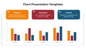
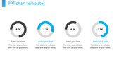
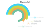
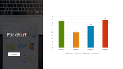
Chart PowerPoint Templates and Google Slides
The "Chart PowerPoint Templates and Google Slides" feature a visually dynamic slide from a PowerPoint presentation, showcasing a 3D bar graph with 10 bars, each colored in three different hues.
These templates serve as powerful tools for professionals across various industries, including finance, marketing, data analysis, and academic research. They are particularly useful for presenting statistical data, market trends, financial projections, or research findings in a visually appealing and easy-to-understand format. Designed for business professionals, analysts, educators, and students seeking to visualize data and communicate insights effectively.
Compatible with PowerPoint and Google Slides, ensuring seamless integration and accessibility across different presentation platforms. Available in "16:9" and "4:3" formats, as well as zip files, providing flexibility to adapt to various presentation settings and preferences. Fully customizable, allowing users to adjust colors, labels, and other elements to suit their specific data visualization needs. Download these free templates now.


You May Also Like These PowerPoint Templates

Add to Wishlist
Download
Edit


Add to Wishlist
Download
Edit

Add to Wishlist
Download
Edit


Add to Wishlist
Download
Edit


Add to Wishlist
Download
Edit

Add to Wishlist
Download
Edit


Add to Wishlist
Download
Edit

Add to Wishlist
Download
Edit


