Financial Dashboard PowerPoint Template and Google Slides
 Canva
Canva
Financial Dashboard Presentation Template
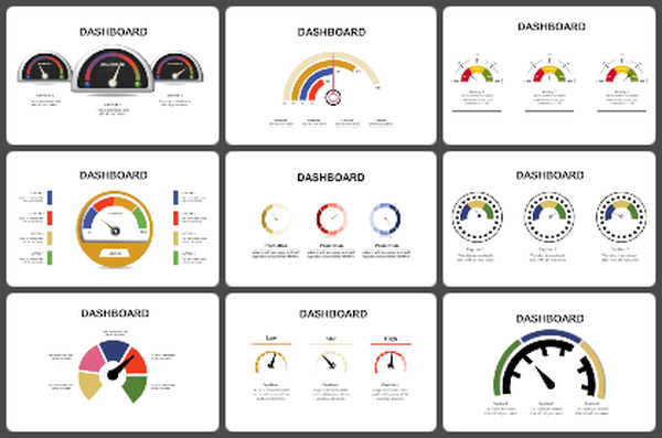
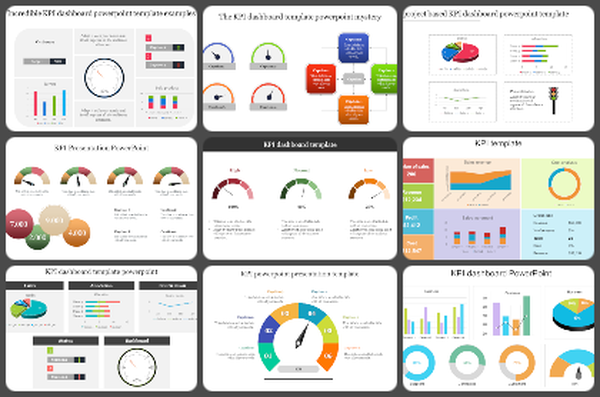
A financial dashboard is useful only when it helps people see the numbers faster. In most meetings, the problem is not a lack of data. The problem is that the data is spread across too many sheets, charts, and reports. A good dashboard brings key figures into one view, so trends, gaps, and changes are easier to spot.
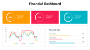
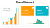
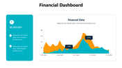
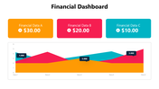
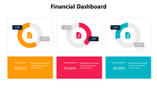
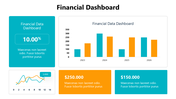
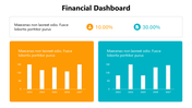
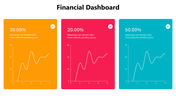
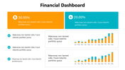
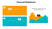
This slide deck is built for that kind of work. It includes layouts for summary cards, bar charts, line charts, area graphs, comparison panels, progress rings, and percentage blocks. That makes it useful when you need to present revenue, cost, growth, targets, or other performance indicators without overloading the audience. Instead of forcing every update into one chart style, the deck gives several ways to show the same numbers depending on the purpose of the review.
The design also supports quick reading. Large metric boxes, clean chart areas, and strong color contrast help separate one data point from the next. This is helpful for finance teams, managers, analysts, founders, and consultants who need to turn raw numbers into slides that are easier to present. Use it for monthly reviews, KPI updates, budget tracking, business reports, and internal performance discussions. Download it and adapt the layouts to build a financial dashboard that is easier to read, easier to explain, and easier to act on.
Features of this template:
- Fully editable financial dashboard slides.
- Available in 16:9 and 4:3 formats.
- Compatible with PowerPoint, Google Slides, and Canva.
- Includes dashboard layouts with summary cards, line charts, bar charts, area graphs, and progress visuals.
- Useful for KPI tracking, budget reviews, revenue updates, performance reports, and financial presentations.
- Helps present multiple data points in one cleaner view.
- Uses color-coded metric blocks for faster comparison.
- Suitable for finance teams, analysts, managers, consultants, and business reporting.
You May Also Like These PowerPoint Templates
Free
Add to Wishlist
Download
AI Customize

Add to Wishlist
Download
AI Customize

Add to Wishlist
Download
AI Customize

Add to Wishlist
Download
AI Customize

Add to Wishlist
Download
AI Customize

Add to Wishlist
Download
AI Customize

Add to Wishlist
Download
AI Customize

Add to Wishlist
Download
AI Customize

Add to Wishlist
Download
AI Customize

Add to Wishlist
Download
AI Customize

Add to Wishlist
Download
AI Customize

Add to Wishlist
Download
AI Customize

Add to Wishlist
Download
AI Customize

Free
Add to Wishlist
Download
AI Customize


Add to Wishlist
Download
AI Customize

Add to Wishlist
Download
AI Customize


Add to Wishlist
Download
AI Customize

Add to Wishlist
Download
AI Customize
