Professional Executive Dashboard PowerPoint Template
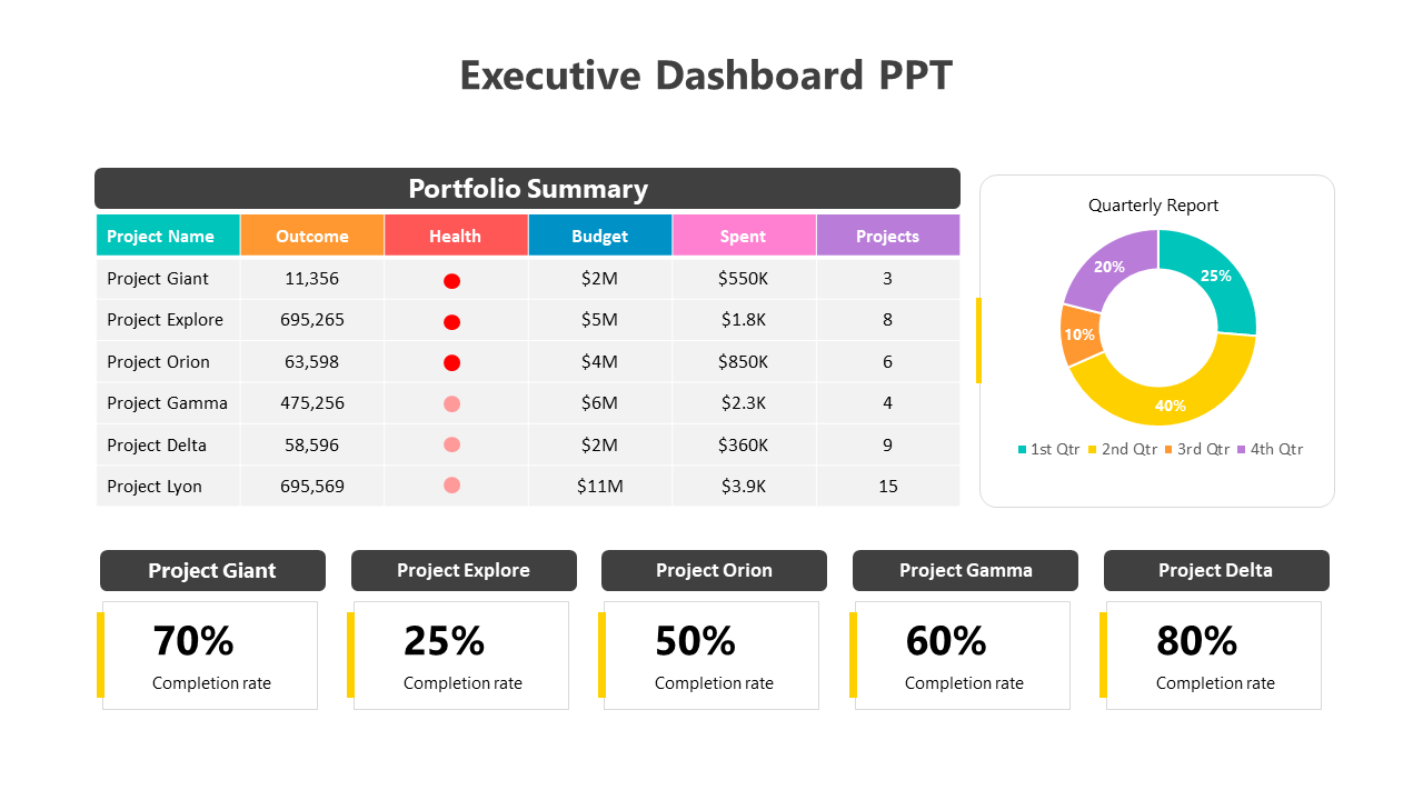
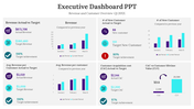
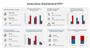
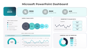
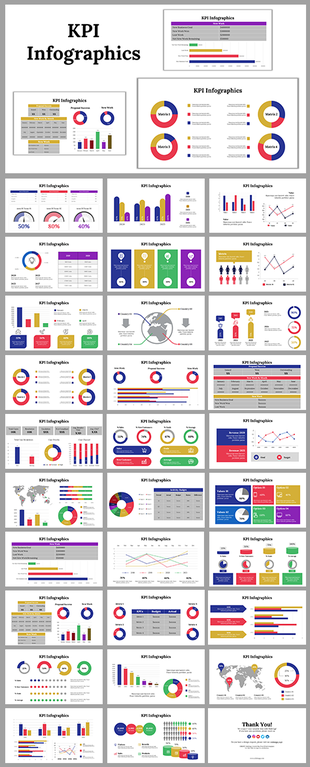
Executive dashboard with a portfolio summary table listing project details and a pie chart displaying a quarterly report.
P.ID : 4024
    1.9K+ views
    337 Downloads
    Designer
    Kavitha
    Get Custom Slides by Experts
    Enhance Your Presentations with Add-ins
    Google Slides Add-in
    Access templates directly in Google Slides
    Microsoft PowerPoint Add-in
    Access templates directly in PowerPoint
    GPT Add-on
    AI-powered presentation assistance

    Executive PowerPoint Template


    Looking for a template to track the key performance indicators? Our executive PowerPoint template helps with that.The template has a tabular form to represent the budget spent on project and outcomes. It also comes with a circular chart diagram to show the quarterly report. 

    Bottom of the slide is provided with percentages relevant to the project data. Suitable to help business executives track key performance indicators (KPIs) and make data-driven decisions. Also ideal to track trends, compare metrics, and identify areas for improvement. Download now to track your business progress towards goals.

    Features of the template

    • 100% customizable slides and easy to download.
    • Slides are available in different nodes & colors.
    • The slide contains 16:9 and 4:3 formats.
    • It is easy to change the colors of the slide quickly.
    • Well-crafted template with an instant download facility.
    Advertisement

    You May Also Like These PowerPoint Templates
    Free
    Add to Wishlist
    Download
    Edit
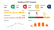
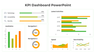
    Dashboard layout includes a line graph, pie chart, and three bar graphs, all colored in red, green, and blue.
    Free
    Add to Wishlist
    Download
    Edit
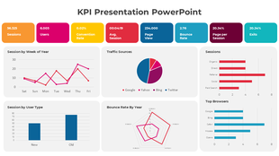
    Project dashboard slide for electricity data with bar graphs showing units and amounts for different categories and months.
    Add to Wishlist
    Download
    Edit
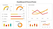
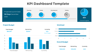
    KPI dashboard slide featuring six charts vertical bars, horizontal bars, area graph, pie chart, and column bar graphs.
    Free
    Add to Wishlist
    Download
    Edit
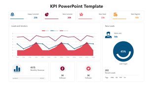
    KPI dashboard with percentage stats, bar charts, and flow diagrams in red, blue, and orange representing data trends.