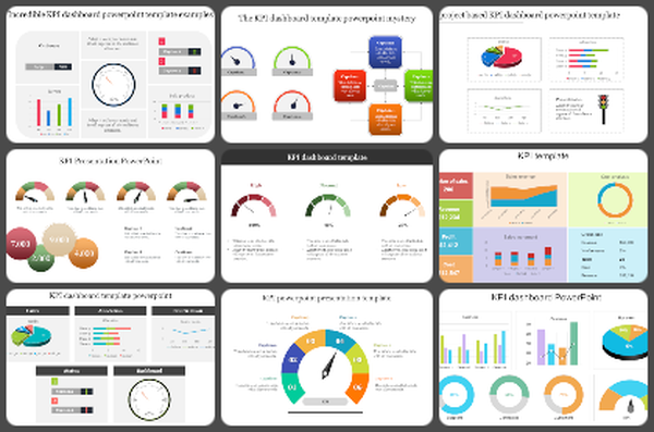
Simple Executive Dashboard PPT And Google Slides Template


Executive Dashboard PowerPoint
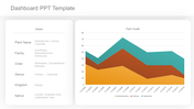
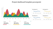
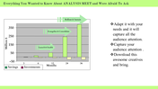
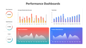
The Executive Dashboard offers a comprehensive snapshot of organizational performance through visually compelling charts comparing revenue and customer data against targets and previous years. Featuring several charts, the dashboard facilitates a quick and comprehensive assessment of key performance indicators. Each chart is meticulously designed with black text and lines for clarity, while the bars and points are presented in vibrant colors such as blue and red, enhancing visual appeal and aiding in data interpretation. This template is an invaluable resource for business executives, senior managers, and decision-makers across industries, empowering them to make informed strategic decisions based on real-time insights. With fully editable slides, users can effortlessly customize the dashboard to align with their specific reporting needs and preferences. By leveraging this template, presenters can streamline the process of creating executive-level reports and presentations, effectively communicating critical information to stakeholders with clarity and confidence. Download our Executive Dashboard template today and unlock the power to drive organizational success through data-driven decision-making.
Features of this template
- 100% customizable slides and easy to download.
- Slides are available in different nodes & colors.
- The slide contains 16:9 and 4:3 formats.
- Easy to change the colors of the slide quickly.
- Highly compatible with PowerPoint and Google Slides.
- Well-crafted template with an instant download facility.
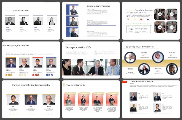
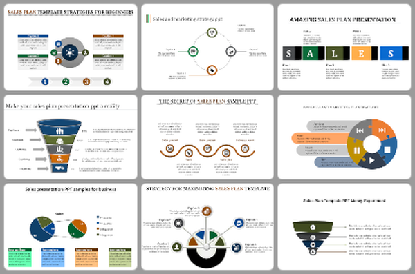
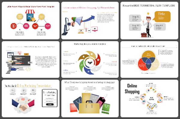
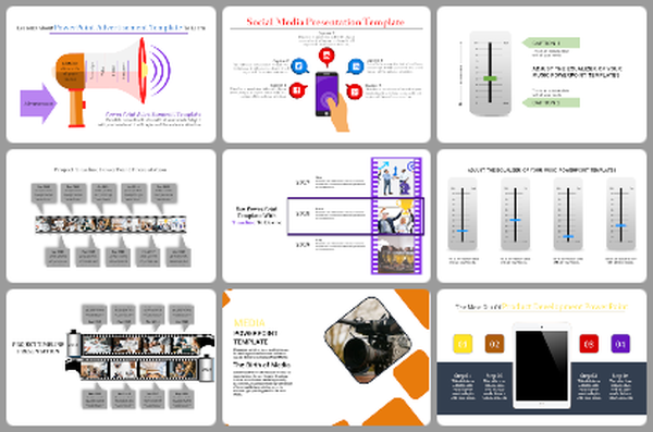
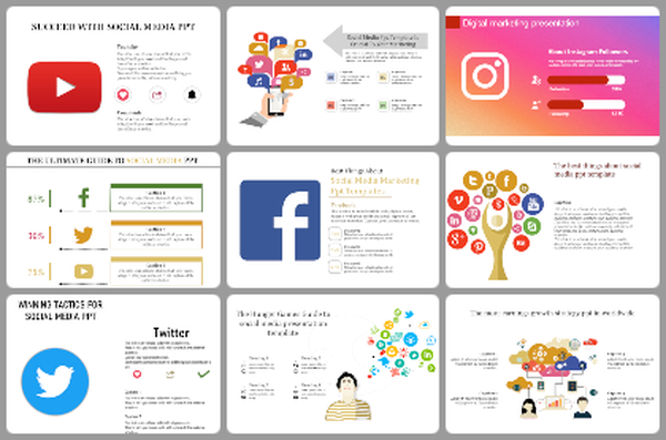
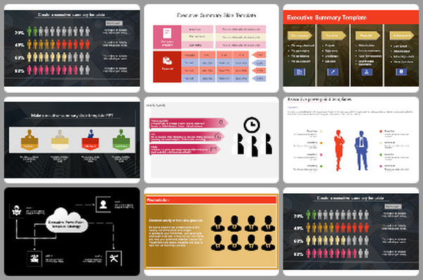
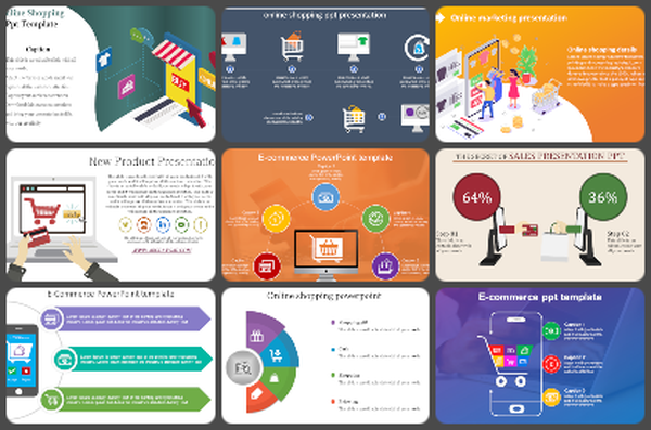
You May Also Like These PowerPoint Templates
Add to Wishlist
Download
AI Customize

Add to Wishlist
Download
AI Customize

Add to Wishlist
Download
AI Customize

Add to Wishlist
Download
AI Customize

Add to Wishlist
Download
AI Customize

Add to Wishlist
Download
AI Customize

Add to Wishlist
Download
AI Customize

Add to Wishlist
Download
AI Customize

Add to Wishlist
Download
AI Customize

Add to Wishlist
Download
AI Customize

Add to Wishlist
Download
AI Customize

Add to Wishlist
Download
AI Customize


Add to Wishlist
Download
AI Customize

Add to Wishlist
Download
AI Customize

Free
Add to Wishlist
Download
AI Customize

Add to Wishlist
Download
AI Customize

Add to Wishlist
Download
AI Customize

