Simple Chart Presentation Template Slide Design-Two Node

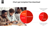
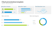
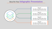
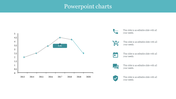
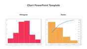
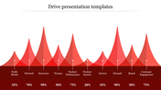
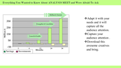
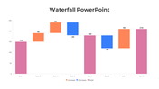
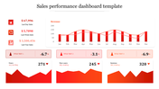
Chart Presentation Template and Google Slides Themes
Charts are the cornerstone of effective data communication, turning difficult data into clear, compelling visuals. Our "Chart Presentation Template" in shades of blue and dark blue is designed to help you craft engaging presentations effortlessly.
What is so unique about our slide?
This chart PPT template simplifies the process of presenting data insights with a variety of intuitive chart designs. Whether you're showcasing sales trends, project milestones, or survey results, our template offers versatile options to visually convey your message.
Purpose of the Slide:
The Chart slide enhances clarity and engagement in presentations, transforming raw data into meaningful charts that facilitate better understanding and decision-making.
Who can use this Slide?
Perfect for professionals, educators, students, and anyone needing to illustrate financial reports, marketing strategies, academic research, and more to communicate with precision and impact.
Download now!
Features of the template:
- 100% customizable slides and easy to download.
- The slides contain 16:9 and 4:3 formats.
- Easy to change the colors quickly.
- It is a well-crafted template with an instant download facility.
- It is a 100% pre-designed slide.


You May Also Like These PowerPoint Templates
Add to Wishlist
Download
Edit

Add to Wishlist
Download
Edit

Add to Wishlist
Download
Edit

Add to Wishlist
Download
Edit

Add to Wishlist
Download
Edit

Add to Wishlist
Download
Edit

Add to Wishlist
Download
Edit

Add to Wishlist
Download
Edit

Add to Wishlist
Download
Edit

Add to Wishlist
Download
Edit

Add to Wishlist
Download
Edit

Add to Wishlist
Download
Edit

Add to Wishlist
Download
Edit

Add to Wishlist
Download
Edit

Add to Wishlist
Download
Edit

Add to Wishlist
Download
Edit

Add to Wishlist
Download
Edit

Add to Wishlist
Download
Edit


Add to Wishlist
Download
Edit
