Free - Business Chart PPT Template for Corporate Reporting
Free
Visualize Success: Chart Template with Grey Theme
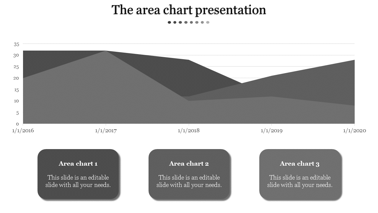
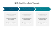
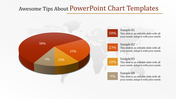
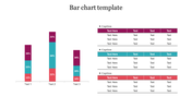
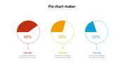
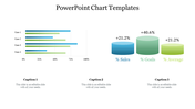
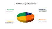
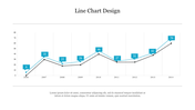
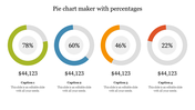
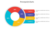
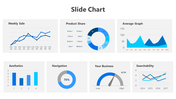
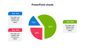
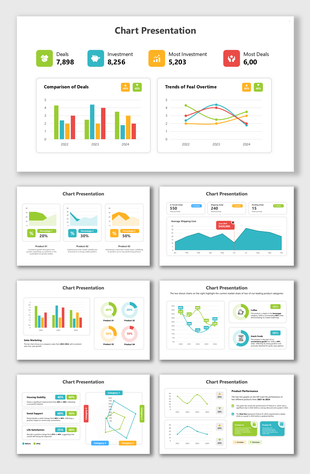
Discover the power of data visualization with our Chart Presentation Template and Google Slides Themes. Ideal for analysts, educators, and business professionals, this template showcases a sophisticated grey-themed chart adorned with three text areas. You can use this for presenting sales figures, market trends, or research findings. Also, it allows users to convey complex information with clarity and precision. From boardroom meetings to academic lectures, this template empowers presenters to captivate their audience and make informed decisions. Elevate your presentations with dynamic visuals and compelling insights, guiding your audience toward actionable outcomes. Streamline your data presentation process and leave a lasting impression with our versatile chart template.
Features of the template
- 100% customizable slides are easy to download.
- Slides are available in different colors.
- The slide has 4:3 and 16:9 formats.
- It is easy to change the slide colors quickly.
- It has a cute design to impress an audience.
- Create feature-rich, animated presentations.
You May Also Like These PowerPoint Templates
Showing20 of69,218 templates