sales growth plan powerpoint presentation chart model









Sales Growth Plan PowerPoint Presentation
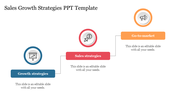
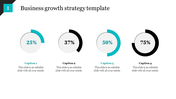
Ignite your sales strategy with our "Sales Growth Plan PowerPoint Presentation" template. This dynamic slide unveils a comprehensive sales growth plan, strategically divided into three sections, each housing a distinct chart. The first chart illuminates the sales growth of the previous year, the second chart reveals the current year's performance, and the third chart forecasts the sales growth for the upcoming year.
Tailor-made for sales professionals, business leaders, or anyone tasked with presenting and strategizing sales growth. Perfect for presentations during sales meetings, performance reviews, or stakeholder discussions where conveying a clear and visually impactful sales growth plan is crucial. Use this template to communicate your past successes, current achievements, and future projections in a concise and engaging manner.
This versatile template supports both "16:9" and "4:3" PowerPoint formats, accommodating diverse presentation styles. Delivered in a convenient "zip" format, the template facilitates seamless sharing and accessibility for enhanced collaboration.
Transform your sales presentations—download the "Sales Growth Plan PowerPoint Presentation" now.
You May Also Like These PowerPoint Templates









Showing20 of69,218 templates