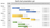
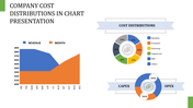
Incredible Chart Presentation PowerPoint Slides Template

Three-Noded Chart PowerPoint Template
Download our Incredible Chart Presentation PowerPoint Slides Template to present your data in a visually appealing manner. It is easy to use and follow and very effective when increasing a company's sales. If you want to make a professional presentation, you must not hesitate to use this template because it is quite effective and can easily attract customers.
About the template:
The incredible Chart PowerPoint Slides Template comes three charts which represent three years. It helps to visualize the growth more clearly and effectively. You can also modify the font style, background, nodes, colors, etc., if necessary. It is also possible to include more graphics, charts, textboxes, company's logo, etc.
Features of this template:
1. 100% customizable slides and easy to download.
2. Slides available in different nodes & colors.
3. The slide contained 16:9 and 4:3 format.
4. Easy to change the slide colors quickly.
5. Well-crafted template with instant download facility.
6. The best chart slide.


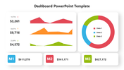
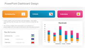
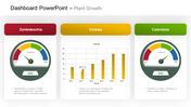
You May Also Like These PowerPoint Templates


Add to Wishlist
Download
Edit


Add to Wishlist
Download
Edit

Add to Wishlist
Download
Edit

Add to Wishlist
Download
Edit


Add to Wishlist
Download
Edit

Add to Wishlist
Download
Edit


Add to Wishlist
Download
Edit

Add to Wishlist
Download
Edit


Add to Wishlist
Download
Edit

Add to Wishlist
Download
Edit

Add to Wishlist
Download
Edit

Add to Wishlist
Download
Edit
