Simple Chart Presentation PowerPoint Slide Templates

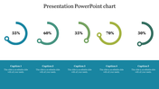
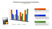
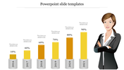
Chart Presentation PowerPoint Templates
Elevate your data visualization game with our "Chart Presentation PowerPoint Templates." This dynamic template features a visually impactful chart displaying the percentage of sales in each quarter of the year, creating a compelling visual narrative for your audience.
Tailored for professionals seeking to present sales data with precision and impact, this template is ideal for quarterly business reviews, sales presentations, or financial reports. Whether you're engaging with stakeholders, team members, or clients, this chart template enhances the clarity and effectiveness of your data-driven presentations.
Designed for business analysts, sales professionals, financial experts, and presenters across various industries, this template empowers you to communicate sales performance effectively. Deploy this template whenever you need to showcase and analyze sales performance across different quarters.
Versatility in both "16:9" and "4:3" PowerPoint formats, ensuring compatibility with diverse presentation styles. Convenient "zip" format for easy sharing and accessibility, facilitating seamless collaboration. Download now to effortlessly communicate your sales data, captivate your audience, and make your presentations more impactful.


You May Also Like These PowerPoint Templates

Add to Wishlist
Download
AI Customize


Free
Add to Wishlist
Download
AI Customize

Add to Wishlist
Download
AI Customize


Add to Wishlist
Download
AI Customize

Add to Wishlist
Download
AI Customize

Free
Add to Wishlist
Download
AI Customize

Add to Wishlist
Download
AI Customize


Add to Wishlist
Download
AI Customize

Add to Wishlist
Download
AI Customize

Add to Wishlist
Download
AI Customize

Add to Wishlist
Download
AI Customize

Free
Add to Wishlist
Download
AI Customize
