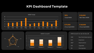
Six Months KPI Dashboard PowerPoint Template Slide
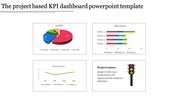
Mind-Blowing Dashboard Template
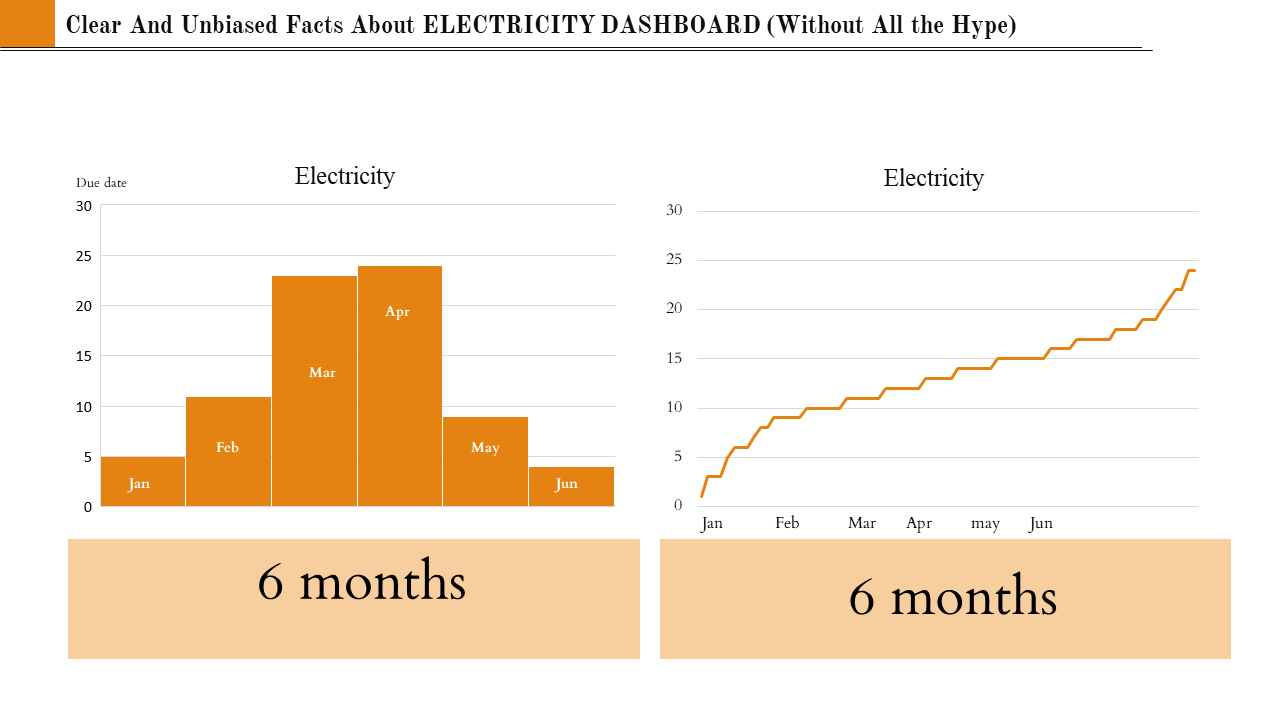
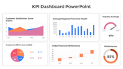
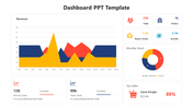
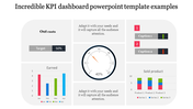
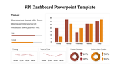
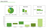
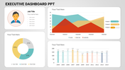
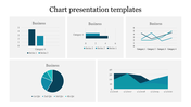
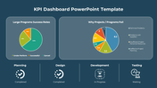
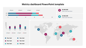
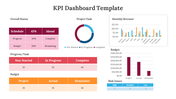
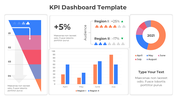
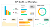
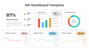
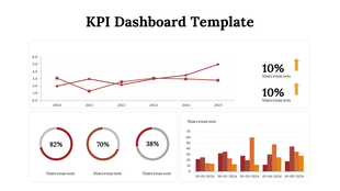
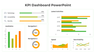
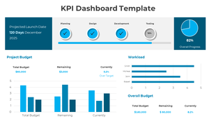
Through this template, you can exactly give a precise analysis of the happenings in the past six months. Visually represent your data and give an accurate report about the electricity flow. You can prominently represent your ideas and analysis with the bar diagram and graph—the KPI dashboard shares all your pieces of information at a glance. The informative animations and their innovative arrangements convey all your desired points in a spark of a moment. You can just add your facts with the user-friendly options we provided and make a renowned slide within seconds.
Features of this template
- 100% customizable slides and easy to download
- Slides are available in different nodes & colors.
- The slides contained 16:9 and 4:3 formats.
- Easy to change the slide colors quickly.
- Well-crafted template with an instant download facility.
- Editable nodes are inserted.
- Available at an affordable cost.
You May Also Like These PowerPoint Templates
Showing20 of69,218 templates