Chart Presentation Template and Google Slides Themes


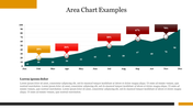
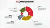
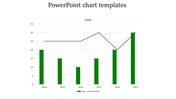
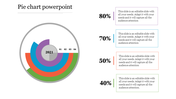
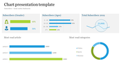
Chart Presentation Template and Google Slides
Our Chart Presentation Template offers a visually engaging way to present your data and analytics with clarity and impact. Featuring a bar chart with perfect values, each bar is marked by various color hues, making it easy to distinguish between different data sets.
Infographics are strategically incorporated into the template, adding visual interest and helping to convey complex information in a clear and understandable manner. Whether you're showcasing market trends, sales figures, or performance metrics, this template will make your data come alive and capture the attention of your audience.
With ample space for labeling each bar with its corresponding name or category, our template ensures that your audience can easily interpret the information presented. Whether you're presenting in-person or sharing slides online, our Chart Presentation Template will help you deliver impactful and memorable presentations. Download this template today and elevate your data presentations to new heights!
Features of the template
- 100% customizable slides and easy to download.
- Slides are available in different nodes & colors.
- The slide contains 16:9 and 4:3 formats.
- It is easy to change the colors of the slide quickly.
- Well-crafted template with an instant download facility.


You May Also Like These PowerPoint Templates
Add to Wishlist
Download
Edit

Free
Add to Wishlist
Download
Edit

Add to Wishlist
Download
Edit


Add to Wishlist
Download
Edit

Add to Wishlist
Download
Edit

Add to Wishlist
Download
Edit

Add to Wishlist
Download
Edit

Add to Wishlist
Download
Edit

Add to Wishlist
Download
Edit

Add to Wishlist
Download
Edit

Add to Wishlist
Download
Edit

Add to Wishlist
Download
Edit

Add to Wishlist
Download
Edit

Add to Wishlist
Download
Edit

Add to Wishlist
Download
Edit

Add to Wishlist
Download
Edit

Add to Wishlist
Download
Edit

Add to Wishlist
Download
Edit
