MILESTONE 🌟 5 Million+ creative minds trust SlideEgg! Grab 80% OFF

Multi color Chart Template PPT Presentation Diagram

A red and black area chart with labeled series, a star badge, and four circular icons with text below.
P.ID : 4223
    116 views
    3 Downloads
    Get Custom Slides by Experts
    Instantly Access Templates in PowerPoint

    Multicolor Chart Presentation


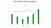
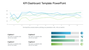
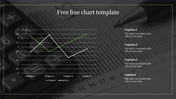
    Consider this: an attractive beginning slide with a multicolored, black, and red chart design that captures the attention of your audience. Explore the details of your data; Series 1 is represented by the dark hues, and Series 2 is shown by the passionate red hues. With ease, the chart creates a visually striking narrative of your data tale by mapping the percentage on the y-axis and the duration of time on the x-axis.

    Find thoughtfully positioned text holders and the caption slots that correspond with them in this chart design, so you can tell your story with style. Customize your presentation with ease because every component fits precisely, resulting in visually appealing and educational facts. Our Multicolor Chart Template, which is designed for both professionals and creatives, makes complex data understandable to a wide range of people by streamlining it. These slides enable you to communicate your ideas clearly and impactfully, regardless of your role—project manager examining project schedules, marketing whiz monitoring campaign performance, etc.

    Leaders in business, instructors, analysts—anyone who wants to turn unprocessed data into an engaging visual story. Utilize data-driven storytelling to enhance your presentations and hold the attention of your audience.

    Ready to boost your presentations? Download our Multicolor Chart Template now and transform the way you share insights. Let your data shine, and watch as your audience becomes captivated by the brilliance of your message! 

    Features of the Templates


    • Completely adaptable.
    • The slide show is in 4:3, 16:9, zip format.
    • There is very strong connectivity with Google Slides and PowerPoint.
    • It is simple and quick to alter the slide's color.
    • An efficient template that can be easily accessed immediately.
    • Easy to Download
    Advertisement

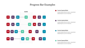
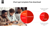
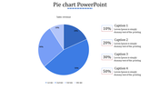
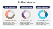
    You May Also Like These PowerPoint Templates

    Add to Wishlist
    Download
    AI Customize
    Dashboard chart displaying social media subscribers by gender, age, most read articles, and categories in 2019.
    Add to Wishlist
    Download
    AI Customize
    Three pie charts in red, yellow, and blue with percentage values, arranged horizontally with text below.
    Add to Wishlist
    Download
    AI Customize
    Chart showing blue bars representing growth metric alongside an orange line marking an ascending trend over eight categories.
    Add to Wishlist
    Download
    AI Customize
    Five segment pie chart in orange, blue, red, green, and pink, each with number and connected with text areas.
    Free
    Add to Wishlist
    Download
    AI Customize
    Line chart in teal showing data points from 2013 to 2020 on a white background, with five icons listed on the right.
    Free
    Add to Wishlist
    Download
    AI Customize
    Histogram on the left and Pareto chart in pink and orange with cumulative line on the right.
    Free
    Add to Wishlist
    Download
    AI Customize
    Slide with red triangular peaks representing various business metrics and percentage values at the base.
    Add to Wishlist
    Download
    AI Customize
    A pie chart featuring five segments, each labeled with percentages, surrounded by text on a blue background.
    Add to Wishlist
    Download
    AI Customize
    Waterfall PowerPoint chart displaying increases and decreases for eight items with color coded bars for each change.
    Add to Wishlist
    Download
    AI Customize
    Horizontal bar graph slide with four colored steps and corresponding descriptions on the right.
    Add to Wishlist
    Download
    AI Customize
    Slide with two donut charts displaying values and a text section on the right with a blurred background image.
    Add to Wishlist
    Download
    AI Customize
    Stacked column chart template displaying proportional data distribution across four categories using three series.
    Add to Wishlist
    Download
    AI Customize
    Colorful circular diagram slide illustrating four corporate strategy methods with labels and percentages.
    Add to Wishlist
    Download
    AI Customize
    KWL chart with sections  in blue, green, and red, each column containing placeholder text.
    Add to Wishlist
    Download
    AI Customize
    Vertical bar chart in red shades, displaying yearly data from 2017 to 2020, with detailed labels on the right.
    Add to Wishlist
    Download
    AI Customize
    Dark themed layout featuring four pie charts with shaded segments, each displaying different percentages.
    Add to Wishlist
    Download
    AI Customize
    Stacked traction bar graph with red, blue, green, orange bars labeled with percentage values and caption areas.