Attractive Chart Presentation Template Slide Designs
Nodes
Colors
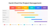
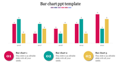
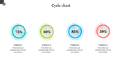
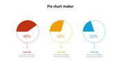
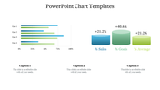
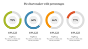
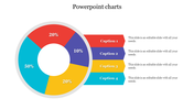
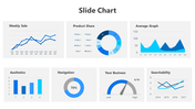
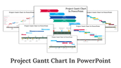
Chart Presentation Templates and Google Slides
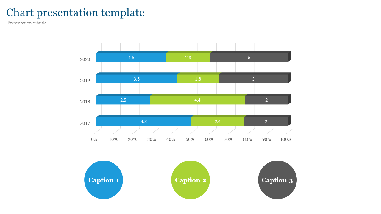
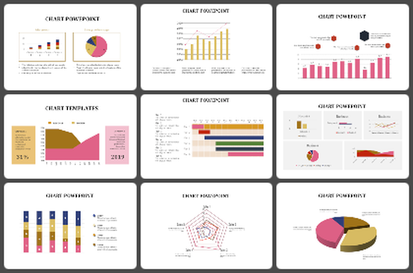
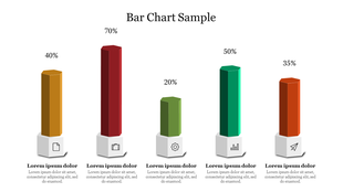
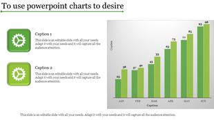
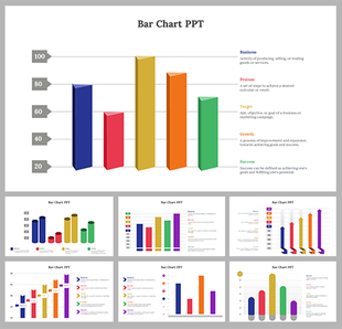
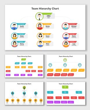
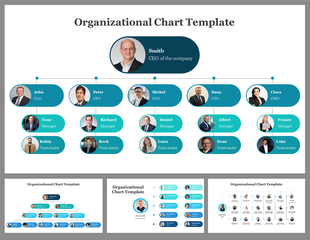
Looking for the perfect chart presentation template to elevate your business presentations? Our chart presentation template is designed with a sleek bar design and three nodes, ideal for delivering clear and impactful data visualizations. Crafted with professional shades of colors, this template ensures your charts not only stand out but also maintain a polished, business-appropriate look.
Whether you're presenting quarterly results, market analysis, or strategic plans, our presentation template with charts provides the versatility and aesthetic appeal needed to captivate your audience. The intuitive design makes it easy to customize, allowing you to highlight key data points effortlessly and keep your audience engaged.
Perfect for creative presentations and business settings alike, our chart presentation template is your go-to tool for making data-driven decisions shine. Say goodbye to dull presentations and hello to a new level of professionalism and creativity. Make your data tell a compelling story with our expertly designed template.
Features of the Template:
- 100% customizable slides and easy to download.
- Slides are available in different nodes & colors.
- The slide contains 16:9 and 4:3 formats.
- Easy to change the colors of the slide quickly.
- Well-crafted template with an instant download facility.
Explore Related Collections
Recommended based on this template.
You May Also Like These PowerPoint Templates

Showing20 of69,218 templates