Free - Effective PowerPoint Chart Template And Google Slides
Free
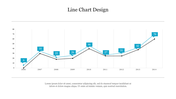
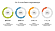
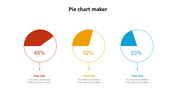
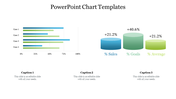
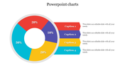
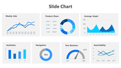
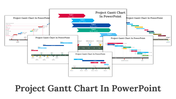
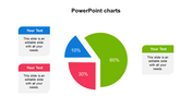
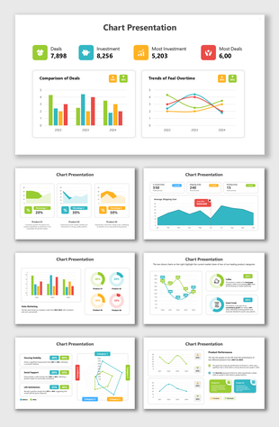
Make Your Data Shine: PPT Chart Template Presentation
Have you ever dreaded the idea of creating a stunning presentation out of your data? Don’t let the data drowning get to you – our PowerPoint Chart templates will help you swim through the information tide.
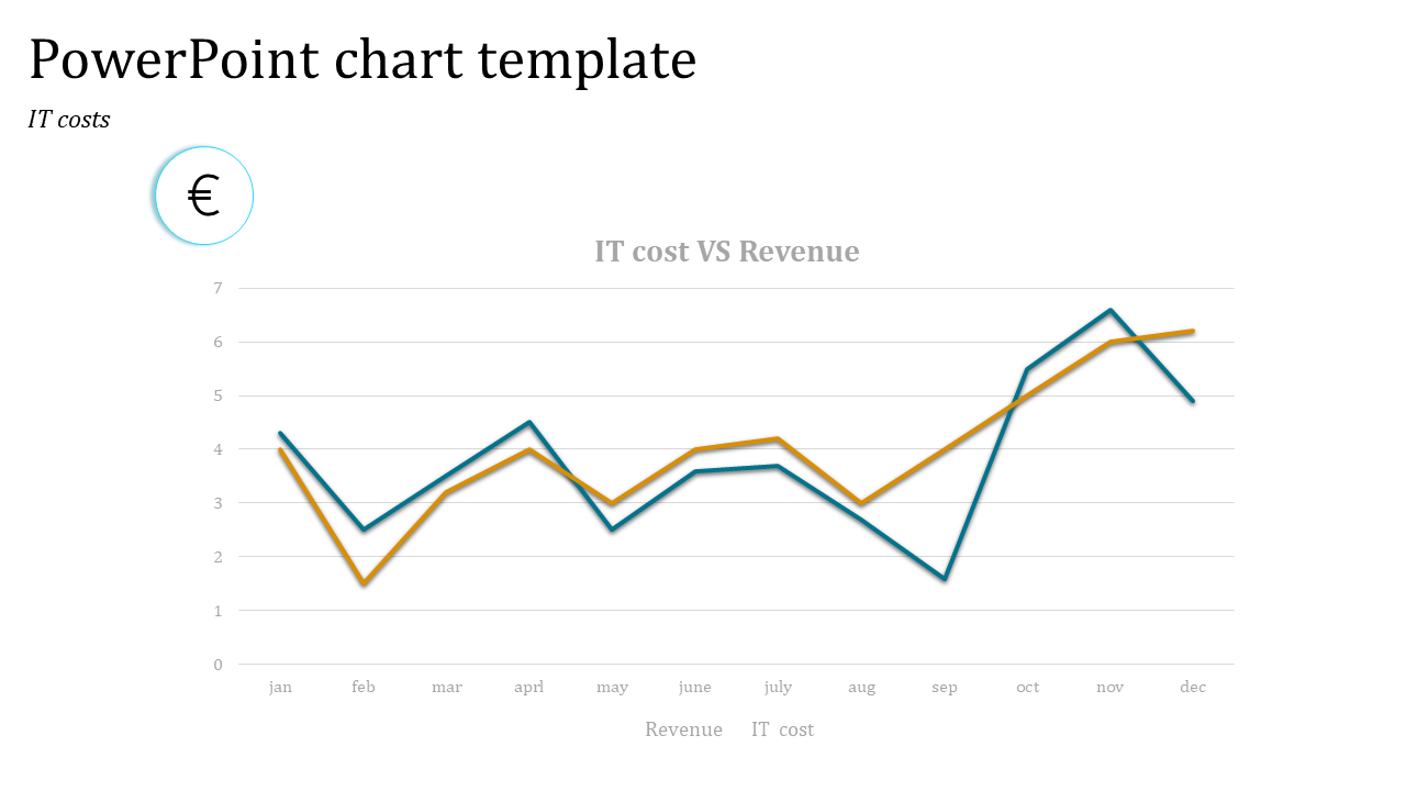
helpfully, make it easy to portray a chart with IT costs in relation to revenues within a year. But that's not all! We have a wide selection of charts and instrumentals for your consideration in this extensive library.
Who stands to benefit from this template?
Business Professionals: Communicate complex information effortlessly and leave a positive impact in the boardrooms.
Educators: How about using colorful and graphically packed presentations that will make your students want to learn more?
Sales Teams: Secure higher sales by effectively conveying the value prop of your product/service with powerful graphs.
Ready to leave the bar chart for good? Get our PowerPoint Chart templates at the earliest and lend a magical appeal to your presentations!
Features of the template
- 100% customizable slides and easy to download.
- The slides contain 16:9 and 4:3 formats.
- Easy to change the colors quickly.
- It is a well-crafted template with an instant download facility.
- It is a 100% pre-designed slide.
- The slide holds vibrant colors.
You May Also Like These PowerPoint Templates
Showing20 of69,218 templates