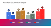
Clustered Column PowerPoint Templates and Google Slides Themes

 Canva
Canva
Best Presentation Template
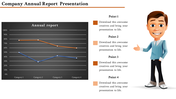
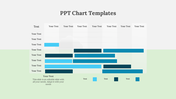
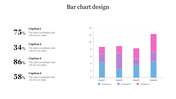
Compare and contrast data across multiple categories with our clustered column chart template, also available for Google Slides themes! This versatile template features a bar chart with years on the X-axis and an image placeholder, allowing you to visualize trends and differences over time while incorporating relevant visuals.
Who can use these slides? Business professionals, educators, researchers, and anyone who needs to present comparative data can benefit from this template.
Our clustered column chart template is designed with bar chart. It provides a clear visual representation of your data, while the image placeholder allows you to add further context and visual interest.Download our template today!
Feature of the template
- 100% customizable slides and easy to download.
- Slides are available in different nodes & colors.
- The slide is contained in 16:9 and 4:3 format.
- Easy to change the slide colors quickly.
- Well-crafted template with an instant download facility.


You May Also Like These PowerPoint Templates

Add to Wishlist
Download
Edit


Add to Wishlist
Download
Edit

Add to Wishlist
Download
Edit

Add to Wishlist
Download
Edit

Add to Wishlist
Download
Edit

Add to Wishlist
Download
Edit

Add to Wishlist
Download
Edit

Add to Wishlist
Download
Edit


Add to Wishlist
Download
Edit

Add to Wishlist
Download
Edit


Add to Wishlist
Download
Edit


Add to Wishlist
Download
Edit

Add to Wishlist
Download
Edit
