
Need an org chart but don’t want to learn new software? Microsoft Word can build one in a few clicks using SmartArt — no drawing, no downloads. This guide walks you through the SmartArt method step by step, shows a shapes method for custom or matrix layouts, and points you to ready-made templates when you’d rather skip the styling.
Word isn’t a dedicated diagramming tool, but for a small-to-medium team chart it’s more than capable—and you almost certainly already have it open. New to org charts? A quick primer on what an organizational chart is and how it works covers the basics, and if you’re weighing the diagram against your actual reporting lines, our guide on organizational structure vs. the organizational chart clears up the difference.
Quick Steps: Org Chart in Word Using SmartArt
- Open your Word document and click the Insert tab.
- In the Illustrations group, click SmartArt.
- Select Hierarchy, choose a layout (e.g., Organization Chart), and click OK.
- Type names and titles into the boxes, or use the Text Pane on the left.
- Add positions with Add Shape on the SmartArt Design tab.
- Restyle colors and fonts under SmartArt Design and Format.
Method 1: Build an Org Chart With SmartArt (Recommended)
SmartArt is the fastest way to build a chart in Word because it positions boxes and connector lines for you.
Step 1: Insert a SmartArt hierarchy
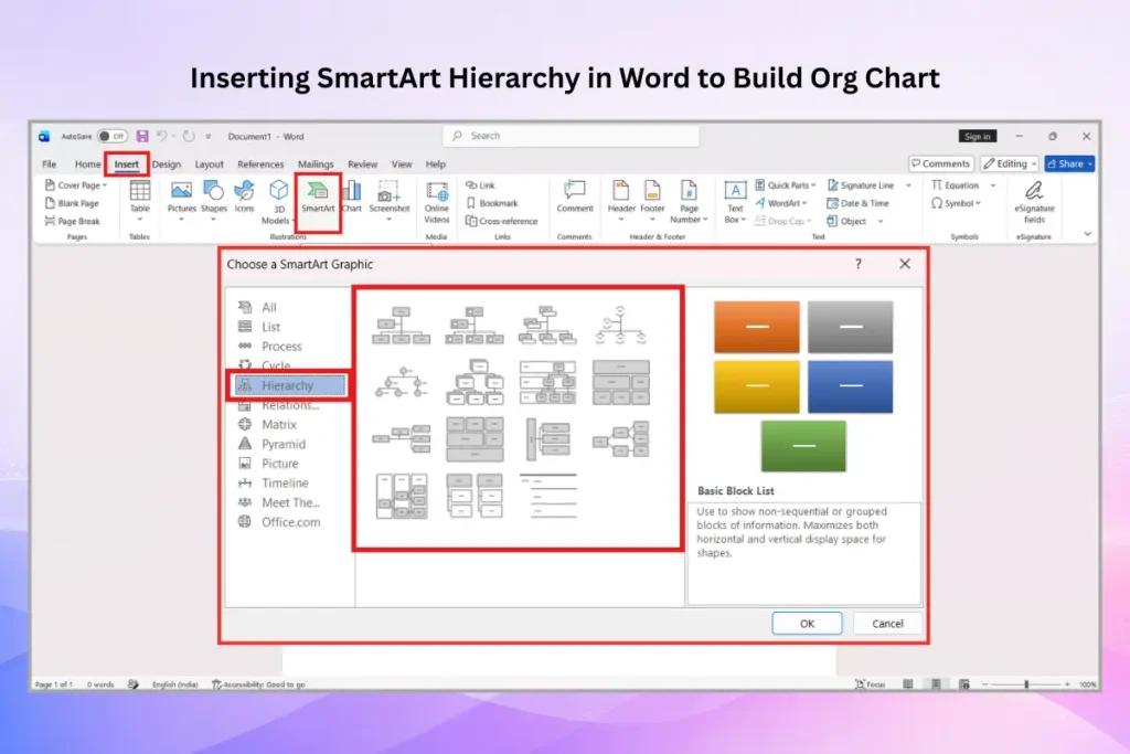
Open your document, go to the Insert tab, and click SmartArt in the Illustrations group. In the dialog box that opens, select the Hierarchy category on the left. Pick a layout—Organization Chart is the standard choice, and the version with an assistant box is useful if you have an executive assistant or chief of staff reporting outside the main line. Click OK.
Step 2: Add names and titles
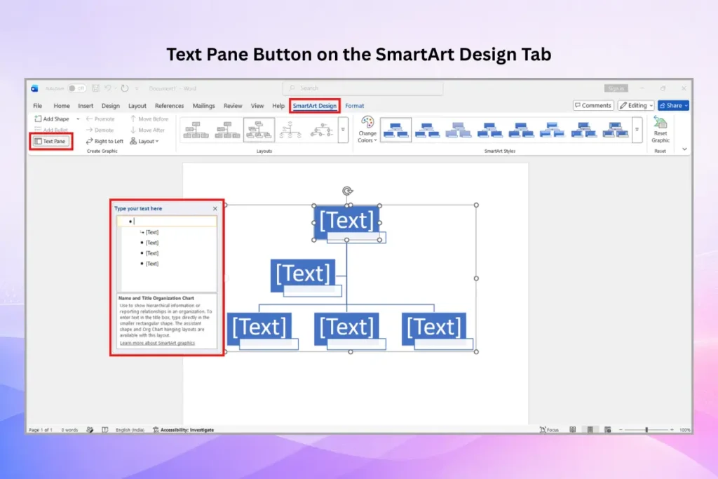
Click any box and type directly, or open the Text Pane (the arrow on the left edge of the SmartArt frame, or the Text Pane button on the SmartArt Design tab) to type every entry as a bulleted list. The Text Pane is faster for larger charts because pressing Enter adds a box and Tab demotes it to the next level down.
Step 3: Add and arrange positions
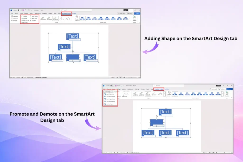
Select a box, then use Add Shape on the SmartArt Design tab. The dropdown lets you place the new box in the right relationship:
- Add Shape Below — a direct report under the selected role.
- Add Shape Above — a manager over the selected role.
- Add Shape Before / After — a peer at the same level.
- Add Assistant — a support role that sits off the main reporting line.
Use Promote and Demote (also on the SmartArt Design tab) to move a box up or down a level without deleting it.
Step 4: Style the chart
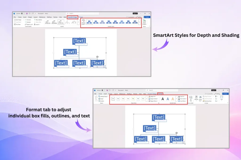
With the chart selected, open the SmartArt Design tab to change the overall look: SmartArt Styles for depth and shading, and Change Colors to apply a palette—pick one close to your brand colors. For finer control, use the Format tab to adjust individual box fills, outlines, and text. Keep it to two or three colors so the hierarchy stays easy to read.
Method 2: Build an Org Chart From Shapes (For Custom Layouts)
If your structure doesn’t fit a standard tree—say a matrix with dotted-line reporting, or a layout that needs boxes placed freely—draw it with shapes instead.
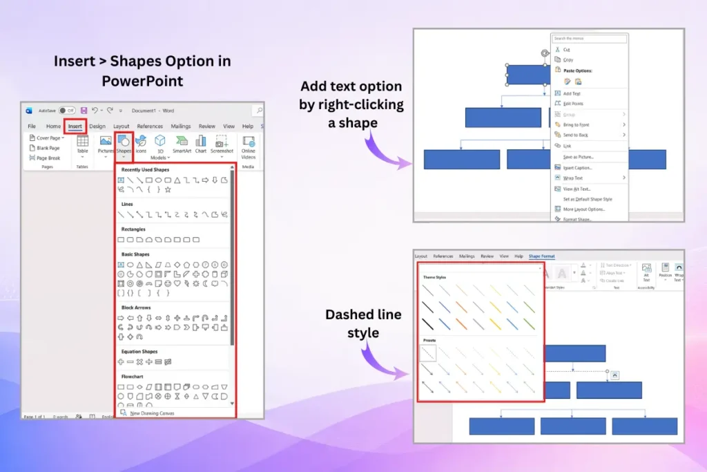
- Go to Insert > Shapes and choose a rectangle for each role.
- Add text by right-clicking a shape and selecting Add Text.
- Connect roles with Line shapes; use a dashed line style for dotted-line (matrix) reporting.
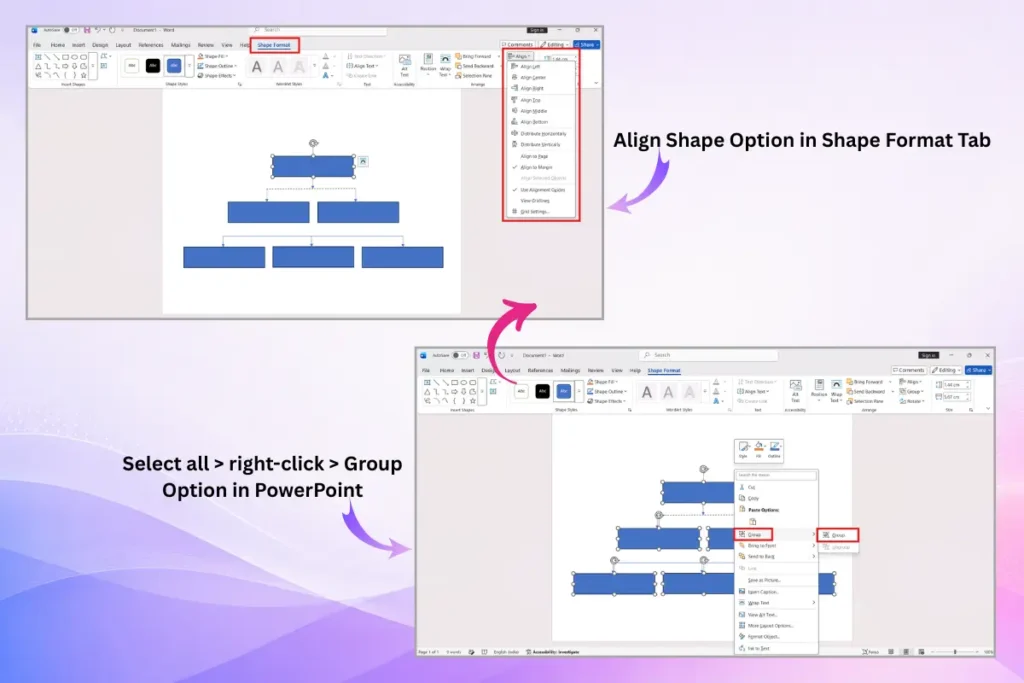
- Select related shapes and use Align (Shape Format tab) to keep spacing even.
- Group the finished chart (select all > right-click > Group) so it moves as one object.
Shapes give you full control, but you lose SmartArt’s automatic alignment—every box and line is yours to position, which gets tedious past a dozen roles.
SmartArt vs. Shapes vs. a Template
| Approach | Best for | Trade-off |
| SmartArt | Standard top-down charts, built fast | Limited layout flexibility for complex structures |
| Shapes | Matrix, dotted-line, or fully custom layouts | Manual alignment; slow for large teams |
| Pre-built template | A polished, presentation-ready result | You adapt the design to your team, not the reverse |
Already have your team in a spreadsheet? Our guide on creating an org chart in Excel from an employee list builds the chart straight from your data instead of retyping every name.
Shortcut: If the chart is going into a deck or a report that others will see, starting from a pre-made organizational chart template saves the styling work entirely—you just swap in your names and roles. Building the same chart in a presentation tool? See our guides on creating an org chart in PowerPoint, Google Slides, or Canva.
How to Add Photos to Your Word Org Chart
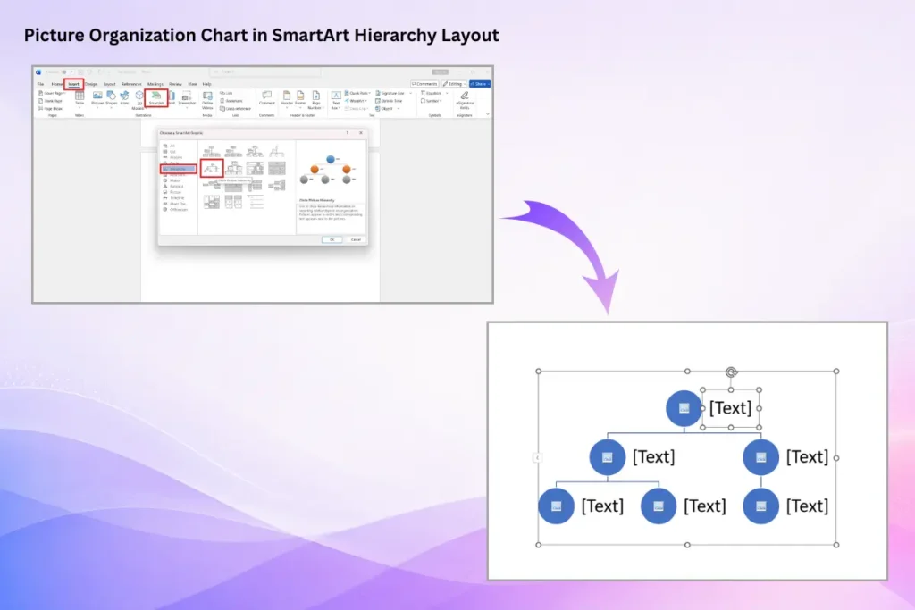
For a photo org chart, choose the SmartArt hierarchy layout named Picture Organization Chart when you insert SmartArt. Each box includes an image placeholder—click the picture icon and insert a headshot from your device or stock library. If you’ve already built a text-only chart, it’s usually quicker to insert a picture-based layout fresh than to convert the existing one.
Common Mistakes to Avoid
A few habits quietly make org charts harder to read. The same ones trip people up in slide decks too, so it’s worth skimming these common org chart mistakes before you share your final version.
| Mistake | Fix |
| Dragging SmartArt boxes by hand to reposition them | Use Add Shape, Promote, and Demote so alignment stays automatic. |
| Cramming a 100-person org into one page | Chart one department or level per page, or link to sub-charts. |
| Using five or six colors “to tell teams apart” | Stick to two or three; use position, not color, to show hierarchy. |
| Typing each box manually on a big chart | Use the Text Pane—Enter adds a box, Tab moves it down a level. |
| Building a complex matrix in SmartArt | Switch to shapes (or a template) when reporting lines cross. |
Frequently Asked Questions
Does Microsoft Word have an org chart template?
Word doesn’t ship a dedicated org chart document template, but its SmartArt Hierarchy layouts act as built-in org chart templates—insert one, add your names, and it’s done. For a more designed result, you can drop a ready-made org chart template into your document instead.
What’s the easiest way to make an org chart in Word?
SmartArt is the easiest method. Go to Insert > SmartArt > Hierarchy, pick the Organization Chart layout, and type your names and titles. Word positions the boxes and connector lines automatically, so no manual drawing is needed.
How do I add a box to a SmartArt org chart?
Select the box nearest to where you want the new role, go to the SmartArt Design tab, click Add Shape, and choose Below, Above, Before, After, or Assistant depending on the reporting relationship.
Can I make a matrix or dotted-line org chart in Word?
SmartArt only handles standard top-down hierarchies. For matrix structures or dotted-line reporting, build the chart from Insert > Shapes using boxes and dashed connector lines, which lets you place everything manually.
How do I make my Word org chart match my company colors?
Select the chart, open the SmartArt Design tab, and use Change Colors to apply a palette, or the Format tab to set individual box fills and outlines. Keep it to two or three colors for readability.
Is it better to make an org chart in Word or PowerPoint?
Both use the same SmartArt engine, so the build process is nearly identical. Word is fine when the chart lives inside a document; PowerPoint is better when it’s part of a presentation, since it’s easier to resize and animate on a slide.
How do I add employee photos to a Word org chart?
Insert the SmartArt Picture Organization Chart layout, which includes an image placeholder in each box. Click the picture icon in a box and add a headshot from your device.
Conclusion
For most teams, SmartArt is all you need: Insert > SmartArt > Hierarchy, type your roles, and let Word handle the layout. Reach for shapes when your structure is genuinely custom, and reach for a ready-made template when the chart needs to look polished for an audience—our roundup of the best org chart templates for PowerPoint and Google Slides is a good place to start. Whichever route you take, keep it to one level or department per page and a two-to-three color palette, and your chart will stay clear as your team grows.