The wrong org chart layout can make even a simple team look confusing. The right one helps your audience understand roles, reporting lines, departments, and responsibilities in seconds. Use this guide to choose the best org chart layout for your team structure.
Why Org Chart Layouts Matter
An org chart is not just a set of boxes with names inside. It is a visual explanation of how people, departments, and responsibilities are connected. When the layout is clear, viewers can quickly understand who leads the team, who reports to whom, and how work moves across the organization.
The problem starts when every team uses the same type of chart. A startup does not need the same layout as a large company. A project team does not need the same chart as an HR onboarding deck. A cross-functional team cannot always be explained with a simple top-down hierarchy.
Before choosing a layout, ask one question: what should the audience understand after seeing this slide? If the answer is authority, use a hierarchy chart. If the answer is collaboration, use a matrix or circular chart. If the answer is recognition, use a photo org chart.
If you are still new to the basic concept, read this guide on what an organizational chart is and how it works. If you already know the basics, the layouts below will help you choose the right structure for your next presentation.
8 Org Chart Layouts for Different Team Structures
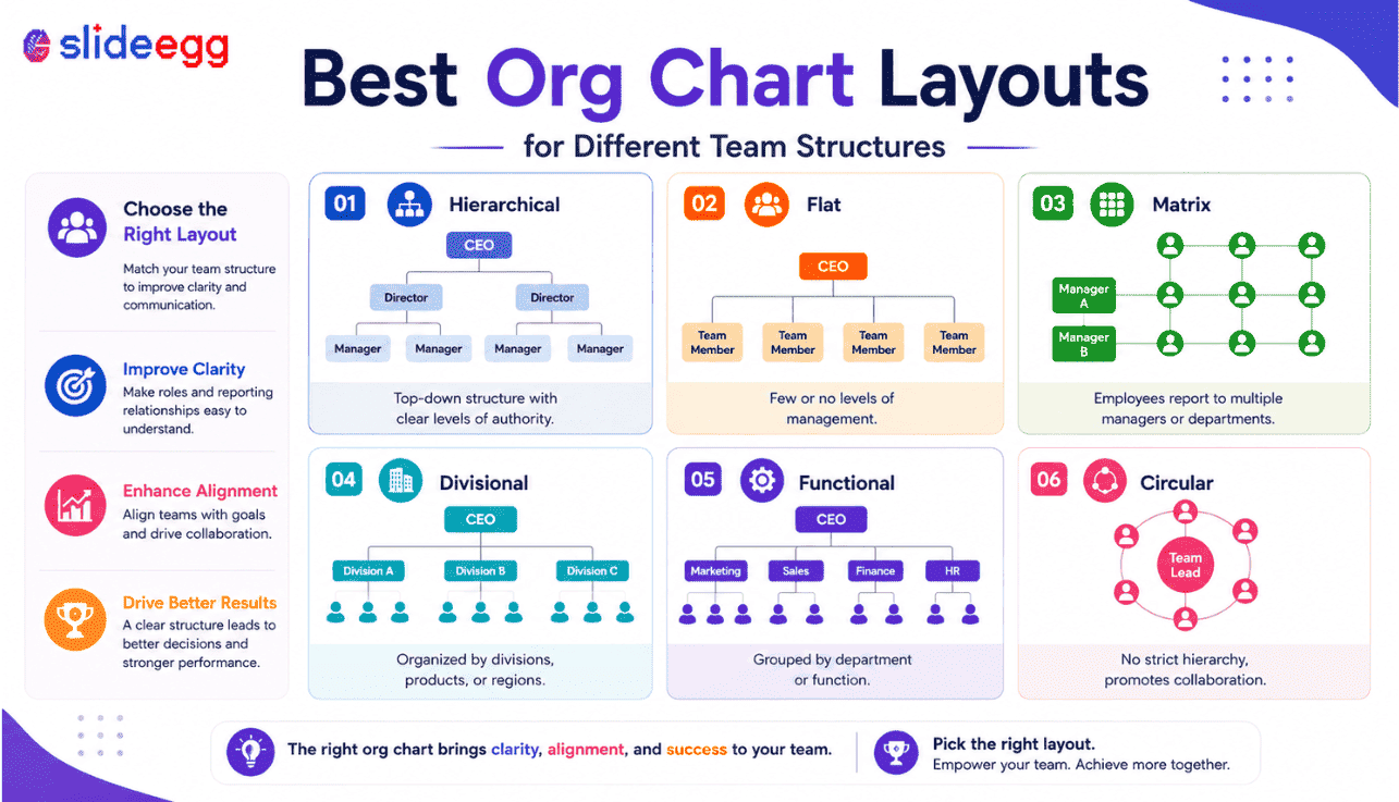
01. Hierarchical Org Chart Layout
Best for clear reporting lines and traditional company structures
A hierarchical org chart is the most common layout. It starts with the top leader and moves down through managers, team leads, and employees. This layout is useful when every person has one clear manager and the reporting structure is direct.
For example, a company may show the CEO at the top, department heads below, managers under each department, and employees below each manager. This top-to-bottom structure is easy to follow because the visual flow matches how authority usually works.
Best For: Corporate teams, HR departments, leadership presentations, employee onboarding, department introductions, and company profile decks.
Use This When: You need to show authority, responsibility, and direct reporting lines. Avoid this layout if your team has shared managers or cross-functional reporting.
02. Flat Org Chart Layout
Best for startups, small teams, and simple structures
A flat org chart shows fewer management layers. It is common in startups, small businesses, creative teams, and founder-led companies. Instead of showing multiple reporting levels, it keeps the structure simple and direct.
This layout works well when the team is small and people work closely with leadership. It avoids making a simple team look more complex than it really is.
Best For: Startups, small businesses, agencies, founder-led teams, creative teams, and small project groups.
Use This When: Your team has a limited hierarchy. If roles overlap, add short responsibility labels so viewers understand what each person handles.
03. Matrix Org Chart Layout
Best for cross-functional teams and shared reporting lines
A matrix org chart is used when employees report to more than one person or work across multiple teams. This is common in project-based companies, product teams, consulting firms, and agile departments.
For example, a designer may report to the Head of Design for design standards and also work under a Project Manager for daily project tasks. A normal hierarchy may not explain this clearly, but a matrix chart can show both relationships.
Best For: Cross-functional teams, project teams, product teams, consulting teams, agile teams, and shared-resource departments.
Use This When: People work across departments or have more than one reporting relationship. Use solid lines for direct reporting and dotted lines for project-based connections.
04. Department-Based Org Chart Layout
Best for showing how a company is organized by function
A department-based org chart groups people by business function. Instead of focusing only on individual reporting lines, it shows how departments are arranged inside the company.
For example, a company may show Sales, Marketing, HR, Finance, Operations, Product, and Customer Support as separate sections. This layout is useful when the audience needs to understand how the business is divided.
Best For: Company overview slides, business presentations, department introductions, internal meetings, and client-facing company profiles.
Use This When: You want to explain the company structure at a department level. Use simple color coding, but avoid too many colors because they can create visual noise.
05. Team-Based Org Chart Layout
Best for showing how work is divided across teams
A team-based org chart focuses on working groups rather than formal departments. It is useful when people are grouped by product, project, region, or responsibility.
For example, a software company may show Product Team, Design Team, Development Team, Marketing Team, Sales Team, and Customer Success Team. This helps viewers understand how work gets done.
Best For: Product teams, project groups, remote teams, marketing teams, sales teams, and department-level updates.
Use This When: The goal is to explain responsibilities and working groups, not only official reporting lines.
06. Circular Org Chart Layout
Best for visual summaries and collaboration-focused teams
A circular org chart places the main role, team, or function in the center and arranges connected teams around it. It looks more visual than a traditional hierarchy and works well when you want to show relationships rather than strict authority.
For example, you can place a “Leadership Team” in the center and show departments around it. You can also place “Project Manager” in the center and show supporting teams around the project.
Best For: Executive summaries, creative presentations, strategy decks, team collaboration slides, and leadership overview slides.
Use This When: You want to show connection and collaboration. Do not use it when the audience needs exact reporting levels.
07. Photo Org Chart Layout
Best for onboarding and team introductions
A photo org chart includes employee photos along with names and roles. This layout is useful when the audience needs to recognize people, not just understand job titles.
Photo charts work well in onboarding presentations, team introductions, internal training decks, and company profile slides. They help new employees connect faces with names and responsibilities faster.
Best For: HR onboarding, team introduction slides, company profile presentations, employee recognition decks, and internal training.
Use This When: The team size is manageable and photos improve understanding. Avoid photo charts for very large structures because they can overcrowd the slide.
08. Project Team Org Chart Layout
Best for showing project ownership and responsibilities
A project team org chart shows roles and responsibilities for a specific project. It may not match the official company hierarchy. Instead, it explains how the project team works.
For example, a project org chart may include a Project Sponsor, Project Manager, Technical Lead, Design Lead, Marketing Lead, Finance Coordinator, and Support Team.
Best For: Project presentations, client updates, implementation plans, consulting projects, product launches, and internal planning decks.
Use This When: Your audience needs to know who owns each part of the work. Focus on responsibility, approval, execution, and support roles.
How to Choose the Best Org Chart Layout
There is no single best org chart layout for every team. The right choice depends on your structure, audience, and presentation goal.
Use a hierarchical chart when you need to show authority and reporting lines. Use a flat chart for small teams and startups. Use a matrix chart for shared reporting. Use a department-based chart for company overviews. Use a photo chart for team introductions. Use a project team chart when responsibilities matter more than formal hierarchy.
If you want ready-made layouts instead of building every box and connector manually, explore these editable org chart PowerPoint templates for PowerPoint, Google Slides, and Canva. You can customize names, roles, departments, photos, colors, and reporting lines based on your team structure.
Best Org Chart Layout by Use Case
| Use Case | Best Layout | Why It Works |
| HR onboarding | Photo org chart or hierarchical chart | Helps new employees understand people, roles, and managers faster. |
| Startup presentation | Flat org chart | Keeps the structure simple without adding unnecessary layers. |
| Large company structure | Hierarchical or divisional chart | Shows leadership levels, departments, and reporting paths clearly. |
| Project planning | Project team org chart | Explains ownership, responsibilities, and escalation paths. |
| Cross-functional team | Matrix org chart | Shows shared reporting and collaboration between departments. |
| Company profile | Department-based chart | Gives a clear overview of how the business is structured. |
| Team introduction | Photo org chart | Connects names, faces, roles, and responsibilities. |
| Executive summary | Circular org chart | Creates a clean visual overview without heavy hierarchy. |
Common Mistakes When Choosing an Org Chart Layout
Many org chart slides fail because the layout is selected only for design. A chart may look modern and still fail if it does not explain the structure clearly.
Choosing a Layout Only Because It Looks Good
Do not choose a circular or creative layout just because it looks attractive. If the audience needs to understand reporting lines, a hierarchy chart may be better.
Adding Too Many People on One Slide
If the chart is crowded, split it into multiple slides. A readable chart is better than a complete but confusing chart.
Using Long Job Titles
Long titles make boxes uneven and hard to read. Keep role labels short while preserving meaning.
Ignoring Reporting Lines
If the audience cannot tell who reports to whom, the org chart is not useful. Keep connector lines clean and easy to follow.
Using Too Many Colors
Colors should help the audience understand departments or levels. Too many colors create visual noise.
For more presentation-focused guidance, read this guide on creating a clear and effective org chart presentation.
Tips to Make Any Org Chart Layout Better
A strong org chart should be easy to scan. Viewers should understand the structure without needing a long explanation. If the slide needs too much explanation, the layout is probably wrong.
- Keep the chart focused on one purpose.
- Use short names and role labels.
- Keep spacing equal between boxes.
- Use clean connector lines.
- Avoid tiny text.
- Use department colors only when useful.
- Add photos only when they improve understanding.
- Split large charts into smaller slides.
- Keep the design aligned with your brand.
- Check readability before presenting.
Build Clear Org Chart Slides Faster
Choose from editable org chart templates for PowerPoint, Google Slides, and Canva. Customize names, roles, departments, photos, colors, and reporting lines without starting from scratch.
Frequently Asked Questions
What is the best org chart layout for a small team?
A flat org chart usually works best for small teams. It keeps the structure simple and avoids unnecessary management layers.
Which org chart layout is best for a large company?
A hierarchical or divisional org chart works better for large companies. These layouts can show leadership levels, departments, regions, or business units clearly.
What layout should HR teams use?
HR teams can use a hierarchical chart for reporting lines and a photo org chart for onboarding. Photo charts help new employees recognize managers and team members faster.
What is the best layout for cross-functional teams?
A matrix org chart is best for cross-functional teams because it can show shared reporting lines and project-based relationships.
Should I include employee photos in an org chart?
Use photos when the chart is for onboarding, team introductions, or company profiles. Avoid photos if the chart is too large or if image quality is inconsistent.
Can one company use different org chart layouts?
Yes. A company can use a hierarchy chart for leadership, a photo chart for onboarding, and a project chart for project responsibilities.
Conclusion
The best org chart layout depends on what your audience needs to understand. A hierarchy chart works well for reporting lines. A flat chart suits startups and small teams. A matrix chart explains cross-functional work. A photo chart supports onboarding and introductions. A project team chart helps show ownership and responsibilities.
Do not choose a layout only because it looks good. Choose the one that explains your structure clearly. Keep the slide readable, avoid clutter, and include only the details your audience needs.
When the layout is right, your org chart becomes more than a simple diagram. It becomes a useful presentation slide that helps people understand roles, teams, departments, and reporting flow quickly.