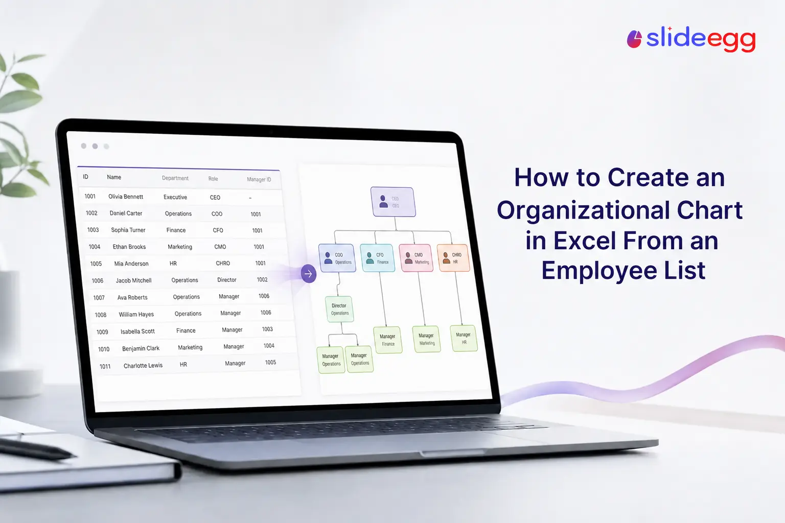
Already have your team in a spreadsheet? Then you’re halfway to an org chart. To turn an employee list into an org chart in Excel, insert a SmartArt Hierarchy graphic, open its Text Pane, and paste your list as an indented outline—each Tab of indentation becomes one level down the reporting line, and Excel draws the boxes and connectors for you. For a large org that changes often, the Visio Data Visualizer add-in can build the chart automatically from a table with a “reports to” column and refresh it whenever your data changes.
One thing to know up front: Excel has no one-click button that reads a flat spreadsheet and draws a chart on its own—the native route works from an indented list, and the automated route needs the Visio add-in. This guide covers both, and which fits your team size. If org charts are new to you, a two-minute read on what an organizational chart is and how it works is worth it first and if you’re unsure how the chart differs from your reporting model, organizational structure vs. the organizational chart spells out the difference.
Quick Steps: Org Chart From a List (SmartArt)
- Structure your employee list as an indented outline (managers first, reports indented below).
- In Excel, go to Insert > SmartArt > Hierarchy and pick Organization Chart.
- Open the Text Pane and delete the placeholder text.
- Paste your indented list into the Text Pane (Ctrl+V).
- Fix any levels with Tab (demote) and Shift+Tab (promote).
- Restyle under the SmartArt Design tab.
Step 1: Prepare Your Employee List
The native SmartArt method reads hierarchy from indentation, not from a “manager” column. So set your list up as an outline, where each level of indentation is one level down the chart:
- Priya Nair — CEO
- Arun Mehta — VP Sales
- Sara Khan — Account Executive
- Leo Park — Account Executive
- Divya Rao — VP Engineering
- Sam Ortiz — Engineering Lead
- Arun Mehta — VP Sales
Keep each person on their own line with the name and title together. If you currently have a flat table with a separate “Reports To” column, either re-sort it into this indented shape, or use the Visio method further down, which is built for exactly that table format.
Step 2: Insert a SmartArt Hierarchy
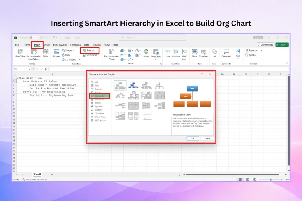
Go to the Insert tab and click SmartArt. In the dialog, select the Hierarchy category and choose Organization Chart (or the version with an assistant box if you need one). Click OK to drop a starter chart onto your sheet.
Step 3: Paste Your List Into the Text Pane
With the SmartArt selected, open the Text Pane—click the arrow on the left edge of the graphic, or the Text Pane button on the SmartArt Design tab. Delete the placeholder bullets, place your cursor in the empty pane, and paste your indented list. SmartArt reads the indentation and builds the boxes and connector lines to match. A top-level name with no indent becomes the top box; each Tab of indent drops a level.
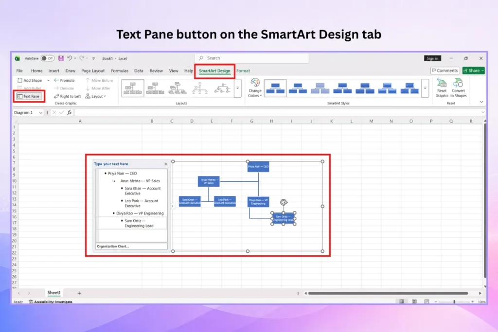
Tip: If everything lands on one level after pasting, your source text lost its indentation. Put the cursor at the start of a line in the Text Pane and press Tab to demote it, or Shift+Tab to promote it, until the hierarchy is right.
Step 4: Style the Chart
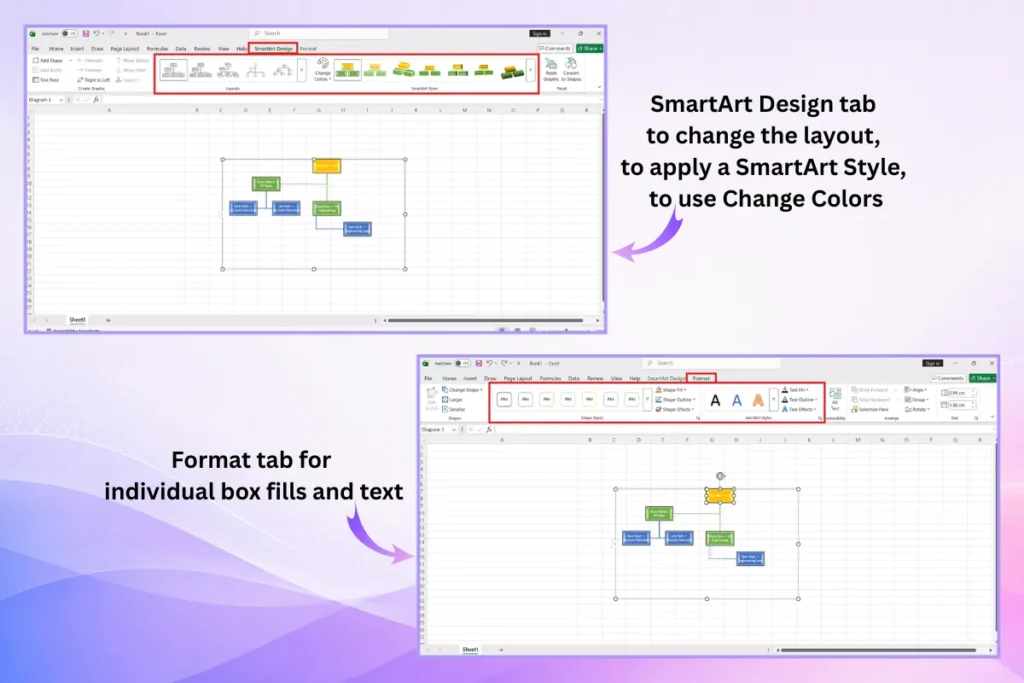
Open the SmartArt Design tab to change the layout, apply a SmartArt Style, or use Change Colors to match your brand. Use the Format tab for individual box fills and text. Keep it to two or three colors so the reporting structure stays readable.
The Automated Route: Visio Data Visualizer
If you manage a large org that changes often, the manual method gets tedious. The Data Visualizer add-in (available through the Visio plan in Microsoft 365) generates the whole chart from a proper data table and lets you refresh it when the data changes.
Your table needs a column for each of these, with headers left unchanged:
| Column | What it holds |
| Employee ID | A unique ID for each person. |
| Name | The employee’s full name. |
| Manager ID | The Employee ID of the person they report to (this defines the lines). |
| Title / Role | Job title shown on the box. |
Point the add-in at that table and it draws the full chart automatically—no manual box placement, and far less risk of a mis-drawn reporting line. When someone joins, leaves, or changes managers, you update the table and refresh the diagram rather than rebuilding it. The trade-off is that this route needs a Visio subscription; the SmartArt method above is built into Excel at no extra cost.
Which Method Should You Use?
| Method | Best for | Trade-off |
| SmartArt from an indented list | Small-to-medium teams; a one-time chart | Manual updates; needs an outline, not a flat table |
| Visio Data Visualizer | Large orgs that change often | Requires a Visio subscription |
| Pre-built template | A polished chart for a deck or report | You adapt the design to your team |
Building the chart for a presentation rather than a spreadsheet? A ready-made organizational chart template skips the styling entirely. You can also build the same chart in PowerPoint, Google Slides, or Canva, which are easier to resize and present.
Prefer to keep everything inside a document instead of a spreadsheet? The same SmartArt steps work in Microsoft Word.
Common Mistakes to Avoid
Most Excel org-chart headaches come down to a handful of habits. These overlap with the common org chart mistakes people make in slide decks too, so they’re worth a quick check before you share the chart.
| Mistake | Fix |
| Expecting a flat table to auto-build with SmartArt | Re-shape it as an indented outline, or use the Visio add-in. |
| Everything pastes onto one level | Use Tab (demote) and Shift+Tab (promote) in the Text Pane to rebuild levels. |
| Charting hundreds of people on one sheet | Chart one department at a time, or use the Visio route. |
| Manually re-typing after every staff change | Keep the source list current and rebuild from it, or use a refreshable Visio chart. |
| Too many colors “to label departments” | Use two or three colors; group by position, not color. |
Frequently Asked Questions
Can Excel create an org chart automatically from a list?
Partly. Excel’s SmartArt can build a chart instantly from an indented list pasted into the Text Pane, but it won’t read a flat table with a “manager” column on its own. For fully automatic generation from a data table, use the Visio Data Visualizer add-in.
How do I turn an Excel employee list into an org chart?
Structure the list as an indented outline, insert a SmartArt Hierarchy graphic (Insert > SmartArt > Hierarchy > Organization Chart), open the Text Pane, delete the placeholders, and paste your list. SmartArt reads the indentation and draws the chart.
Does Excel have an org chart template?
Excel doesn’t include a dedicated org chart workbook template, but its SmartArt Hierarchy layouts serve the same purpose. For a designed, presentation-ready chart, use a ready-made org chart template instead.
What’s the difference between the SmartArt and Visio methods?
SmartArt is free inside Excel and works from an indented list, with manual updates. The Visio Data Visualizer builds the chart automatically from a table with Employee ID and Manager ID columns and refreshes when the data changes, but it requires a Visio subscription.
How do I update an Excel org chart when staff change?
With the SmartArt method, edit the Text Pane directly or rebuild from your updated list. With the Visio Data Visualizer, update the source table and click refresh—the diagram updates itself.
Can I add photos to an org chart in Excel?
Yes. When inserting SmartArt, choose the Picture Organization Chart layout, which includes an image placeholder in each box for headshots.
Is Excel or PowerPoint better for an org chart?
Excel is convenient when your employee data already lives in a spreadsheet. PowerPoint is better when the chart is going into a presentation, since slides are easier to resize, animate, and present. Both use the same SmartArt tools.
Conclusion
Excel handles org charts two ways: paste an indented employee list into a SmartArt Hierarchy for a quick, free chart, or use the Visio Data Visualizer add-in to generate and refresh a chart automatically from a data table. Choose SmartArt for small teams and one-off charts, and the Visio route for large orgs that change often. When it’s time to make the chart look polished for an audience, our roundup of the best org chart templates for PowerPoint and Google Slides is a good next stop. Either way, keep the source list clean and the palette simple, and your chart stays accurate and easy to read.