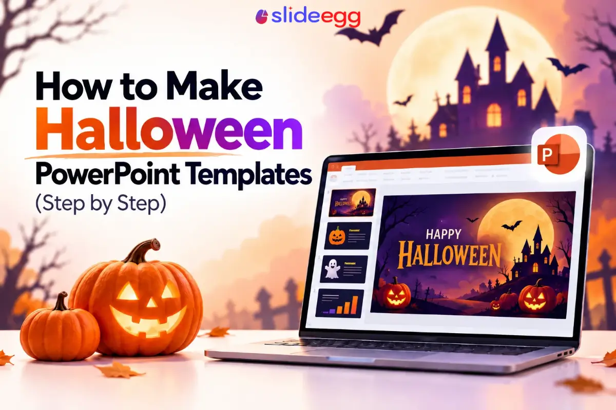
There’s a specific failure mode with Halloween decks: someone drops a cobweb clip-art border onto every slide, swaps the font to something spooky and barely legible, and the result reads more like a 2006 MySpace page than a presentation anyone wants to sit through. The theme works fine, what’s missing is restraint about where it goes.
Palette
Typography
Templates
Step 1: Decide what kind of Halloween this is
Spooky and playful aren’t the same mood, and picking one before opening PowerPoint saves a lot of second-guessing later. A kids’ classroom deck wants bright orange, friendly ghosts, cartoon pumpkins. An office party announcement or client-facing update wants something closer to moody purple and charcoal with sparse, elegant Halloween motifs, a single bat silhouette rather than a cluster of them. Mixing the two moods is usually what makes a deck look unfinished rather than themed.
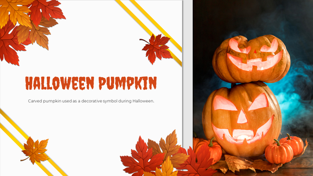
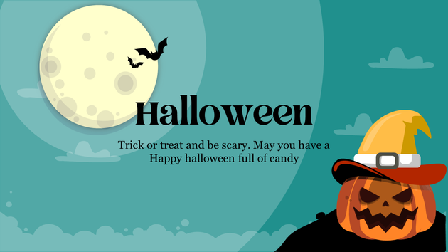
Source: Free Halloween Pumpkin template, SlideEgg
Source: Scary Halloween template, SlideEgg
Step 2: Pick a palette and stop there
Classic Halloween orange and black works, but it’s heavy if overused. A better default: one dominant color (deep purple, burnt orange, or near-black), one accent (a brighter orange or a sickly green), and white or cream for text backgrounds so body copy stays readable. Three colors, used consistently, reads more intentional than five colors used once each.
Step 3: Choose two fonts maximum
A display font for the title slide and any big standalone text, something with a bit of character, and a completely plain sans-serif for every line of body text. The spooky font belongs nowhere near a paragraph or a bullet list; it’s unreadable at small sizes and undermines the exact readability a presentation needs.
Step 4: Build the title slide first
This is the one slide people actually judge the whole deck by, and often the one slide that gets screenshotted. Put the full theme here: the palette, the display font, a single strong visual, a pumpkin, a moon, a spider web corner treatment, nothing cluttered. If the rest of the deck is more restrained, that’s fine; this slide is allowed to carry the most personality.
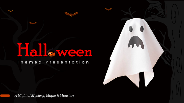
Source: Halloween Themed Presentation, SlideEgg
Step 5: Keep content slides boring on purpose
Whatever the deck is actually about, an update, an agenda, a set of results, those slides need to be read quickly and accurately, which means a plain background, high-contrast text, and the Halloween palette reduced to an accent: a thin colored border, a small icon in the corner, nothing competing with the content itself.
Step 6: Close on the theme again
Bookend the deck the way it opened. A closing slide with the same visual treatment as the title slide gives the whole thing a sense of having been designed on purpose rather than assembled slide by slide under a deadline, which, to be fair, it might have been.
Skip the design work entirely
If six steps is still more than there’s time for, SlideEgg’s Halloween PowerPoint template collection already applies this balance, themed title and closing slides with calmer content layouts underneath, so the only work left is dropping in your own text.
Frequently asked questions
Is it unprofessional to add a Halloween theme to a work presentation?
Not if it’s confined to the parts of the deck that can carry it, a title slide, a section break, a closing slide, while the actual content stays in a readable, neutral layout. The mistake is theming every slide equally, not theming at all.
What font actually reads as Halloween without looking like a kids’ party flyer?
A slightly heavier serif or a rounded display font used only for the title, paired with a plain sans-serif for every other line of text, gets the seasonal feeling across without making body copy hard to read.
How many slides should actually carry the Halloween theme?
Usually just the title slide, one section divider if the deck has multiple parts, and the closing slide. A 20-slide deck with heavy orange and purple on every page gets tiring well before slide 10.
Want the palette and layout already worked out?
Start from a template built for exactly this balance.